stationery
Croxley Cambric
Aug 16, 2023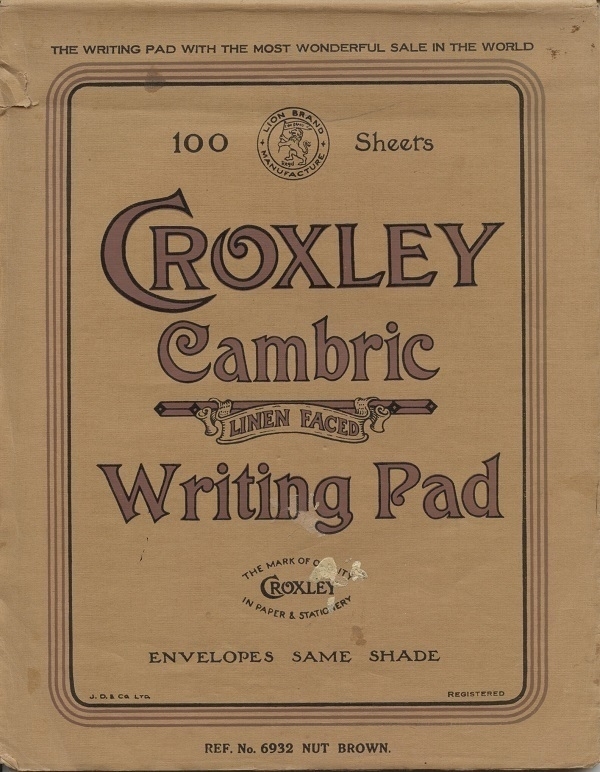
My first vintage stationery acquisition was some Croxley Script typing paper in the old foolscap (13"x8") size which was once the default format in the UK for business use, prior to the onslaught of ISO 216. Looking for more of the same, I found an ebay listing for the part-used pad of linen-faced Croxley Cambric writing paper shown above, together with a small quantity of matching envelopes in the same shade of ‘Nut Brown’. I was inclined to buy it, and have since used all that was left of it.
Croxley Green in Hertfordshire was the site of one of the John Dickinson and Co.’s main paper mills, thereby lending its name to several of the company’s product-lines. On the front of the pad a boast of its being “The writing pad with the most wonderful sale in the world.” Not then the best-selling, necessarily, but somehow the wonderfullest. Within was an information sheet with other product details, etc. The Old Bailey head office address printed on the sheet likely dates the pad to before WWII; and that address’s ‘EC4’ post-code probably means it’s post-WWI.
Writings
Aug 2, 2023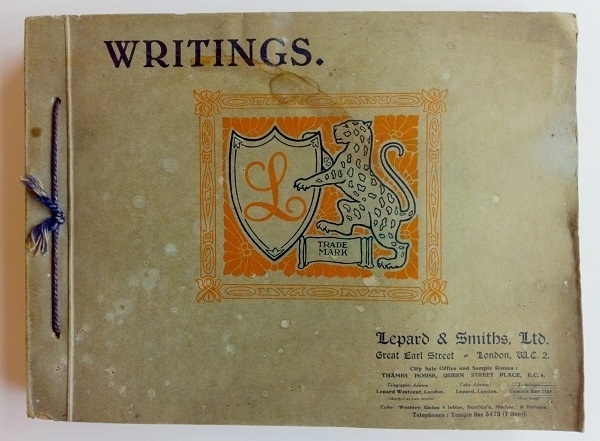
My odd enthusiasm for old stationery has bled its way into my library, with the acquisition of a number of paper sample-books. One of the best is this collection of Writings (i.e. writing paper samples) issued in March 1936 by Lepard & Smiths Ltd., apparently one of the longest established paper-merchants in London. The book’s cover is in rather shabby condition, but the contents have aged much more gracefully. On the first page is the boast that “we believe this to be the best and most complete Sample Book of Writings issued by any house” and the claim that “fully 95% of the papers shewn are of British make.”
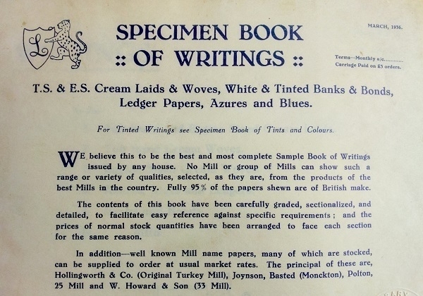
To the contemporary letter-writer, who might do well nowadays to find even a few different types of writings in all but the most specialised retail outlets, the bewildering choice available to their forebears is much to be envied. Among the options offered by Lepard & Smiths, one curiosity is their Kalatex paper, made, as its name implies, with the addition of latex rubber to the esparto-based pulp. Of this paper, they claim that “the surface grips the ink, as there is not the slightest trace of greasiness”, and indeed its surface does have a ‘grippy’ feel about it - though I’ve not tried writing on the stuff.
Though the bulk of the papers in the book are of a plain ‘cream’ off-white colour, there are also some given in a range of shades, with, for example, their “Eleven” series of papers: available in Lilac, Yellow, Blue, Daffodil, Pink, Green, Buff, Salmon, Deep Blue, Moss, Cerise, Silver Grey and Old Gold. This paper is one of only a very few in the book which has suffered any significant deterioration over the last eighty-seven years, a testament to the fine quality of Lepard & Smiths' products.
Index Cards
Jul 23, 2023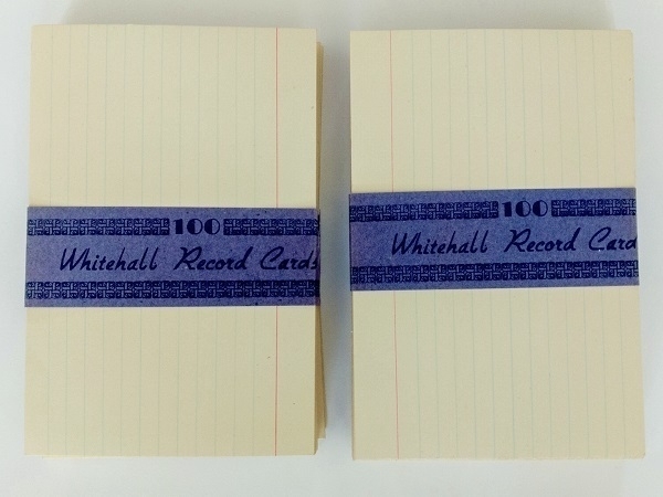
I bought a ’50s index card ‘outfit’ a few years ago: that is, a Winel brand flip-top card-box, some alphabetical separators and a couple of hundred Whitehall 6"x4" cards. As well as the blank cards, there were a dozen typewritten ones left there by the set’s original owner, one for every month of the year, with major household expenses listed on each one.
The most significant expense through the year, described as ‘Building Society’ (presumably a monthly mortgage payment) was for £78 (£6 10s x 12). Besides that, the largest single amounts were for the annual rates bill (£29 18s 6d) and a fairly hefty £16 1s 3d for car insurance. The ‘A.P.S.W. Subscription’ on the January card suggests a membership of the Association for Professors of Social Work. Also in the box were a few pieces of professional correspondence all addressed to a Miss M_______ based near Sleaford, Lincs., who I imagine must have typed out the cards. These letters are all dated 1957, so I guess the cards most likely relate either to that year, or to 1958.
Chivalry Antient Script
Jul 21, 2023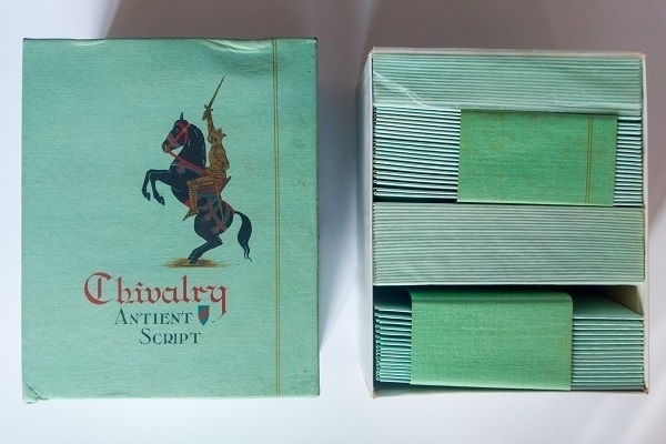
Pictured above is an old box of Chivalry Antient Script envelopes in ‘Jade’ green, Duke size. I bought them from an ebay seller. According to on-line paper-size guides, Duke is supposed to have been 7"x5½", but evidently not everyone followed that standard as the notepaper matching these envelopes comes in folded sheets closer to 6¾"x5⅛" (approx. 10¼"x6¾" when unfolded), with these meant to be folded in half again to fit in the ca. 5½"x3⅔" envelopes.
On one end of the box is a mark boasting that the paper has “Guaranteed Rag Content” and is “British Made”, while on the other its origin is given as the “Aberdeen Mill - Established 1770” with a picture of a Scottish Terrier in profile as a trademark. Each sheet of the notepaper is likewise watermarked with a stylized ‘Scottie dog’. The manufacturer isn’t stated but I’m fairly confident it was made by Alexander Pirie & Sons Ltd., later part of Wiggins, Teape and Co., and nowadays of ArjoWiggins.
I don’t know how old it might be. Pirie’s Antient British Parchment, Antient Vellum and similar trade names are listed in the 1923 Phillips' Paper Trade Directory of the World, but not this one. The sole reference to it I’ve found is in a 1937 ad in the Straits Times of Singapore, so it was a current brand shortly before WWII, at least.
Return Thanks
Jul 9, 2023It’s 1932, and Mr. Johnson has died suddenly in Gloucester. His grieving widow and four children have received many dozens of letters of sympathy and numerous floral tributes in the wake of his decease, for each of which etiquette demands a timely note of thanks in reply. Mrs. J. just doesn’t have it in her to tackle this onerous task - but, thankfully, there are services which will supply pre-printed responses in bulk, thereby enabling the family to adhere to the letter of the law of etiquette, if not quite its exacting spirit.
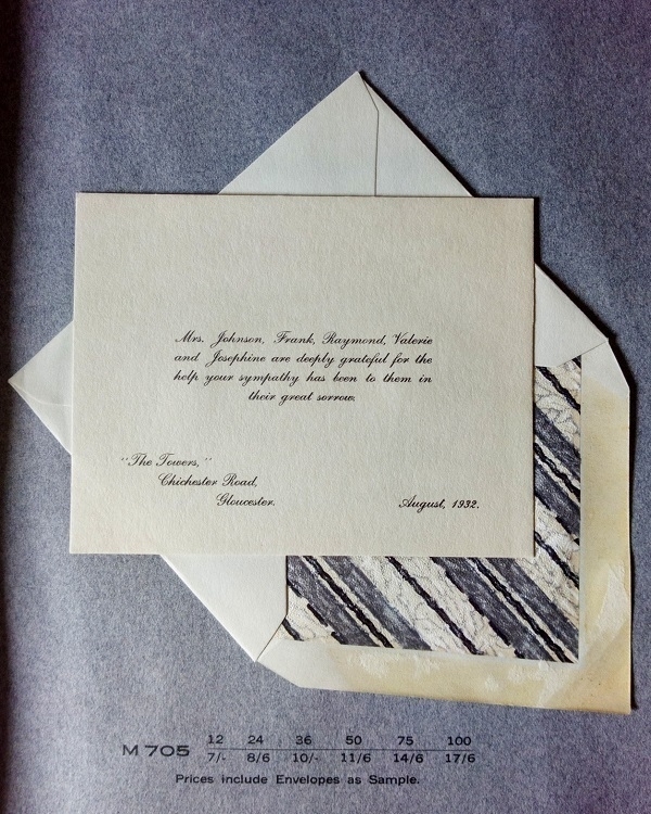
Recently I obtained (via ebay) a sample-book of such pre-printed messages including the example above. On the cover is the text Sharpe’s “Classic” / Return Thanks Stationery / British Manufacture, where Sharpe’s were the manufacturers providing the paper, cards and envelopes; and ‘Return Thanks’ (I presume) their service run in co-operation with participating printers, to supply the requisite personalisation. Loosely held in the book was some documentation relating to The Manor Press Ltd., Colchester, apparently the printers who had owned and used the book. Similar sample books would doubtless have been available for weddings, etc.
A range of paper styles & tints were on offer: hand-made off-white paper with deckle edges; white cards with Victorian-style black borders, or else un-bordered or edged with silver or grey; and also paper in a pale lavender shade, which I thought an odd choice until I learned that lavender/mauve was once recognised as a secondary colour associated with mourning. Some of the envelopes have surprisingly gaudy linings, as in the one above.
The forms of words in the samples are generic: customers may have fallen back on such standard phrasing or would have had the option to supply their own text. In a couple of cases the samples explicitly state that the bereaved “find it impossible to answer letters personally”, by way of explanation for the impersonality of a ready-made reply. In terms of the lettering used, script faces predominate, with sans serif and ‘Old English’ styles the other main options.
Wookey Hole Note
Jun 25, 2023
Wookey Hole, thankfully, has nothing to do with the Star Wars™ universe. For anyone unfamiliar, it’s a village on the southern edge of the Mendip Hills in Somerset, south-west England; the village named after a nearby limestone cave system. For centuries the area was a centre of paper-making, with the Wookey Hole mill itself, owned & operated by W.S. Hodgkinson & Co., being known for its high-quality hand-made papers.
The Hodgkinson company sold the mill ca. 1951, with paper still manufactured there commercially until 1972. Since then, the mill has been repurposed as a tourist attraction, with paper now only made at the site on a very small scale as an “experience exhibit”.
I imagine then that the box of paper and envelopes above, acquired via ebay, must be at least seventy-two years old. I like that the box informs the buyer of its being “suitable for either steel or fountain pens”: though in my view, as with most hand-made papers, it doesn’t have the ideal surface for either, with the quality of the writing experience very much depending on the properties of the ink one uses. It is excellent paper for typing on, however.
Laroche-Joubert
May 31, 2023
The stationery set shown above is one of a couple I’ve owned that were produced by the French company Laroche-Joubert. This Barbarella set doesn’t have any obvious connection with the comic book or the movie featuring that character: perhaps there was merely an intention to cash in on that phenomenon by indirect association. As might just be visible, there’s a faint image of a woman’s head and shoulders on each page, with the same picture more clearly visible on the front cover of the folder.
The other set (whose product name is Anabelle) likewise has a background image on each sheet (see below), this time a drawing of a figure reminiscent of some of Leon Bakst’s designs for the Ballets Russes. Here, however, the folder’s cover image bears no relation to the one within. I wonder if this one might date from the early-to-mid ’80s, whereas the other one has more of a ’70s look about it - but those are altogether uninformed guesses.

The industrialist and politican Jean-Edmond Laroche-Joubert (1820-84) inherited a paper-making concern from his father, building it into a much larger enterprise, chiefly associated with the town of Angoulême. “The company was known for high quality writing papers that could be watermarked with all sorts of drawings at the choice of the buyer” says his wikipedia page, which ties in with the sets I’ve acquired, in which the paper quality is indeed admirably good.
Koenigstein
May 15, 2023
It surprised me to learn, when perhaps it ought not have done, that communist East Germany was a source of high-quality stationery. Was it, I wonder, a democratic luxury, or one restricted to the export market and to those in the upper echelons of the Party? Five or six years ago I aquired the box of Koenigstein paper and envelopes shown above. The simple design on the box reflected exactly the watermark in each A4 sheet. The paper within was beautifully hand-made: some of the best I’ve yet to put my hands on.
As well as the Koenigstein paper, the box held a smaller number of sheets bearing a different watermark: Spechthausen, likewise hand-made, and of no lesser quality. The Spechthausen mill, I gather, was not far to the north-east of Berlin; whereas the Koenigstein one was located south-east of Dresden. Like the majority of hand-made paper it had a very slightly hydrophobic surface which made it less than perfectly suitable for use with a fountain pen. Even so, I had no difficulty using it all up.
More recently I’ve acquired the set of paper & envelopes below. This paper is perhaps a tad less deluxe, with a smooth machine-made finish, but it still has a lovely high-quality feel. This paper isn’t watermarked, and the only indication of a manufacturer or brand-name are the words Briefalux Papier on the outside of the folder. The envelopes are tissue-lined. Each sheet in the pad bears a sepia-toned illustration of one of ten different East Berlin landmarks: it’s by no means clear in the small image that follows that we’re seeing the Marx-Engels-Forum depicted on the uppermost sheet. According to wikipedia, this park, with its statues of the authors of The Communist Manifesto, wasn’t inaugurated until 1986, thereby (one imagines) dating the set to the last years of the DDR, or the first years of a reunited Germany.

Waldorf Club
May 3, 2023
Waldorf Club writing paper has nothing to do with the Waldorf hotels (aside, perhaps, from a hope of accruing some unearned prestige by association). Neither has it anything to do with the Waldorf educational method, the salad, or the Muppet of the same name. The paper was first sold in 1910, two years after the London Waldorf Hotel opened its doors, and was apparently among the first to be advertised nationally in the UK. It was made by Jacobsen, Welch and Co., who had their origins in London before becoming associated with their Newton Mill plant in Cheshire.
My current box of the stuff (shown above) came with a couple of slips reminding the owner to re-stock: ‘Say this after me - “I must get some more Waldorf Club - the noteworthy notepaper”’. The watermark on the pre-folded Post Octavo sheets includes the text “N.M.Ltd.” for Newton Mill Ltd., as the company had become known by the ’50s. If I had to guess, I’d hazard it may possibly date back as far as that decade, or perhaps from the following one. The reminder slip mentions a choice of two paper sizes and two colours; whereas some promotional material from the ’30s mentions half a dozen sizes and a wider variety of shades.

At some point during the ’70s the Club was dropped from the brand name, which, eventually, also became the company name: Waldorf Stationery & Greeting Cards Ltd. To my mind, the Waldorf stationery from this later period lacks the charm of their earlier production.
Special Bargain Offers
Apr 20, 2023
An interesting ebay purchase was a folder containing “Specimens of Die Stamping, Notepaper and Copperplate Printing” produced by the once-renowned London department store Harrods ahead of their 1940 January Sale. It contained the typewritten letter shown above, along with examples of stamped & printed personalised letterheadings, and samples of some of the various types of paper they stocked.
“Paper prices are literally soaring” begins the letter, getting straight to the point, before adding, realistically, that “even to-day’s prices will certainly go higher”. For some, it may have been a last chance to stock up before paper rationing took effect the following March, with, in its wake, measures such as the “Book Production War Economy Standard”. With the raw materials for paper-making (esparto, most notably) in ever shorter supply, British paper-makers were obliged in some cases to make do with rather less desirable stuff such as wheat-straw in its stead.
A Harrods catalogue of somewhat earlier vintage lists papers made by prestige manufacturers such as Joynson, Hollingworth, Towgood & Whatman, along with an extensive range of own-brand lines. I imagine their range wouldn’t have been too very different by 1940. Via separate ebay acquisitions I’ve had the chance to work my way through a cache of their ‘Hans Bank’ writing pads and to use a fine machine-made rag paper made by Hollingworth and sold by Harrods (I’m unsure when) under the ‘Stag of Kent’ brand: both were excellent.
Mourning Stationery
Apr 7, 2023While its roots are apparently older, black-edged mourning stationery had a long heyday in the ostentatiously mournful Victorian era. The thickness of the black border would frequently be used to signal the severity of the sender’s grief, with the expectation it would become narrower over time until it was no longer used at all. Even while grief-stricken, however, people didn’t always necessarily want to do the same old thing, and some sought novelty: very thin ‘Italian’ borders became more prevalent toward the end of the 19th Century, while another option, introduced in 1890, was stationery marked with a single black triangle.

I have two sets of mourning stationery. Shown above is a box of The Queen’s Parchment paper, some nice-quality pre-folded octavo cream paper with a moderately thick border, along with a smaller number of notecards. Only two of the original envelopes remain. It was made by Thomas de la Rue & Co. Ltd., best known as manufacturers of playing cards, postage stamps and banknotes. One can only guess at its age: I would hazard it could date as far back to the 1900s or ’10s. I’m even less confident about the vintage of the Templecombe Mourning paper shown below, and no idea at all who might have made it. A mid-20th-Century origin wouldn’t surprise me, even though that was a time when such paper had become quite outmoded. It has a narrow ‘Italian’ border and a hammered surface texture.

English Lawn
Mar 23, 2023
As a small-time collector of vintage stationery, researching one’s ebay acquisitions can be very difficult. Trying to determine when or where a certain writing paper was made is too often a frustrating matter of the most inexact guesswork, given the paucity of ready references.
One of the best sources of information I have been able to find is a 1923 volume at the Internet Archive entitled Phillips' Paper Trade Directory of the World. Thanks to this book’s ‘Water-Marks and Trade Names’ section, I have, for example, ascertained that the box of ‘English Lawn’ paper shown above was made by the firm of G. Waterston & Sons. As it happens the watermarks in each sheet of the paper include the initials ‘G W & S’. Searching at Grace’s Guide turned up more information about the company, but little that might tell me when my paper might have been manufactured.
To my eye the packaging has a vaguely ‘Arts & Crafts’-influenced look about it which makes me think it may date back to the turn of the 20th century, but it could just as well be a later ‘retro’ design. Evidently, per Phillips' Directory ‘English Lawn’ (Lawn in this context referring to the fabric, rather than an expanse of grass) was a current or recent trade name in the early 1920s. I’d be surprised if the box were post-WWII.
Anyway, it’s lovely paper, in Post Octavo size, in this case in the form of pre-folded Post Quarto (9" x 7") sheets. It feels like fine-quality stuff, and has not discoloured in the least over time. I also have a box of matching Crown Quarto envelopes in the same shade, which can fit a sheet or two of the paper folded in half: trying to squeeze in any more in tends not to work too well. The gum on the envelopes has perished somewhat, but can still be made to stick perfectly well. I have to hope it’s more or less non-toxic!