Walking Away
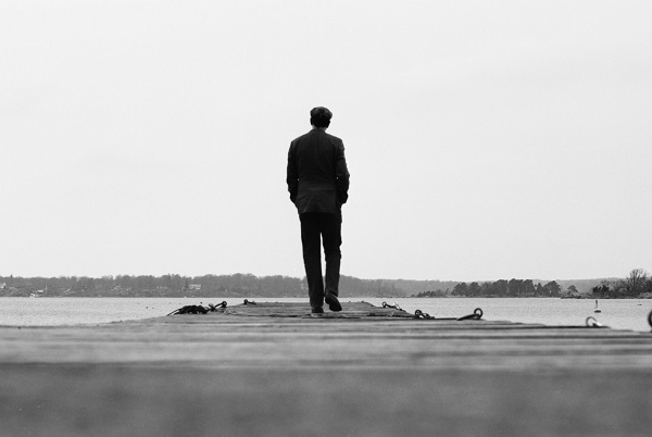
Strolling along the Baltic coast at Gräsvik one April day, Nikon F80 film camera in hand, I stopped at one of the jetties leading out into the water and thought it might make for a good photo if I could get a shot of myself walking out on to it. I soon established that by merely placing the camera flat on one of the planks, the angle of view wouldn’t be ideal. Having nothing else handy, I took out my wallet and wedged it under the F80 so that the lens was slightly tilted upwards. After re-checking the focus and the field of view I set the self-timer and strode away as purposefully as I could. Fortunately there were no opportunistic thieves in the vicinity, or I could have ended up minus both my recently-acquired camera and my bank cards.
I was delighted by the way the shot came out. I’d used Ilford Delta 100 film that I sent off to a lab for development. Something other than a flat grey cloudy backdrop might have made it better, but, then again, depending on the position of the sun, a clear sky may have complicated matters. I tried a few times to take similar pictures with other cameras & other film-stock, but none of them came out as well as this one.
After 333 posts in 680-odd days, I’m walking away from blogging again for a while. In due course I may start another: if I do it will be in a different format to this one. My thanks & apologies to anyone who has paid a visit here!
Facit
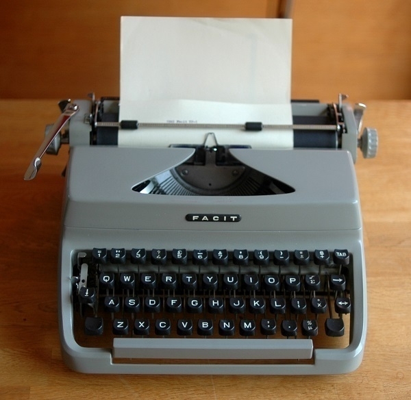
What we have here is a 1965 Facit TP1 typewriter. In its native Sweden, this would have been designated a Facit Privat (Serie 2), namely the second design the manufacturer sold under the ‘Privat’ name. Later still there was a third – Serie 3 – iteration, which was elsewhere marketed as the TP2. My TP1 has 12cpi Elite type, and a keyboard with some mathematical symbols on it: ‘±’, ‘√’, ‘Σ’, ‘°’, ‘×’ and ‘μ’.
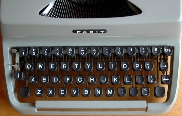
I bought mine via ebay in 2018: I don’t think it cost any more than £35. It’s very well-designed and well-made; and it works beautifully, although there are other machines I prefer when it comes to the ‘feel’ of the typing action. Unusually for an old typewriter there is nothing mechanically wrong with it at all. Perhaps that lack of imperfection is why I find it a little less interesting than most of my other machines.
Legend

Second-hand reggae LPs are relatively uncommon in this part of the world, which means I’ve collected rather few of them: four or five LPs and a handful of singles. Even the wildly popular Legend compilation posthumously bringing together some of Bob Marley’s most popular songs is something I’ve never seen in the charity shops hereabouts, and only seldom at used record stores. When I did recently catch sight of a copy on sale for £8 at ‘The Vinyl Spinner’ market stall in Monmouth, I felt the inclination to buy it.
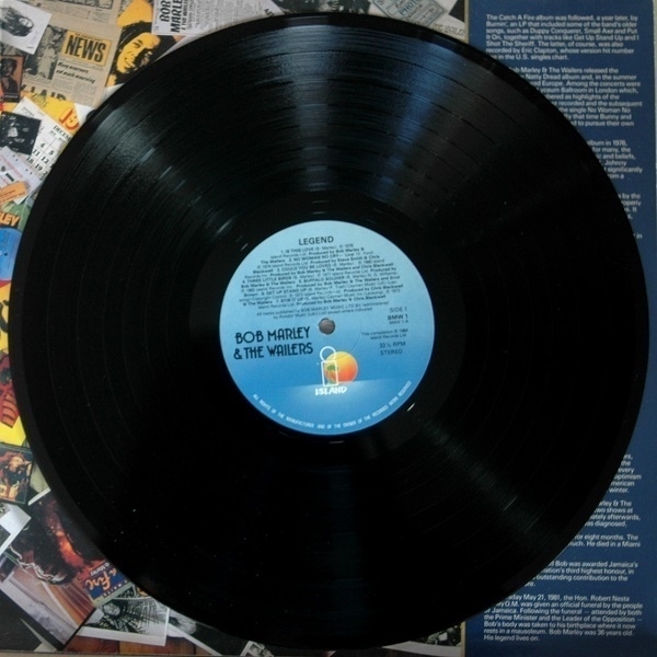
It’s a record I’d heard often enough in various circumstances in the past: a flatmate at university had a home-taped cassette copy, for example, and it played in the background at no few student parties; my former mother-in-law was a fan had it on CD. These tunes were often on the radio. Putting the record on my turntable for the first time, though, I realised that in many cases it had probably been a half a decade or more since I’d last heard some of these wonderful songs.
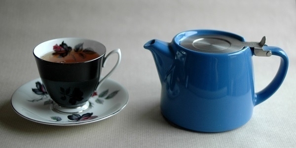
Colombia Supremo
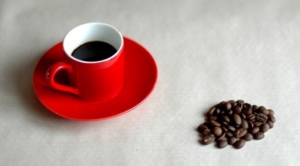
After months drinking decaf, I’ve made a tentative start back on to the hard stuff. In an attempt to go beyond the very limited choice available at the local supermarkets, I stopped in to the Bristol Coffee Company’s outpost in Thornbury last weekend and picked up a bag of their ‘Colombia Supremo’ blend. It’s very good, though I’m not sure that it’s any more to my taste than my former regular standby, Lavazza Qualità Oro.
In the picture there is some ‘Colombia Supremo’ espresso in a red cup made by Wm Bartleet & Sons that was one of a pre-owned pair I bought from ‘The Magic Cottage’ charity shop in Abergavenny the weekend before it burned down.
Papier
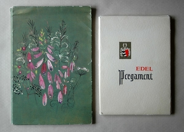
Via ebay I’ve acquired some more vintage stationery, four packs of it, all German-made and, according to the seller, dating back to the ’60s. Two of the packs are shown above. The one on the left with the floral design is unmarked bar for a small logotype on the back: Papier Elepa. The Edel Pergament (‘Noble Parchment’) has a different logo: a shield with a stylized ‘H’ made to resemble a pair of factory chimneys, and the text Rurpapier 1877, plus an inset in the shape of an envelope with the word Club on it.
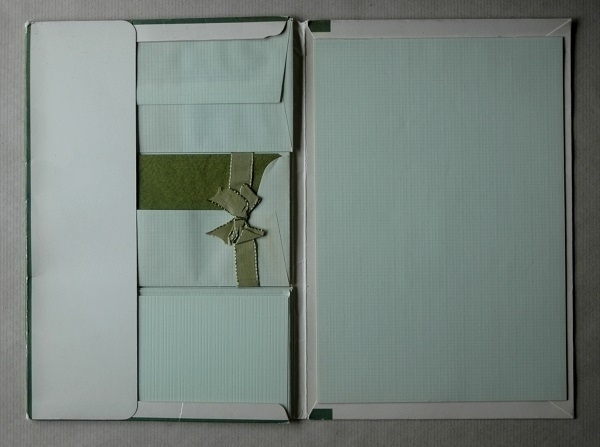
Opening up the Elepa folder one sees a pad of green paper about 252mm x 175mm, so roughly B5 size, and some matching envelopes and notecards. The paper and envelopes alike have a grid pattern on the surface which one can’t see very well in this small picture. There are no watermarks. The envelopes are tissue-lined in a darker shade of green. Some on-line searching suggests that the manufacturer was the Stuttgart-based Briefumschlag- und Papierausstattungsfabrik Eugen Lemppenau, who seem to have origins going back to 1860.
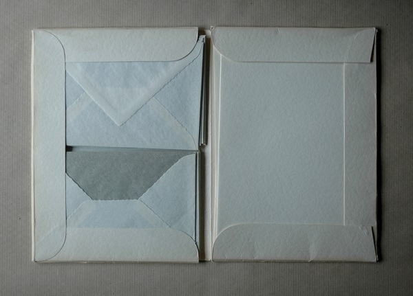
Inside the Edel Pergament folder there are folded sheets of white, scallop-edged A4 paper, and C6 envelopes lined with grey tissue. Again there are no watermarks. I’ve not been able to find out anything about the manufacturer. The other two packs in my purchase were both Papier Elepa productions in which the paper is watermarked. One set has a floral design printed on one corner of each sheet of paper; whereas the other, which has Rhodos (‘Rhodes’) on its cover, has designs of a Greek island scene printed in blue and yellow on the linings of its envelopes.
Write More Letters
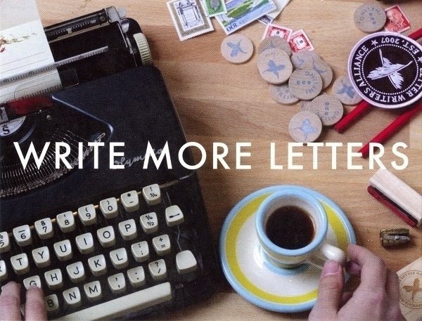
About nine years ago I signed up for something called the Letter Writers Alliance, an organisation founded to maintain and promote the art of letter writing. I’d been in two minds about joining it, as I gathered that a large part of the Alliance’s activity was conducted on Facebook, and I had, with great satisfaction, closed my account there some time before. Even so, I completed a form and paid a small one-off membership fee, in return for which I was sent some ephemera: a membership card; a badge; and a couple of postcards (one of them shown above). Meanwhile, and more importantly, I was provided with the contact details of two prospective correspondents.
One of these exchanges did not flourish. After a promising initial round of letters with a lawyer in São Paulo, I mis-addressed my next letter by transposing two digits in the CEP (Post Code) which meant that about two or three months later the letter was returned to me, undelivered & unread. I tried sending another after that, but wasn’t surprised that it went unanswered. The other correspondence, however (with a journalist in New Mexico), did develop, and thrives to this day. It’s now my longest-running ‘conversation’ with someone I’ve never met. Even though I didn’t afterwards participate in the LWA’s activities (and wasn’t even aware until the other day that those had ceased in 2020), I remain grateful to them for enabling a long-running epistolary friendship.
‘Write More Letters’ is something I strove to do after moving to my current address, recently bereaved, short of funds, and having a dog and two cats to look after. I thought it would offer a good way of making some strong connections despite my having relatively little free time or ready money to spare: and so it proved. Year on year I scribbled and typed more & more, until, in the pandemic year of 2020, I was averaging close to a dozen letters a month. Since then I’ve slowed down somewhat, but still managed to send about ninety letters last year. Nowadays, with postal services under increasing strain as the volumes of mail continue to fall, while costs and prices rise, I wonder for how much longer the pleasure of sending and receiving ‘snail mail’ will continue to even be an option.
Unread
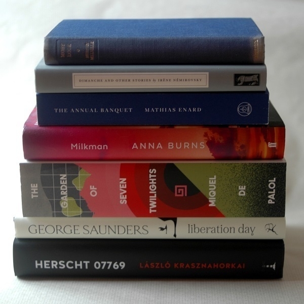
Pictured above is my current TBR pile, comprising seven books, namely (from the top): Moby-Dick by Herman Melville; Dimanche and Other Stories by Irène Némirovsky; The Annual Banquet of the Gravedigger’s Guild by Mathias Énard; Milkman by Anna Burns; The Garden of Seven Twilights by Miquel de Palol; Liberation Day by George Saunders and Herscht 07769 by László Krasznahorkai. The newest arrivals are the two volumes at the bottom. Having much admired Saunders' Lincoln in the Bardo, I thought I’d try one of his short story collections. And I’ve been a fan of Krasznahorkai since the turn of the century, when The Melancholy of Resistance was the only novel of his available in English, so I was quick to buy a copy of Herscht 07769 when it was published a few months ago.
Other titles have been in the pile since 2023. I don’t know why I’m quite so hesitant to get around to Énard’s work. His Street of Thieves rested unread on my shelves for at least two years before I began it. I wasn’t quite as tardy with Compass which only had to wait for six months or so. The title at greatest risk of permanent residency in the pile is The Garden of Seven Twilights. I failed to appreciate when I ordered it quite how hefty a brick of a volume it would be: 880+ pages of smallish print. It daunts me. Of the others, Milkman, and the ’50s copy of Moby-Dick were cheap charity shop purchases; whereas Dimanche was part of an on-line order placed directly with the publisher. I have every intention of reading most of these by the end of this year.
Abstracts
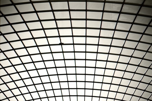
Here are a couple of somewhat abstract film photos. The first one shows part of a skylight in the ceiling of the Cabot Circus mall in central Bristol. I took it with a Nikon F80 loaded with Adox CMS 20 film, which I afterwards developed myself in dilute Rodinal.

A mile or two from where I live is a stretch of coastal path that passes directly under an electricity pylon. It was from that vantage-point I took the second photo. After capturing a couple of more conventional frames of the same subject, it occurred to me to try one that was deliberately out-of-focus, which I ended up preferring to the others. This was also taken with the F80, but using a roll of Kentmere 100 film which I sent off to a lab for development.
Hanna
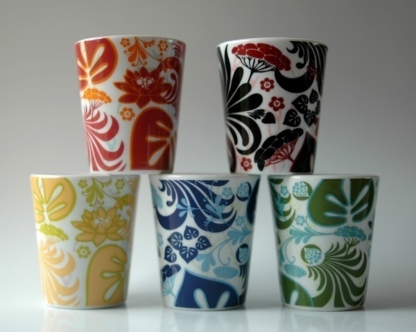
Pictured above are five small porcelain cups, each about 6cm tall. While they were sold as espresso cups, I’ve only very seldom used them in that way, generally preferring a more conventional demi-tasse for my coffee. They have served such miscellaneous purposes as temporary containment for pre-measured cooking ingredients; for serving shots of aquavit; and as impromptu egg-cups. My late wife took a shine to the bold designs when she saw them in a shop somewhere in Sweden ca. 2006, and, instead of getting several the same, she bought one in each of the available colourways.
The pattern is apparently called Näckrosryss, the work of designer Hanna Werning, made for Rörstrand, whose origins go back as far as 1726, making it “Europe’s second-oldest porcelain brand”. Nowadays Rörstrand is one of numerous tableware brands belonging to the Fiskars group, including a couple of others I’ve mentioned here before: Iitala and Royal Albert. According to Werning, the pattern is “a happy marriage of Russian souvenirs and Swedish flora”. On the base of each cup is the text HANNA, the designer’s signature, and the Rörstrand name and logo.
Kiwanuka
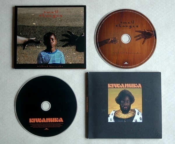
I became aware of Michael Kiwanuka’s music after the release of his debut album in 2012. I paid more attention to it after its follow-up Love & Hate (2016) came out, but it wasn’t until his third, self-titled, album appeared in 2019 that I reached for my wallet, buying both Kiwanuka and its predecessor in quick succession, greatly enjoying them both. What about this new one?, I wondered, when I learned that album #4 Small Changes was due for release last month. I didn’t have to wonder long: I saw a clip on YouTube of Kiwanuka & band performing its penultimate number ‘The Rest of Me’, and, loving what I heard, had placed a pre-order before it was finished.
Small Changes is more low-key, inward-looking and nocturnal in mood than Kiwanuka or Love & Hate. For my current needs it’s just about the ideal medicine.
Stinking Bishop
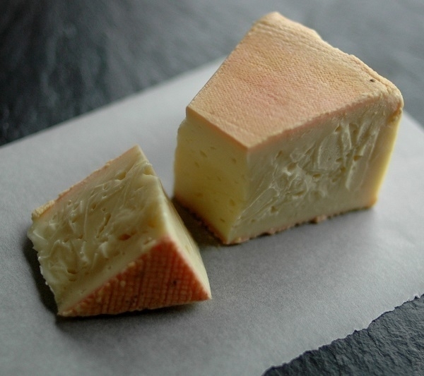
When I first heard of ‘Stinking Bishop’ in the late ’90s, I knew it would be too challenging a cheese for my palate as it was then. With my tastes having broadened over the last few years, however, I’ve been newly curious to try some; but I hadn’t seen any hereabouts until the Friday before Christmas. At Abergavenny market I spied some at one of the stalls and bought a small wedge of it, as pictured above.
It’s by no means an ingratiating footstuff. The pinkish-orange rind is clammy to the touch, and, as for the aroma, although ‘stinking’ may be too strong a word, it undoubtedly has a forthright olfactory presence. The body of the cheese, with a texture akin to set custard, has a surprisingly mild and very delicious flavour. The rind tastes like it smells, but, on the palate – by whatever strange alchemy – this comes to seem like a good thing. It has a lingering and fascinatingly complex aftertaste. It’s not something I’d want every day, but I’d gladly have it again as an occasional treat.
The name apparently derives from a variety of pear, used to make a perry with which the rinds of the cheeses are washed as they mature. The pear in turn was named for a disreputable 19th-century farmer. The slate cheeseboard in the picture is a recent acquisition: I picked it up from a charity shop for £2.
Bagiau Ailgylchu
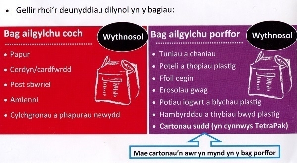
Legislation stipulates that “so far as is appropriate in the circumstances and reasonably practicable […] the Welsh and English languages should be treated equally in the conduct of public business in Wales”. In practice, that will often mean receiving official communications given in both languages. An example is shown above: part of a bilingual leaflet I was sent recently on the subject of what materials can be placed in our new bagiau ailgylchu amldro (reusable recycling bags). The vocabulary shown happens to include several terms taken from, or via English, for example: tuniau a chaniau are tins and cans; potiau iogwrt are yoghurt pots; ffoil is foil; erosolau are aerosols; plastig is plastic.
I’m all in favour of Welsh being treated equally, despite its being a minority language I don’t speak, and even though I live in one of the most Anglicized corners of Wales. Sometimes the insistence on providing translations can verge on the ridiculous, such as when signs point to a lifft / lift (an unvoiced f sound is written as ff in Welsh; while a single f in Welsh would be pronounced like an English v). It’s hard to imagine a monoglot Welsh speaker taking to the stairs because they don’t know what a ‘livt’ is. Half-baked combinations of the two languages are not uncommon: for example a new housing development near me has been called ‘Elderwood Parc’, where parc is simply the Welsh (in which a c is always hard) for park – why not use a Welsh equivalent of ‘Elderwood’ too, or just leave it at ‘park’?
Paradise Lost
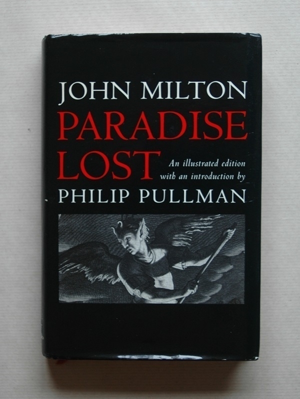
Like many others I was first exposed to John Milton’s Paradise Lost while still at school. I think I would must been fourteen or fifteen when I read the excerpts from Book I of the poem included in one of our textbooks. At infrequent intervals over the intervening decades, I’d be reminded of it by articles praising its virtues, or quoting a few lines from it; and it might occur to try reading the whole thing. Last year, while expanding the poetry section of my bookshelves, I at last bought myself a copy. Looking for a handsome hardback volume I ended up paying £6.49 for an ex-library copy of a 2005 illustrated edition published by the OUP, with an introduction by Philip Pullman.
I was reminded of it again last month on reading a piece about a PhD student teaching the poem to incarcerated students in New Jersey. I pulled it off the shelf during a lull in my working day last Thursday, and had finished it by Sunday. It was more compelling than I’d expected. The Christian mythos has always struck me as unsatisfyingly bizarre, so I was much impressed that Milton had made such a page-turner out of it. It’s not all equally good throughout: the intensity of Books I & II isn’t always maintained; and I thought Book XII at the end, aside from its well-judged closing lines, felt like something of an awkward speed-run through the postdiluvian age.
A continual pleasure was Milton’s sonorous way with an enjambed pentameter, and his pleasingly polysyllabic Latinate vocabulary (with its sprinkling of obscure words like ‘circumfused’ and ‘transpicuous’ – also ‘magnific’, that I’d hitherto encountered in a very different context) which together gave a monumental heft to his ponderous verse. I was surprised by the cosmological passage in Book VIII where, in an account of the creation, geocentric and heliocentric theories of the solar system are entertained, and the possibility of other suns and other planets is hinted at, although at the end of it the Archangel Raphael enjoins Adam to “Think only what concerns thee and thy being / Dream not of other worlds…”
I very much liked the design of the volume, credited to one Bob Elliott: the 17th-century illustrations; the two-colour text; the tasteful typography. I raised an eyebrow at Pullman’s name being printed almost as large as Milton’s on the jacket – such is marketing, I suppose. Pullman contributes a ten-page introduction; a further paragraph prefacing each of the poem’s twelve books; and a brief afterword, all of which conveys a fan’s enthusiasm for the work, while remaining unobtrusive enough. No further notes are provided, but as the afterword points out, there is no shortage of explanatory material out there for the befuddled reader, or the idly curious one.
Mannequins

I’d had my Nikon D80 for less than a month when I took the shot above. It was a quiet Sunday morning in the January of 2008. Someone – a mischievous window-dresser? a rogue customer? – had left a shop-window mannequin under-dressed. I’ve slightly cropped the original frame. I was pleased with the composition and the colour, less so that the auto-exposure setting had resulted in blown highlights. At that point the camera would have been mounted with the kit zoom lens it had been bundled with.
KWZ
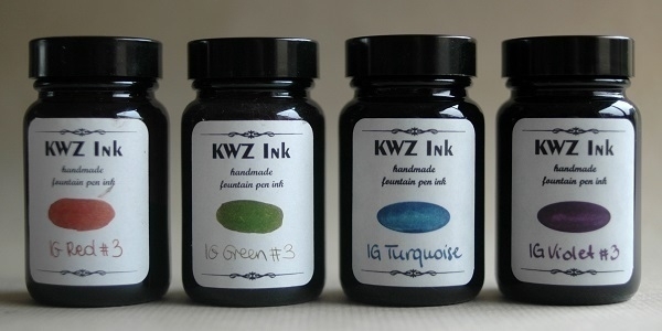
More bottles: ink-bottles this time, four of them; all ‘iron gall’ fountain pen inks produced by KWZ in Poland. From left to right are IG Red #3, IG Green #3, IG Turquoise and IG Violet #3. The first two I’ve owned for several years: the red one is three-quarters empty, the Green a little over half-full. The other two are recent arrivals. The Turquoise is a replacement for another bottle I had that I dropped and cracked: I was lucky it didn’t make an even worse mess than the one I had to clean up. The Violet I’ve yet to open.
Currently I have some of the red in a Lamy Al-Star; and some of the Turquoise in a Faber-Castell Loom pen. Although iron gall inks are acidic and potentially corrosive over the long term, I’ve yet to see any damage in the pens I’ve used these in. If I had any very expensive pens I suppose I might hesitate to fill them with these inks. I very often use them for letter-writing and note-taking and find they work well on virtually all of the many & varied types of paper I have. I like how they hit the paper and how well they last on the page and how they keep in the bottle. KWZ employ additives which impart a particular smell to their inks: not everyone likes it but to me it’s inoffensive.
I’m unsure whether the Red #3 and Green #3 inks may have been discontinued, or if they’re just harder to get now in the UK, post-Brexit. If it’s the former then that would be too bad, as I’m very fond of them. In my first flush of fountain pen use I must have accumulated a few dozen assorted inks: I’ve since whittled that down to fewer than ten, of which these have been mainstays.
The Bottle
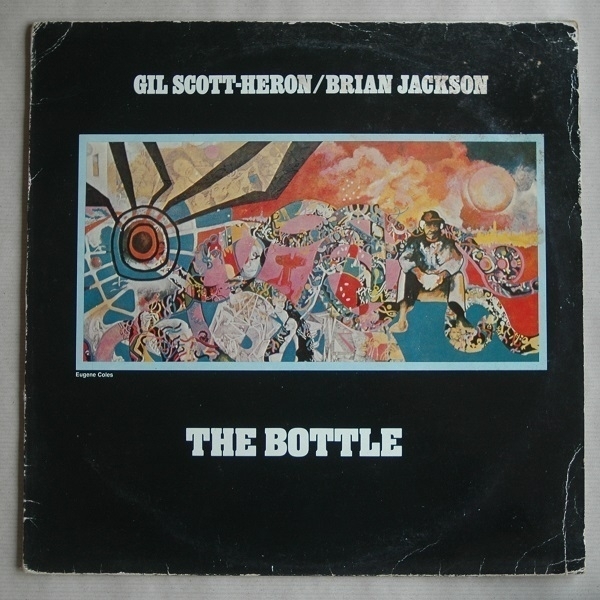
From a picture of a bottle in the previous post to a picture of The Bottle, that is a 1981 UK issue of an album by Gil Scott-Heron and Brian Jackson first released in 1974 and originally & otherwise known as Winter in America. ‘The Bottle’ is the best-known track on the record, kicking off side B. The record label must have hoped that renaming the album would reel in more would-be purchasers who remembered the song. I bought it for £25 from Heart of the Valleys Records in Blackwood a few weeks ago. I wouldn’t normally spend that much on old vinyl, but I had some spare cash that day and thought it would be a good record to hear in analogue format.
My knowledge of Scott-Heron’s work didn’t extend beyond a half dozen numbers (‘The Revolution Will Not Be Televised’, ‘Whitey On The Moon’, ‘Lady Day And John Coltrane’, ‘Home Is Where The Hatred Is’, ‘The Bottle’ and ‘I’m New Here’). It feels good to make a start on getting to know his music better. On what is predominantly a melancholy, introspective album, the penultimate track ‘H2Ogate Blues’ offers a more topical and satirical message, which, while very much of its time, nevertheless resonates with current events. Winter is here; winter is coming.
Amarone
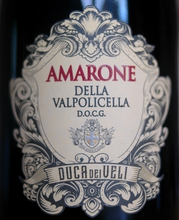
The way I remember it, I didn’t fall in love with Amarone wines until the very end of my time in Italy. For a few years afterwards if I wanted to treat myself, or perhaps try to impress someone else, I might seek some out. On the handful of occasions when I’ve tried Amarone in recent years, however, I haven’t enjoyed it in the same way I used to. The wines have been good, but haven’t provoked the same delight they formerly did. Is this down to my changing tastes, or is Amarone not what it used to be?
As I’ll have mentioned before, my preferences in general have shifted from intense and full-bodied red wines to easier-going medium-bodied ones. And it’s not like I’ve been sampling top-tier examples lately, trying out whichever ones end up at the local Lidl or Aldi (like the bottle in the picture, from which I had a couple of glasses last night). Meanwhile, the article on Amarone in The Oxford Companion to Wine informs me that over-production of the wine has been an issue, with the proportion of Valpolicella grapes made into Amarone having increated greatly between 1990 and 2005 (“the problem, however, remains one of quality, for there is too much poorly-made Amarone for sale”).
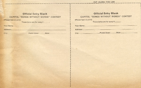
Songs Without Words
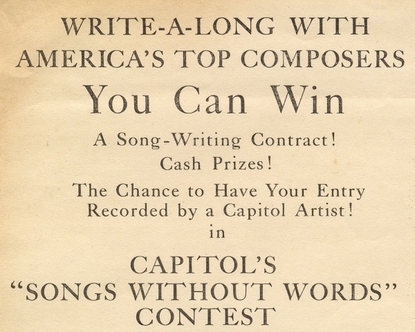
A few years ago I bought a fairly early mono copy of Frank Sinatra Sings For Only The Lonely (the 1958 LP where Frank is depicted as a sad clown on the cover), which had an interesting inner sleeve: one advertising a songwriting competition. Capitol Records' “Songs Without Words” contest was staged in 1961. The would-be entrant needed to buy (or at least listen to) an album with ten instrumental tracks, and then come up with lyrics for one or more of them. Two of the numbers were classed as Country & Western, two as Rock’n’Roll, and the remaining six as generically ‘Popular’.
Among those listed as composers of the instrumental tracks were such big names as Jimmy Van Heusen and Johnny Mercer (though oddly, Mercer was primarily known a lyricist – and, perhaps not coincidentally, as a co-founder of Capitol Records). Entrants were instructed to print or type their lyrics on blanks on the back of the inner sleeve, but with those allowing only about 3" x 4" of available space, they would have been obliged to use either tiny text or very few words. It doesn’t appear as though any erstwhile amateurs were catapulted into the limelight as a result of the contest. Information about the winners has apparently proven to be elusive. The whole contest, moreover, was a re-tread of one run in 1949, with some of the earlier tunes ending up recycled on the 1961 record.
The Empusium, etc.
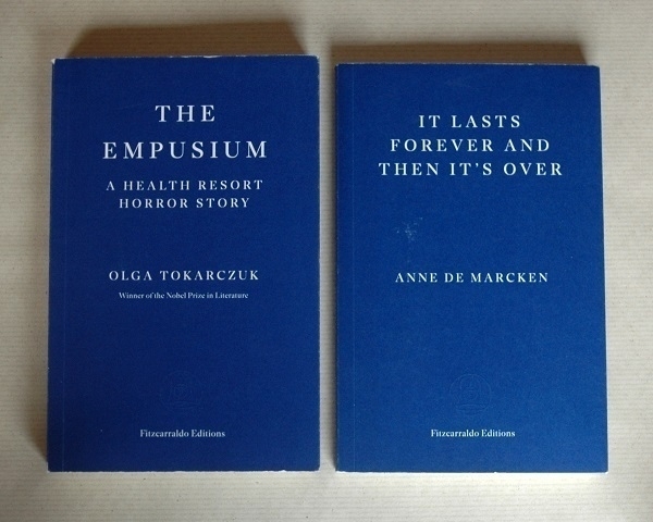
Two more titles from Fitzcarraldo Editions I finshed in the last few days are The Empusium: A Health Resort Horror Story by Olga Tokarczuk and Anne de Marcken’s It Lasts Forever And Then It’s Over. After thoroughly enjoying Tokarczuk’s Drive Your Plow… I have not fared as well with the other books of hers I’ve read. I wasn’t altogether convinced that the connections between the constituent parts of Flights were strong enough to stand the work properly upright as a whole. And I was unequal to the challenges of The Books of Jacob. While I loved parts of it (especially the scene-setting opening chapters) my attention flagged as the story’s momentum seemed to stall after the half-way mark.
As for The Empusium, despite its several fine ingredients, I once again had my reservations about the finished product. It’s an historical novel where the misogyny and other prejudices of its setting are scrutinized, and their parallels with contemporary attitudes implied. The conversations between its characters illustrated those points well enough, but at a length that, I felt, impeded the development of the plot. What might have been a good short horror story and an interesting accounting of early-20th-century attitudes seemed to me sub-optimally spliced together.
It Lasts Forever And Then It’s Over was more to my taste. The back-cover blurb tells us, coyly, that its heroine is “voraciously alive in the afterlife”. Imagining some kind of limbo or purgatory as the setting, what I found instead was more like the aftermath of a zombie apocalypse from a zombie’s point-of-view. Which, I suppose one could argue, might be construed as a limbo of sorts. It must be one of the more ambiguous and literary zombie stories out there. I found enough to admire about it that I could forgive its several implausibilities: the protagonist and her fellow undead don’t breathe, for instance, but they do somehow engage in gnomic, bewildered conversation.
Christmas Reflection
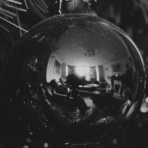
To take the picture above I put my Nikon F80 on a tripod and focussed closely on a reflective Christmas tree bauble. This would have been one of the days following the Christmas of 2011. I set the self-timer and sat back on the nearby sofa trying to look casual about the whole thing. The camera was loaded with Adox CMS 20 ‘microfilm’, which I developed myself in dilute Rodinal. The full frame can be seen here. The ‘fish-eye’ effect caused by the reflection in what was effectively a convex mirror made a small room seem rather larger than it was.
My late wife loved the run-up to Christmas, and was enthusiastic about decorating the house. To me it always just seemed a chore, but there’s pleasure to be had in a loved one’s joy, so I was happy to do the work. The big day itself brought about a reversal: she seemed to find it a chore; whereas, by then, I could draw upon genuine enthusiasm. Since she died, with no one to please but myself, I’ve not bothered putting up a tree or other trimmings. Except for that one year I got a small table-top tree – but the cat waged such a relentless war against it that I ended up putting it away.
Slickers
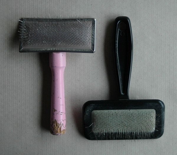
If one has a cat with longer fur then they may appreciate a little help with keeping their coat well-groomed. For that purpose a slicker brush is very useful: I have two of the things. The one on the left of the picture is twenty-five years old and has seen a great deal of use, with some of its wire bristles bent out of alignment or broken off. The damage at the end of its handle was due to a certain dog getting hold of it. I’ve had the black plastic brush for a mere fifteen years or so. I bought it after misplacing the other one. These are implements which seem prone to misplacement, but having two it’s usually not so hard to find one of them.
More String Quartets
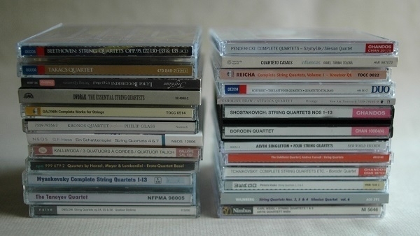
In the picture are twenty-two albums and box-sets including most (but not all) of the music for string quartet I have on CD. I’ve previously written about the quartets I own on vinyl, while some of the albums shown here were mentioned in my old blog: the Myaskovsky set; the discs of music by George Onslow and Georg Friedrich Haas; and the album by the Cuarteto Casals featuring Ravel’s Quartet in F major, etc.
Among the famous quartets here are sets including the last five of Beethoven’s and of Dvořák’s; Schubert’s last four; Tchaikovsky’s three; and the first thirteen by Shostakovich. A little more obscure are the discs of quartets by Beethoven’s contemporary Anton Reicha; those by another 19th-century composer of Bohemian origin Johann Wenzel Kalliwoda. Meanwhile, from the 20th century, there are quartets by Shostakovich’s lesser-known contemporary Mieczysław Weinberg and an obscurer Soviet composer, German Galynin. As well as the disc including Philip Glass’s quartets nos. 2-5, I have others not in the picture with nos. 6-9. Rather less famous than Glass is his compatriot and near-contemporary Alvin Singleton, who has written at least four quartets.
Women composers aren’t particularly well-represented on my shelves, alas. There’s a disc featuring compositions by Fanny Mendelssohn Hensel, Emilie Mayer and Maddalena Laura Lombardini Sirmen; along with a couple of contemporary ones with quartets by Caroline Shaw and Andrea Tarrodi. The majority of these albums were acquired over the course of the last decade but a couple I’ve had for much longer – I bought the Philip Glass disc a good twenty-five years ago. The latest addition was the album at the botton of the right-hand pile including two of the Austrian/American composer Karl Weigl’s eight quartets.
Tea-Rod
Included as a free sample in my latest order from What-Cha, was something I never knew nor even suspected the existence of – a ‘tea-rod’. This is a vaguely cigar-shaped bundle of black Ceylon tea leaves. The picture I took of mine didn’t turn out too well, and in any case the What-Cha product page shows it much more clearly. The blurb there explains that “the leaves are collected from a former tea estate called Warnagala which was planted over 140 years ago” only to be abandoned, where the “tea bushes have since become trees which are now 40-50 feet (12-15 meters) in height”.
I usually just brew my tea in a strainer directly in the cup, but as the accompanying instructions for the ‘rod’ suggested brewing it in a pot, that’s what I did. My seldom-used teapot is a Forlife ‘stump’ model. For my taste I could have done with brewing it longer as it came out on the weak side. Despite that, the flavour, if a little dilute, was really very good. “It has a smooth and sweet taste with ripe plum and molasses notes which linger in the mouth” they claim. Faintly fruity mellowness seemed about right: I’d like to try more of the stuff.
I served it in a Royal Albert ‘Masquerade’-pattern cup. It’s a design apparently first made in the ’50s, where the black roses conjure up something of a gothic mood. The cup is one of four or five I was given by my father, from an incomplete spare set he and his late partner once used in their holiday caravan. I imagine it must have come from his partner’s family. From what I’ve seen on-line, it’s more common for the cups to have the floral design and the saucers to be plain black, rather than the reverse, as here.
Inscription
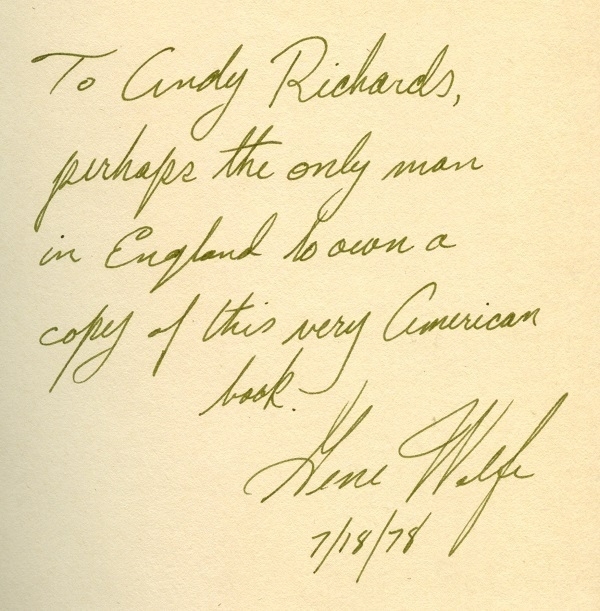
Among my books are no more than a dozen signed by their authors. Of those only a couple have more elaborate inscriptions, one by Rhys Davies (who seems to have been a prolific signer & inscriber), and the other by Gene Wolfe, as shown above: “To Andy Richards, perhaps the only man in England to own a copy of this very American book” – i.e. his debut novel Peace. I acquired the volume from Mr. Richards, the proprietor of Cold Tonnage books. As I recall it was part of a barter exchange in which no money changed hands.
I bought my first copy of Peace second-hand for a pound in 1989. It’s a strange and slippery sort of novel that I started but failed to finish a couple of times until one weekend in early ‘97 while in the throes of a migraine. On that occasion, just after picking up where I’d left off a few years earlier, I came upon a phrase saying something to the effect that we can never know, as readers, how long may have elapsed between the writing of one sentence in a story and the next. In the circumstances, I couldn’t help thinking that writers, likewise, can’t know how long a reader might pause between sentences, and how much might change for them in that interval.
Poetry x 10
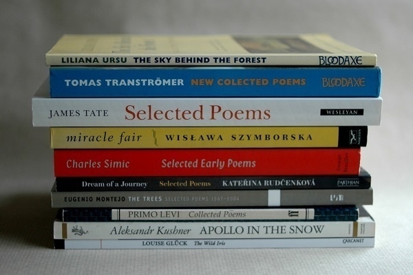
The first half of December is, for me, the least propitious time of year for reading. There just never seems to be any time for it. Rather than write about books I’ve just finished (there are none), I’ll have to cast my net further back, in this case bringing up ten of the single-author poetry books I’ve read this year. Three are by Nobel laureates: Wisława Szymborska (1996); Tomas Tranströmer (2011) and Louise Glück (2020). I ordered Glück’s The Wild Iris in what was effectively a very delayed reaction to her winning the prize: I’d seen a great deal of praise of her work, of which I’d read scarcely any. I owned collections by Szymborska (and by Primo Levi) in the past, so these were re-aquaintances rather than fresh introductions.
Seven of the ten are books are translated, variously from the Russian (Aleksandr Kushner); Italian (Levi); Venezuelan Spanish (Eugenio Montejo); Czech (Kateřina Rudčenková); Polish (Szymborska); Swedish (Tranströmer); and Romanian (Liliana Ursu), with the remainder by American authors. Not pictured, but also read in 2024, were volumes by John Ashbery, Anne Sexton, Emily Dickinson and Frank O’Hara; by Álvaro Mutis; by C.P. Cavafy, Ágnes Nemes Nagy and Giuseppe Ungaretti; and by British & Irish poets only Christina Rossetti & Ciaran Carson. All of which was part of the effort to fill out my poetry bookshelves.
In a dream I look down
at the wide Chinese river at dawn
intoxicatingly bright lanterns swaying above it.
I have to write a poem about this right now, I tell myself,
before I wake up
before the first light –
while it’s all still true.
—Kateřina Rudčenková (translated by Alexandra Büchler).