Baton Barbe

Last summer I bought a couple of ‘sticks’ of vintage French shaving soap from an ebay seller, intending in due course to use them. The soap boxes bore the Cadum brand, which is still very much current, though they don’t appear to make shaving products these days. As to how old the soaps might be I can only speculate. The packaging has, to my eye, more of a mid-20th-century than late-century look about it & at the very least it pre-dates the barcode era. A clue might be the blurb on one of the top flaps of each box: “Doublez la durée du baton barbe avec l’étui Bakélite” i.e. make the soap last twice as long by using a Bakelite case. Even by the ’60s Bakelite would surely have been considered somewhat old-fashioned.
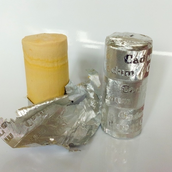
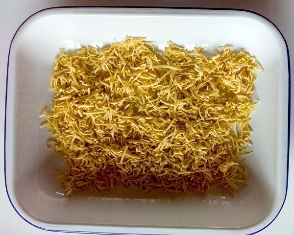
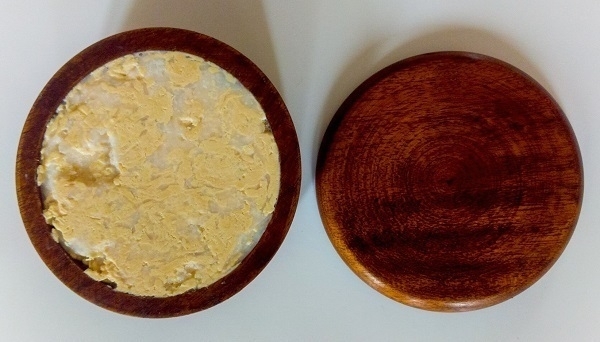
Inside the boxes the soaps were foil-wrapped. One stick had a few small spots of surface discolouration which I cut off, but otherwise they looked and smelled just fine. The soap is medium-soft - not much firmer than cold butter - so was easily grated. I regretted not buying a third stick, as the total amount of soap wasn’t enough to fill the bowl I had in mind for it. I happened to have a puck of modern Erasmic soap handy, so grated that in together with the Cadum, pressing the resulting mixture into the bowl (hence its variegated appearance).
A couple of weeks on I’m very pleased with the combination. Its composite aroma is a straightforwardly old-school soap scent. It lathers readily and profusely, with smoothly comfortable shaves the result.
Fly or Die

A newly-released arrival in the post this week - the third and final Fly or Die album by jaimie branch and her quartet: Fly or Die Fly or Die Fly or Die ((world war)). It’s pictured above with FLY or DIE II: bird dogs of paradise (2019) - both on CD. I have yet to aquire Fly or Die (2017), the initial album in the series.
I wrote a little on my former blog about how I came to hear branch’s music. As a new fan, eager to encounter more of her work, it was a body blow to learn of her untimely death later last year. More recently there was the news that a posthumous album, all-but-complete when she died, would be forthcoming.
I’d already heard ‘The Mountain’ which had become firmly embedded in my mind over the past month. At first acquaintance with the record as a whole I wasn’t sure I liked it as much as FLY or DIE II, but I’m still getting to know it and my feelings may change. As well as ‘The Mountain’, I am, at the time of writing, particularly fond of the tracks ‘Baba Louie’ and ‘Bolinko Bass’.
Single Gloucester
I had never been to Stroud until last week. On my first visit there I was tempted by the wares on offer at Hania Cheeses, who operate out of a van parked outside the Shambles Market on Fridays and Saturdays. From their excellent selection I opted for some Wigmore sheepsmilk cheese from Berkshire and a wedge of Single Gloucester made by local producer Jonathan Crump. Both were thoroughly enjoyable.
In contrast to the ubiquity of Double Gloucester, its Single counterpart is nothing like as widely-available. Its relative rarity can be explained by its humble origins. Historically, the rich and creamy Double cheeses would be made for sale, sent off to the nearby towns and cities, then further circulated and exported, thereby spreading their renown; while the local farmers were left with only the lighter, quickly-made and less-esteemed Single cheeses, whose fame did not increase in the same way.
In the relevant article in The Oxford Companion to Cheese, Charles Martell writes “as late as the mid-twentieth century, there were people who grew up on farms in Gloucestershire who had never eaten Double Gloucester cheese because it was too valuable. It was always sent away, they complained, to provide the farm with its income…” A plain and ‘basic’ foodstuff it may be, but made with care, and in accordance with tradition, it’s still a delicious one.
The cheese revived a dim memory that I’d read something comedic about (nonexistent) Triple Gloucester in one of Thomas Pynchon’s novels. As is often the case with faint recollections it proved not to be entirely correct. I’d been thinking of Chapter 16 in Mason & Dixon: “Twas at the annual cheese-rolling at the parish church in Randwick, a few miles the other side of Stroud. And May-Day as well, in its full English Glory […] Every young woman for miles around would be there, although Mason adopted a more Scientifick motive, that of wishing to see at first hand, a much-rumored Prodigy, styled ‘The Octuple Gloucester’— a giant Cheese, the largest known in the Region, perhaps in the Kingdom…”
Yost
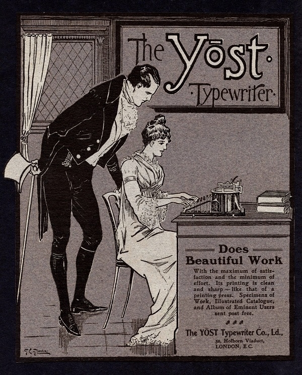
I found the ad for the Yost Typewriter Co. shown above in a 1902 issue of The Connoisseur (‘A Magazine for Collectors’). Yōst is presumably shown with a macron over the ‘o’ to indicate it’s intended to rhyme with most or post rather than cost or lost. I don’t know why the couple depicted in the ad are dressed anachronistically: perhaps they’re depictions of well-known actors in roles the public might recognize?
According to the typewriter database, the Yost range current at the turn of the 20th century would have included their model 4, 5, 6, 7 and 8 - all apparently variations of the same mechanism with differing carriage sizes. I’m guessing they would have been higher-end machines - in a Harrods Catalogue (issued a decade later, in 1912), the Yost Model 15 was priced at nine shillings and sixpence more than the equivalent Underwood and Remington standard models of the time.
Elco Paris Linen

Elco is a Swiss stationery brand that is one of the relative few still in business: long may they continue! For those of us old-school letter-writers, their current James line of writing paper (with its distinctive scalloped edges) is excellent both for fountain pen and typewriter use. As well as their current offerings I’ve also acquired (via ebay as usual) a couple of their discontinued lines. The latest such addition to my stationery stash is the box of Elco Paris Linen paper & envelopes shown above.
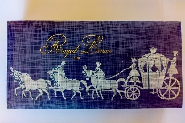
As well as their Paris Linen, I’d previously obtained a box of Elco Royal Linen of seemingly later vintage. While the latter was linen-faced which is to say it had a surface texture made to vaguely resemble that of woven cloth, the former has more of a faux-fabric look rather then feel, with a smoother surface which has a somewhat clothlike patterning applied to it. And whereas the Royal Linen sheets were A5 and the matching envelopes A6, the Royal Linen has non-ISO-compliant dimensions, the paper being ca. 24cm x 16cm, and the envelopes made to accommodate those sheets folded in three.
Shelf-Portrait No. 5
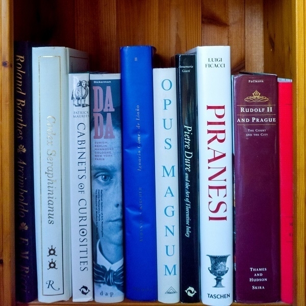
The third shelf in my downstairs ‘display’ bookcase (previously) has the most headroom and is home to some of my tallest volumes. These are more or less expensive art-books of one kind or another. Costliest among them would have been the FMR Arcimboldo book with the black spine none-too-clearly visible on the left. At one time I had another couple of titles from the same I segni dell’uomo series, but those I had acquired second-hand, whereas I bought the one above new from their official outlet in Venice (during the same trip as I acquired the carnival masks mentioned below).
The Opus Magnum volume cost me in the region of £150 - which seemed like a lot at the time but is I think a better price than one could find a copy for nowadays. And I could easily have paid £100 or so for the blue-spined book about Athanasius Kircher. I’ve had all those for between 15-25 years. Slightly more recently-acquired were the 2014 edition of The New Sylva (the red-spined volume on the right), and the Rizzoli printing of the Codex Seraphinianus; with the latest arrival of all being the Taschen Piranesi book which came into my hands last year. I had owned an Italian volume about Piranesi for some time which was pretty good, but where the reproductions of his etchings left something to be desired: the illustrations are larger and clearer in the Taschen edition.
Mask

From my second visit to Venice I brought home a couple of carnival masks as souvenirs: a Pulcinella-type mask in green and gold for myself; and a full-face Columbina one, profusely decorated with feathers, as a gift for my wife. I’d set out on an aimless walk one morning while she lolled abed at the hotel and it caught my eye from the window of a workshop somewhere in the Dorsoduro district of the city.
For years the latter was part of our decor, displayed hanging on a wall in each of our various abodes. Of the several photos I took of it over that time, the one above is my favourite. Converting the original image to monochrome in Photoshop using a blue filter effect emphasised the faux-craquelure effect on the face and darkened the gold-painted visor and lips to satisfying effect. I still have the mask now, its feathers, alas, all full of dust, adorning a mannequin that stands in my study.
Soulville, etc.
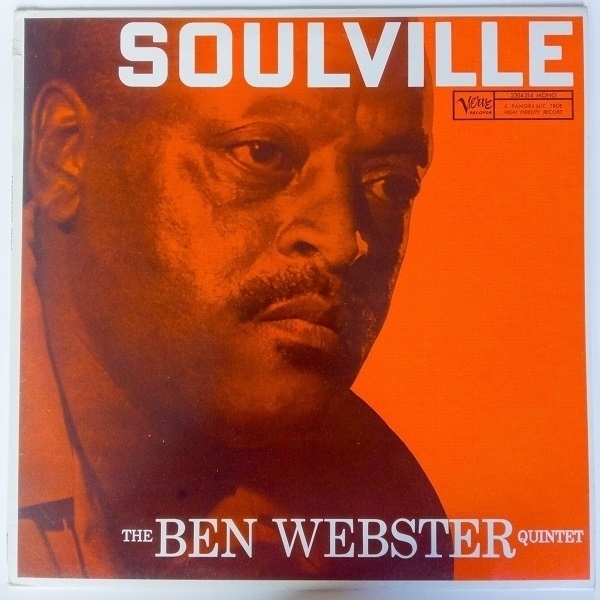
One of the best of my recent vinyl purchases was Soulville by saxophonist Ben Webster, who seems to have been caught in rather pensive mood when the cover photo was taken. Originally released in ‘58 on the Verve label, the copy I found was a 1980 French re-press in excellent condition. It’s a warmly mellow album, heavy on the ballads. I’ve had mixed success with his records previously, finding it hard to love See You at the Fair (1964) and ending up with a damaged copy of Gerry Mulligan Meets Ben Webster (1960), but this one’s definitely a keeper.
On the same day I acquired more jazz in the shape of an interesting compilation (How High The Mooon) of late ’60s recordings featuring another saxophonist: Illinois Jacquet. Among the tracks an interesting take on Monk’s “‘Round Midnight” where Jacquet switched to bassoon, an instrument very seldom heard in a jazz setting. As well as the jazz I picked up no fewer than four David Bowie 45s: ‘Sorrow’, ‘Rebel Rebel’, ‘Rock’n’Roll Suicide’ and ‘Sound and Vision’, plus Hawkwind’s ‘Silver Machine’, also on 7".
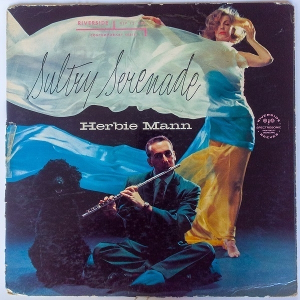
From another subsequent batch of acquisitions my head was turned by Jeri Southern At The Crescendo (1960), apparently the singer’s final album before withdrawing from the music business, but the first I’d heard of her. I’m hoping to put a few more of her albums alongside it on my shelves. At first listen I was less taken with Herbie Mann’s 1958 outing Sultry Serenade, which I’d bought on account of its wonderful cover photo. Also known as Moody Mann it’s another mellow collection, albeit to my ears a less effective one than Soulville. It features the flautist using an alto flute on a few tracks, and, on one number, switching to bass clarinet.
Nilgiri
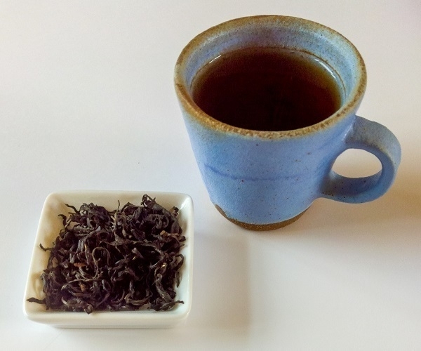
When it comes to black tea from India, not for me the delicacy of a Darjeeling or the brisk astringency of an Assam - my preference is for nice cup of Nilgiri. A small, strong cup of the stuff on a Saturday morning does me the world of good. The tea shown above is an ‘Orchid’ Nilgiri from What Cha. The cup was made by Matthew Jones Ceramics.
My sensory apparatus for flavour & fragrace is by no means the most acute, and my descriptive vocabulary for it correspondingly weak. I’ve seen Nilgiri described as having “bold fruity and floral flavours — with hints of dusk orchid and woody plums” with a “nutty and spicy” aftertaste. I have to say that neither fruit nor flowers come to mind when I drink it. And I can’t recall ever having eaten an orchid. What does come to mind when I taste the stuff is a sense of mellow warmth & breadth, like a comforting embrace in beverage form. However inexact my apprehension of its niceties, it has become a firm favourite.
Parker 61
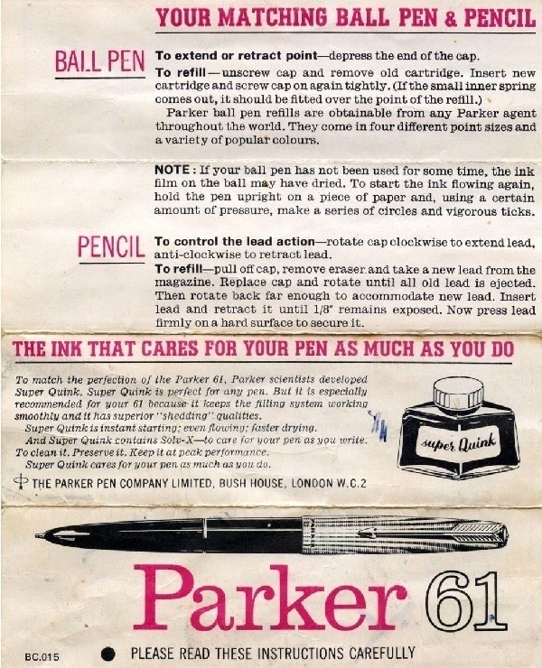
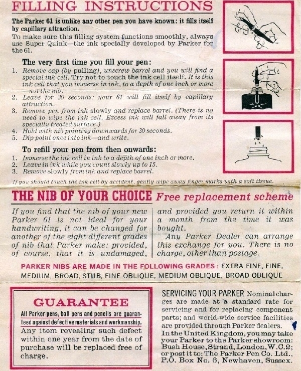
When I bought a vintage Parker 61 fountain pen (six or seven years ago), it came with an original product information leaflet. Indeed the leaflet was more original than the pen itself, with the former extolling the vitues of Parker’s revolutionary capillary-action ink filling system, which they’d developed for the 61. Unfortunately for Parker, this system didn’t work anything like as well in the real world as it had in their labs, with many 61s later altered to use more conventional converter-style re-filling - the one I bought among them. Unfortunately for me, the plastic barrel of mine cracked and broke within a year of my acquiring it.
I enjoy using fountain pens, preferring them to ballpoints and rollerballs. For a year or two I was on course to their becoming the focus of yet another collection, but I ultimately stepped off that boat and let it set sail without me. I still have (and regularly use) half a dozen fountain pens, and own as many types of ink, and for me that has proven quite sufficient. Some will derive a thrill from owning numerous inks from around the world in all-but-indistinguishable shades of blue; and in having costly gold nibs precisely altered to their exacting specifications - I’ve conceded that my own taste in writing implements is just not that refined.
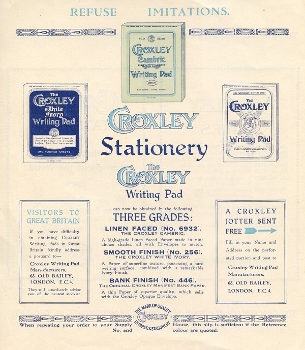
Croxley Cambric
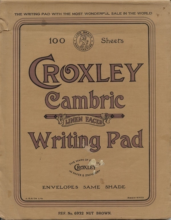
My first vintage stationery acquisition was some Croxley Script typing paper in the old foolscap (13"x8") size which was once the default format in the UK for business use, prior to the onslaught of ISO 216. Looking for more of the same, I found an ebay listing for the part-used pad of linen-faced Croxley Cambric writing paper shown above, together with a small quantity of matching envelopes in the same shade of ‘Nut Brown’. I was inclined to buy it, and have since used all that was left of it.
Croxley Green in Hertfordshire was the site of one of the John Dickinson and Co.’s main paper mills, thereby lending its name to several of the company’s product-lines. On the front of the pad a boast of its being “The writing pad with the most wonderful sale in the world.” Not then the best-selling, necessarily, but somehow the wonderfullest. Within was an information sheet with other product details, etc. The Old Bailey head office address printed on the sheet likely dates the pad to before WWII; and that address’s ‘EC4’ post-code probably means it’s post-WWI.
Mavis Gallant
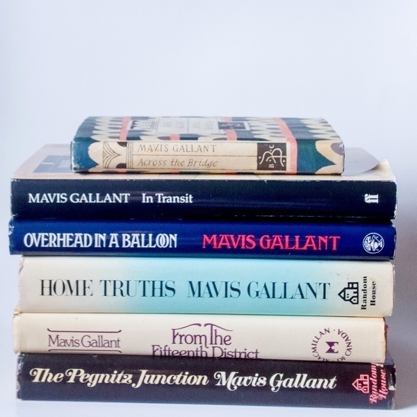
I’d become a great admirer of the short stories of Sylvia Townsend Warner (of Lolly Willowes fame) and read something on-line mentioning that the only other female author whose short fiction had been featured as often in the pages of The New Yorker over the same time-frame had been Mavis Gallant. Not at all familiar with the latter’s work, I ordered a copy of the 2004 reprint of her Selected Stories and found that although I loved her writing too, I took an irrational dislike to the physical book: a cumbersome 900+ page paperback. I felt it was the wrong format for her densely concentrated writing - like an off-puttingly super-sized portion of some very rich and calorific confection.
I’ve since accumulated half a dozen separate hardback copies of her short fiction (as pictured above), from The Pegnitz Junction (1973) to Across the Bridge (1993). For me these have been much more digestible servings of her prose. How to describe her writing? Here’s a thumbnail sketch of it by critic Hilary Bailey, as quoted on the rear dust jacket flap of Overhead in a Balloon (1987): “Brilliant, dryly accurate, impeccable detail, knowing and terrifyingly neutral. Mavis Gallant’s stories seem to tell us that all are victims of history and each other, all are out of synch with their own times and each other, all are strangers where they live and strangers to each other”.
Gallant was a Canadian who spent most of her writing life in Paris. Exile, displacement & alienation are prominent and recurring ingredients in her work, but nearly always well-blended with other flavours. Her characters are fully-rounded: good people one can’t love because of their exasperating flaws; awful people one can’t hate on account of their saving graces. How she can stealthily fold so much detail, plot & characterization into so few pages is a marvel. She strung some of her stories into inter-related sequences which collectively come across as novels in all but name - albeit with all the surplus padding removed. For example, the quartet of tales “A Recollection”, “Rue de Lille”, “The Colonel’s Child” and “Lena” jointly pack a tremendous novelistic punch into no more than thirty-seven pages.
As good as she was, there are some duds among her tales. She could be very funny but wasn’t really a humourist - a few efforts at lighter comedy fall a little short (I’m thinking of the ‘Grippes and Poche’ pieces). She was accomplished at extracting strangeness from the everyday, but also tried her hand at some deliberately surreal vignettes (such as the title piece of From the Fifteenth District) which didn’t work terribly well. And even now and again in her customary mode, the point of this or that subtly-realised slice of life might elude the frustrated reader. Those relative failures, however, are well-outnumbered by her many successes.
Couple
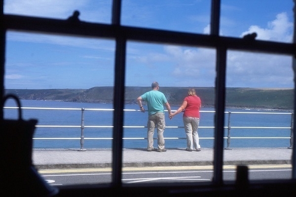
While I’ve no particular talent for judging ‘the decisive moment’ in spontaneous photography, sometimes luck is all one needs. And, like almost any other hamfisted idiot with a camera, I have got lucky sometimes. The picture above is one such shot that I think came out well. Sitting inside The Old Success Inn at Sennen Cove, near Land’s End in Cornwall one August afternoon I spotted a couple looking out to sea neatly framed in a windowpane and reached for my Nikon F80.
As well as the framing, I like that their poses jointly combine tenderness and awkwardness; placidity and tension. And I like the contrast in colours between their shirts and the summer blues of the sea and sky.
Cufflinks
A decade ago I happened upon the four pairs of cufflinks I owned at the time, and wondered if I ought to just throw them away. I hadn’t any double-cuffed shirts to use them in. Indeed, at no time in the preceding decade had I been in possession of more than two such shirts: why so many cufflinks? I’d bought one pair with the first of the shirts in Manchester the day before a wedding. The second pair I’d ‘won’ in an expensive Christmas cracker. The third were a gift from my sister; the fourth handed down from my father-in-law.
After a few years of being short of money I’d worn out most of my good clothes and had to resort to shopping for the cheaply cheerless at supermarkets and bargain outlets, which was dispiriting. Before then I’d looked askance at buying clothes second-hand from charity shops, but my circumstances encouraged me to take a closer look at what they had. At the Heart Foundation shop in Chepstow one day I found a few good-quality shirts in my size for a few pounds apiece: that two of them were double-cuffed presented no obstacle what with all the cufflinks at home.
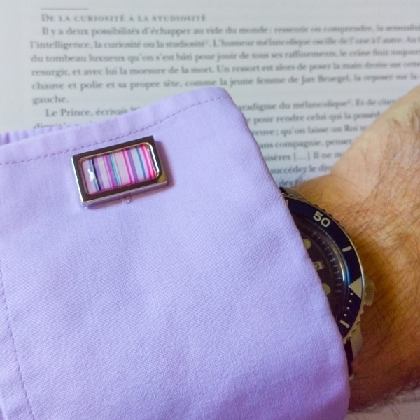
Thus began my collection of charity-shop shirts. With the broad social tendency towards more casual attire, cufflinks aren’t exactly de rigueur, and hence cufflink-compatible shirts are less in demand and often priced appealingly. I must have at least a dozen of the things now, not to mention the several others I’ve worn to destruction. In the picture above is the left cuff on a Pierre Cardin shirt (or a rip-off of the same) bought for a couple of pounds pre-pandemic in North Bristol. The cufflink shown is one from two similar pairs I bought last year from my local charity shop. They’re ‘silver tone’ metal set with some kind of resin or plastic insert.
I don’t need any kind of spcial occasion to wear them, and will happily work from home wearing them, or head out to the supermarket all cufflinked up.
Interval Signals
There was a tune that haunted me for about thirty years before I finally found out what it was. I first heard it issuing from a television set, but it wasn’t ‘on TV’ exactly.
When I was given my first home computer as a birthday present in late ‘82 (a Sinclair ZX Spectrum), it came with a TV to serve as its display. My parents had pushed the boat out for the computer, and couldn’t afford to buy me a new TV too. Having asked around, my mother learned that her cousin Betty had an old one she didn’t use any more. Betty was a flight attendant for TWA, and had picked it up at some point on her travels.
It was a nominally-portable Hitachi unit, a ’70s model with an 11" screen and a tuning dial rather than buttons to switch between channels. It could theoretically pick up both VHF and UHF transmissions, but, lacking an aerial, didn’t do so at all well. Not that it mattered that I could only conjure up a snowily indistinct ghost of the BBC, as it worked fine with the computer.
In the days before the world wide web, one was often bored. One of the things I sometimes did when boredom weighed heavily was to idly scan through the TV’s frequencies in the faint hope of finding something, anything unusual. To my great surprise I did on odd occasions detect unexpected audio issuing from it, having (I presume) strayed into shortwave radio territory. Most strikingly I could sometimes discern a chiming fourteen-note melody, in two similar sets of seven tones, floating eerily over a bed of inteference. I never heard any accompanying announcement, just the same music repeated several times. I lacked the presence of mind to record it.
When, twenty years later, I heard about shortwave numbers stations, I thought maybe my mystery tune might be connected in some way with those, but I found nothing to match it on ‘The Conet Project’ CDs, or elsewhere. More time passed and, although I never forgot the tune altogether, I sometimes doubted whether my recollection of it was correct.
Then, in November 2014, I heard it on the radio - on scheduled terrestrial digital radio this time, not in any random traversal of the airwaves. During one of Stuart Maconie’s Freak Zone shows on BBC 6 Music, he played some tracks from OMD’s 1983 Dazzle Ships album. One of these, ‘Swiss Radio International’, an addition to later CD re-issues of the album, was the melody I remembered, a recording of the eponymous station’s ‘interval signal’: mystery solved! I further learned that the tune had been drawn from a 19th-Century song called Lueget, vo Bärgen und Tal.
Etna Rosso

My favoured wine of the moment is the cumbersomely named Generazione Mille898 Etna Rosso 720 (2019) latterly available at Lidl. My experience of wines made from the traditional Sicilian grape varieties Nerello Mascalese and Nerello Capuccio was scant and far from recent. I had once been partial to Corvo Rosso which apparently includes some Nerello Mascalese, but that was decades ago. As it happened, I was delighted to find this Etna Rosso very much to my taste.
The blurb on the back of the bottle promises “a complex and intense nose of red berries, aromatic herbs and spices. On the palate it is robust, well-balanced and persistent [combining] elegance with a strong mineral touch typical for its volcanic origin.” Meanwhile, in a review at Decanter, Amy Wislocki writes of it having “spicy red berry character, some tomato leaf and an attractive earthiness. The minerality and slight tannic grip give a weight and structure that make it a good gastronomic choice…”
Lacking such discernment, I would have been oblivious to the wine’s “minerality” had it not been so prominently mentioned. I can sort of see what they’re saying, but it’s a characteristic so well-integrated into an harmonious blend of flavours that it certainly doesn’t obtrude: this is by no means an austerely “stony” experience. Where I once favoured very full-bodied reds, my preference now is for something a little lighter & subtler, and this is a wine that fits that bill very well indeed.
Invitation to the Dance
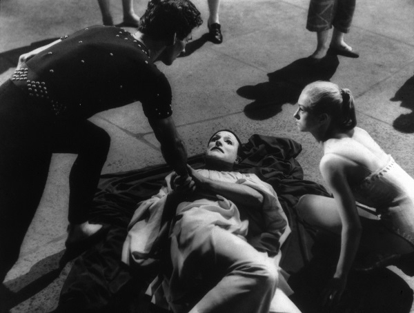
Here’s another from the set of movie stills I mentioned a few months ago, this one from Einladung zum Tanz (‘Invitation to the Dance’), starring and directed by Gene Kelly; filmed in 1952-4 but not released until ‘56. It’s a monochrome still taken from a colour production. The three figures fully in the frame are Igor Youskevitch, Kelly, and Claire Sombert. The still corresponds roughly with the 5:10 point in this YouTube clip, though the camera angle and framing seem slightly different.
When I looked up the movie (and saw a couple of excerpts) it rang a distant bell - I suspect I watched at least some of it on TV decades ago. It’s a three-part anthology with all the narrative and drama in each part communicated solely via the media of dance and mime, a premise which reputedly alarmed Kelly’s backers at MGM who overruled his original proposal not to appear in the film himself. When the movie belatedly saw daylight it was not a success, with Kelly’s choreography and “artistic pretensions” the subject of particular criticism.
Writings
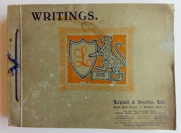
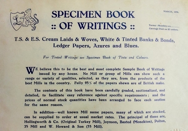
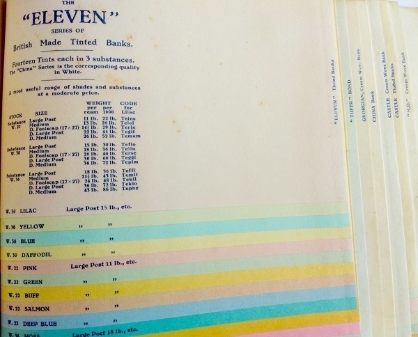
My odd enthusiasm for old stationery has bled its way into my library, with the acquisition of a number of paper sample-books. One of the best is this collection of Writings (i.e. writing paper samples) issued in March 1936 by Lepard & Smiths Ltd., apparently one of the longest established paper-merchants in London. The book’s cover is in rather shabby condition, but the contents have aged much more gracefully. On the first page is the boast that “we believe this to be the best and most complete Sample Book of Writings issued by any house” and the claim that “fully 95% of the papers shewn are of British make.”
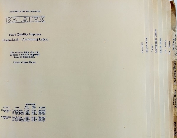
To the contemporary letter-writer, who might do well nowadays to find even a few different types of writings in all but the most specialised retail outlets, the bewildering choice available to their forebears is much to be envied. Among the options offered by Lepard & Smiths, one curiosity is their Kalatex paper, made, as its name implies, with the addition of latex rubber to the esparto-based pulp. Of this paper, they claim that “the surface grips the ink, as there is not the slightest trace of greasiness”, and indeed its surface does have a ‘grippy’ feel about it - though I’ve not tried writing on the stuff.
Though the bulk of the papers in the book are of a plain ‘cream’ off-white colour, there are also some given in a range of shades, with, for example, their “Eleven” series of papers: available in Lilac, Yellow, Blue, Daffodil, Pink, Green, Buff, Salmon, Deep Blue, Moss, Cerise, Silver Grey and Old Gold. This paper is one of only a very few in the book which has suffered any significant deterioration over the last eighty-seven years, a testament to the fine quality of Lepard & Smiths' products.
Shadow

The unassuming photograph above: the shadow of a tree cast on to a yellow-painted structure (along with part of the tree itself) was five or six years in the making. The structure in question is Amiralitetsklockstapeln, that is, the Admiralty Clocktower, in Karlskrona, Sweden.
For several years I lived nearby and at least twice a day, almost every day, I’d pass it on my daily walks with the dog around Admiralty Park. In the spring of 2002 or ‘03 I would have first noticed a scene like the one in the picture and thought I should take a snap of it. At the time I didn’t have a good camera. Moreover, when I remembered to return with the available camera some days later, the angle of light was no longer quite right, and the effect wasn’t the same.
Only in the March or early April of 2008 did everything fall into place: it was the right time of day at the right time of year; the weather was bright and sunny; I had a good camera with a suitably wide-angled lens allowing me to capture maximum shadow and minimum tree. I used my Nikon F80 with plain old Fuji Superia 200 film. I suspect I must have had a polarising filter on the lens to get the sky looking quite so blue. I don’t recall which lens I used - most likely it would have been a 24mm auto-focus Nikkor of some description.
Clock
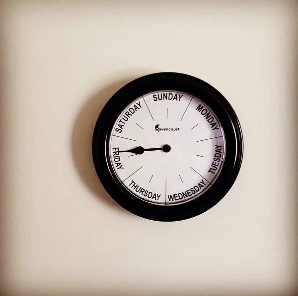
Like a great many others my working routine changed dramatically in the spring of 2020. Working from home, which had hitherto been a once-in-a-while thing, became the inescapable norm. It took me quite some time to adjust. While the individual hours passed no more slowly than they ever had, the working week as a whole felt somehow distended, with each working day barely distinguishable from the next.
The thought occurred to me to get a clock for my office/study at home that might serve as an immediate reminder of my whereabouts in the week. Ebay naturally had what I sought: a wall-clock whose circumference was divided into seven rather then twelve, and with a single hand completing each rotation in a hundred and sixty eight hours. The specific clock I bought was one primarily intended as an aid for people with dementia, but did just as well to assuage my short-term disorientation.
After nearly two years at home I returned to working at the office in the spring of last year - albeit for only two days a week. The clock has stayed in its place, even though my need for it has lessened since then.
Singles

Of the hundred and fifty or so 7" singles I’ve accumulated over the past decade, a disproportionate number of them date back to the tail end of the ’70s and the early part of the ’80s. In other circumstances, these could have been my peak single-buying years - I was between the ages of nine and fifteen - but I had other priorities at the time, and, in any case, not very much money. It’s been a pleasure to acquire now some of the records I might have bought then had things been different.
Shown above are a select half-dozen such 45s which happen to have picture sleeves:
- ‘(I’m Always Touched by Your) Presence Dear’ by Blondie (1978)
- ‘Making Plans for Nigel’ by XTC (1979)
- ‘Echo Beach’ by Martha and the Muffins (1980)
- ‘Reward’ by The Teardrop Explodes (1981)
- ‘Beat Surrender’ by The Jam (1982)
- ‘Nobody’s Diary’ by Yazoo (1983)
Farls
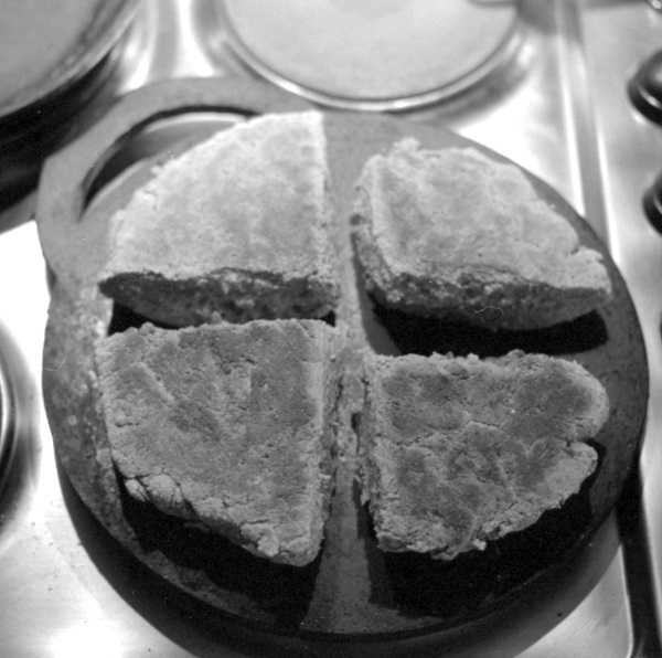
A ‘bakestone’ is a type of heavy flat griddle. The one I have is a disc with a cut-out handle 10" in diameter and ⅓" thick. It had been my maternal grandmother’s. After she died, it went to my aunt, who later passed it on to me after I’d started making bara planc, a traditional Welsh style of bread not baked in an oven but cooked on the stove-top. I had at first been making it in a cast-iron pan, but a bakestone, being thicker, provides a more uniform heat better suited to the task. Bara by the way simply means ‘bread’, and planc is one of the Welsh terms for a bakestone.
Back in the mists of time bakestones were actual stones, but in more recent centuries cast iron and mild steel have been the preferred materials. Mine has no kind of maker’s mark or other sign of its origin, and I was for a time curious as to how old it might be. The mystery was solved when, talking to my Dad one day about my bread-making activities, he told me he’d made it ca. 1970. He’d just begun his first post-apprenticeship job as a “maintenance fitter” at a factory. Juniors like him were sometimes given busy-work to keep them out of harm’s way, and one such task he’d been assigned was making bakestones by cutting them out of mild steel plate. Of the several he made, one became a gift to his mother-in-law.
Making bara planc is easy enough but takes a few hours and calls for a certain amount of premeditation. Soda bread on the other hand can be rustled up more spontaneously, and is easier still, with a dough very quickly fashioned by mixing buttermilk into flour with a little salt and a little more baking soda added. Once the dough is pressed on to the stone and cut into ‘farls’ (as depicted above), one’s warm, freshly-cooked bread is soon ready to enjoy.
Index Cards
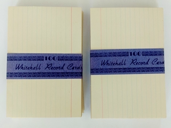
I bought a ’50s index card ‘outfit’ a few years ago: that is, a Winel brand flip-top card-box, some alphabetical separators and a couple of hundred Whitehall 6"x4" cards. As well as the blank cards, there were a dozen typewritten ones left there by the set’s original owner, one for every month of the year, with major household expenses listed on each one.
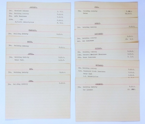
The most significant expense through the year, described as ‘Building Society’ (presumably a monthly mortgage payment) was for £78 (£6 10s x 12). Besides that, the largest single amounts were for the annual rates bill (£29 18s 6d) and a fairly hefty £16 1s 3d for car insurance. The ‘A.P.S.W. Subscription’ on the January card suggests a membership of the Association for Professors of Social Work. Also in the box were a few pieces of professional correspondence all addressed to a Miss M_______ based near Sleaford, Lincs., who I imagine must have typed out the cards. These letters are all dated 1957, so I guess the cards most likely relate either to that year, or to 1958.
Chivalry Antient Script
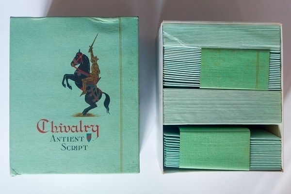
Pictured above is an old box of Chivalry Antient Script envelopes in ‘Jade’ green, Duke size. I bought them from an ebay seller. According to on-line paper-size guides, Duke is supposed to have been 7"x5½", but evidently not everyone followed that standard as the notepaper matching these envelopes comes in folded sheets closer to 6¾"x5⅛" (approx. 10¼"x6¾" when unfolded), with these meant to be folded in half again to fit in the ca. 5½"x3⅔" envelopes.
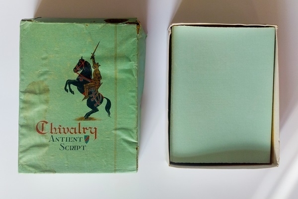
On one end of the box is a mark boasting that the paper has “Guaranteed Rag Content” and is “British Made”, while on the other its origin is given as the “Aberdeen Mill - Established 1770” with a picture of a Scottish Terrier in profile as a trademark. Each sheet of the notepaper is likewise watermarked with a stylized ‘Scottie dog’. The manufacturer isn’t stated but I’m fairly confident it was made by Alexander Pirie & Sons Ltd., later part of Wiggins, Teape and Co., and nowadays of ArjoWiggins.
I don’t know how old it might be. Pirie’s Antient British Parchment, Antient Vellum and similar trade names are listed in the 1923 Phillips' Paper Trade Directory of the World, but not this one. The sole reference to it I’ve found is in a 1937 ad in the Straits Times of Singapore, so it was a current brand shortly before WWII, at least.
Selected 'Selected Poems'

In my recent reading have been half a dozen books with the same title: Selected Poems. I especially enjoyed the two shown above. Putting aside my usual predilection for poetry in translation, these books have predominantly been by poets writing in American English.
Barring a couple of brief encounters in anthologies, I’d made the mistake of overlooking Marianne Moore’s poems until now, which is too bad as I find them very much to my taste. For me there’s something reminiscent of a fine jeweller’s sharp-eyed precision in the way she fits her words together into elaborate settings as if they were so many semi-precious stones - all to suitably sparkling effect.
John Berryman’s Selected Poems (1938-1968), on the other hand, I’d met with before, having owned an ’80s copy of the same collection in my youth. This latterly-acquired early-’70s one has the benefit of being printed on better-quality paper. Although he worked within the constraints of meter & rhyme often enough, Berryman’s art comes across as altogether untidier than Moore’s; a side-effect perhaps of his flailing through a chaotic life. There are nevertheless jewels aplenty in his poetry too.