Rockwell 310A

When my Olympia CD-520 calculator finally expired, I had a replacement ready to go: a late ’70s Rockwell 310A. Even without an on-line reference to vouch for its date of manufacture, one might have a good guess based on its brown and orange colour-scheme. It’s too bad the display is a green VFD one: orange Panaplex numerals would have been the perfect match.
In terms of functionality, this newer unit offers a small step up over the Olympia, having a floating point option and a ‘%’ key. On the underside of the calculator one sees it was an offering of Rockwell International’s ‘Microelectronic Product Division’, who were based in Anaheim, CA – and that it was Made in Japan.
At Mister Kelly's

Acquired last month, an LP copy of Anita O’Day at Mister Kelly’s, originally a 1959 release on the Verve label, though I can’t be sure if my copy, a South African pressing, dates back to that year. On the back of the sleeve is one blurb explaining “Everyday is somebody’s birthday – Give a national record gift token – Exchangeable anywhere in Southern Africa” and another reassuring the mono LP’s buyer that “Stereophonic equipment will not cause this dynamic high fidelity recording to ever become outmoded!” The sleevenotes are courtesy of Verve’s founder Norman Granz.
It’s a very good album, well recorded, with O’Day in fine voice throughout on standards such as ‘But Not For Me’ & a skitteringly rapid ‘Tea for Two’; and on less familiar numbers like ‘Varsity Drag’ & ‘The Wildest Gal in Town’. O’Day’s long-time partner in crime John Poole plays drums, with Joe Masters on piano and L.B. Wood on bass. It joined another similarly-enjoyable LP already on my shelves recorded at the same venue the year before: Sarah Vaughan At Mister Kelly’s, where the singer is accompanied by Jimmy Jones (piano), Richard Davis (bass) and Roy Haynes (drums). Mine is a late ’60s budget re-press on the Mercury Value Label.
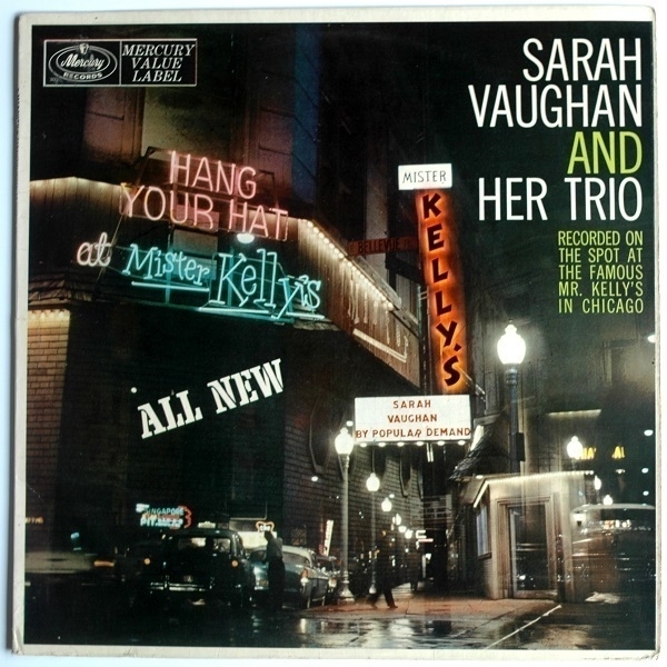
It goes without saying that Vaughan and her trio sound fantastic. There’s a little more in the way of as-it-happened spontaneity than on the O’Day record, with the sound of a dropped microphone and some hastily-improvised lyrics at the close of ‘Willow Weep For Me’, for instance. With most of Vaughan’s records from this era featuring big-band or orchestral backing, it’s great to hear her here in the relaxed company of a fine jazz trio. Mr. Kelly’s was a Chicago nightspot in business between 1953 and 1975. The sleevenotes on the back are the work of the club’s proprietor Oscar Marienthal who writes “Here you get this delightful evening of Sarah Vaughan for less than an average minimum and cover charge, and you get it over and over again, as often as you want. That’s enough to break a night club proprietor’s heart…”
Milk Oolong

On first hearing about ‘milk oolong’ tea, the idea didn’t much appeal to me. I’ve enjoyed sampling various kinds of oolong over the years, but am firmly of the belief that milk and tea are best kept apart. When placing my last order at What-Cha I thought I’d give the stuff a chance, and thereby acquired 50g of Jin Xuan leaves originating from Anxi in Fujian, China.
The blurb at the site describes it as tasting of ‘mango and milk’. For me it’s an overt fruitiness that dominates its flavour, reminiscent of dried mango rather than fresh. I’ll have to take their word about the advertised milkiness, which doesn’t come across for me, although there’s undoubtedly a certain quality to its mouthfeel which one could construe as milk-like. It’s an interesting drink, and while I do like it, I wonder if something in a similar vein with a subtler flavour might be more to my taste. The cup in the picture is a ‘turquoise crackleglaze’ one made in Japan.
Note to Self
Of all the communications I received during the recent General Election campaign, easily the strangest arrived in the form of a letter, ostensibly addressed to me from my future self, on a single sheet headed with by name and address and dated July 2024 It begins as follows:

It was part of an attempt by the Conservative Party to dissuade voters from casting their ballots for those ‘populist’ arrivistes the Reform Party. As I’d never any intention of giving my vote to either of these outfits, it was altogether wasted on me. The concept of it did get me thinking, however – what if I were to take its premise at face value?
Imagine a 2044 where technology exists to send pieces of paper backwards through time, yet word-processing software is no better than it is today. It suggests impressive (albeit uneven) technological progress over the coming two decades. And yet it’s a future where there’ll still be scope for anachronistic activities like writing a letter (perhaps one will also be able to transmit dire warnings to the past via text message, email and fax). Moreover, this is a 2044 where I’m still – at the age of 75 – alive, somehow still at the same address, and well enough to write: perhaps the hazards of climate change, pandemics and global political instability won’t be as bad as all that.
Worryingly, though, I must at some point develop dementia or sustain a brain injury, as I can’t see myself spouting such twaddle were my faculties still fully intact. I like to think I’d put any properly urgent warning to my past self in a few forceful words, while in any other scenario I’d want to have some fun with it at 2024-boy’s expense, but there’s no hint of fun in the letter I received. Perhaps an Artifically Intelligent entity will by then have subsumed my identity, and is merely pretending to be me? Whoever wrote it was right to suppose we’d end up with masses of Labour MPs after this election, but forgot that the Reform Party did indeed win five seats. Unless the latter is knowledge that future authorities will strive to suppress…
The letter, I think, is too long for its intended purpose: it rambles; it’s poor advertising copy. Whether anything better-conceived might have been any more effective seems doubtful. In my constituency the incumbent Conservative was unseated by the Labour candidate. Had the right-wing vote not been split by a Reform Party candidate, the erstwhile Tory MP might – narrowly – have kept his job.
Ivan Generalić
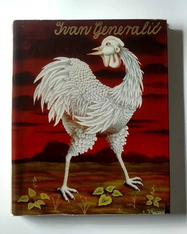
An art-book caught my eye during a recent visit to Broadleaf Books in Abergavenny. On its cover, a striking specimen of poultry; while within were various scenes of country life painted in a somewhat naive style, with hints here & there of the surreal. I enjoyed the pictures but couldn’t read the text, which is in Serbo-Croatian, this being a volume devoted to the work of the artist Ivan Generalić published in Zagreb in 1973. I bought it anyway: it’s good to have something representing another language on my shelves.
A short bio at artnet says of Generalić that he “is remembered for his highly stylized, vibrant, and almost hallucinatory landscapes of rural farm life which he combined with incisive political commentary” and that he “made his works through a unique process of applying oil paint on the reverse of a pane of glass, creating a shimmering, screen-like quality”. Several of his paintings are reproduced at a website devoted to his work.
Games of Chess
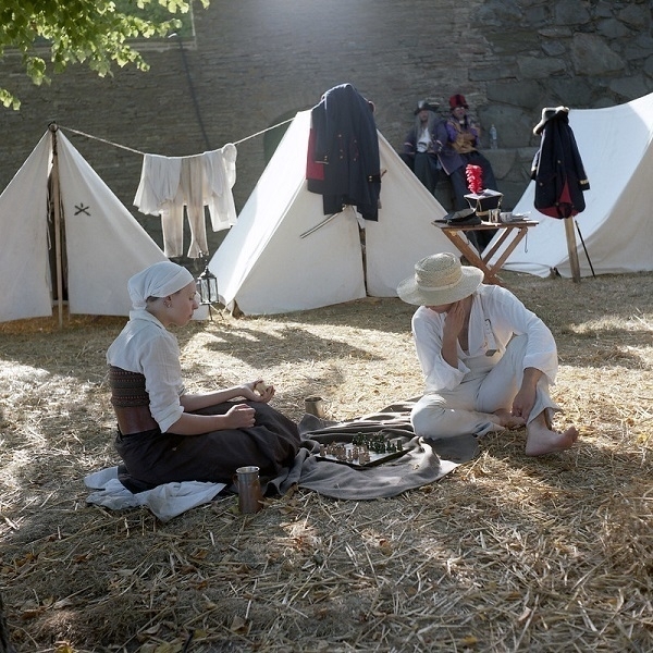
Two re-enacters play chess in front of some tents around which are pieces of military uniform and other items of clothing. I don’t know anything like enough about historical garb to say whether the pair’s outfits are properly authentic, or even consistent with each other. Still, to my inexpert eye, the overall impression allows at least for a suspension of disbelief. Looking more closely at the full-sized image one can see a couple of anachronisms, with the woman’s doubly-pierced ear and what looks like a tattoo at the back of her neck. And then there are the pair of jokers out of focus in the backround who look as though they’ve wandered in from a different movie.
The shot was taken with a Yashica Mat camera loaded with Kodak Portra 160 NC film at the ‘Sail’ festival in Karlskrona, Sweden in 2008. I must somehow look like I have a knack for chess – no few people have supposed it – but I’ve no aptitude for the game at all. The one other chess-related photo I’ve taken that comes to mind is the one below, a black-&-white shot of an outsize, outdoor chessboard in Wämöparken, also in Karlskrona. This one was captured the following summer, using my other TLR, a Mamiya C330S on Rollei Retro 100 film that I developed myself using Rodinal.

Strop
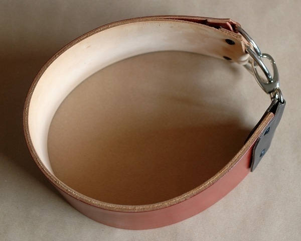
If one shaves with straight razors, one must use a strop. On sending me one of my early razor purchases, the ebay seller recommended a stropping regime, after every shave, of twenty-five laps on a fabric surface and then twenty-five more on leather. So good was the edge he’d put on that razor that I fully trusted his expertise, and I’ve followed his advice ever since. I bought a canvas strop from the same seller but felt I could do better than the leather one I had at the time, so I went looking for something of higher quality.
What I found was the strop shown above. It would normally be hanging flat from the end with the clip – I only formed it into a loop to allow for a photo with a squarer aspect ratio. It’s a double strop with two usable surfaces: one a soft, pale ‘nubuck’ leather (the inner surface in the picture) the other of smoother and shinier ‘shell cordovan’ (the outer one). I use both sides, always finishing with the cordovan. I bought the strop three years ago from Quercur in Spain, via Etsy. Sadly, they no longer sell to the UK. I paid something in the region of £75 for it, plus shipping.
Shell Cordovan, per wikipedia, “is an equine leather made from the fibrous flat connective tissue (or shell) beneath the hide on the rump of a horse.” Its name relates to the city of Córdoba, where it reputedly originated. Cordovan is difficult and time-consuming to make, hence it’s a costly leather, but one perfectly suited for strops. Drawing a blade along it feels exactly right: smooth and easy. After about five hundred uses, mine is now slightly scuffed and scratched in places, but still, I hope, has years more service left in it.
Eight Seasons
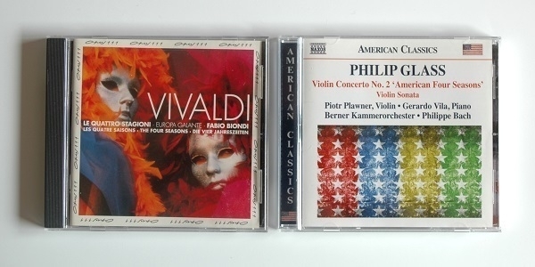
Antonio Vivaldi’s quartet of violin concertos Le Quattro Stagioni, first published in 1725, must be among the most recognisable and frequently performed in the ‘classical’ repertoire. I became properly aware of them during the ’80s, when they seemed to be much in vogue – from the 1981 movie The Four Seasons, whose soundtrack prominently features them, to Nigel Kennedy’s hugely successful 1989 recording. Although I liked the music well enough, I didn’t obtain it on disc until the early ’00s, when I bought Gidon Kremer’s version, on a CD where where Vivaldi’s pieces alternated with Astor Piazzolla’s Cuatro Estaciones Porteñas. Much as I admired the playing by Kremer and his band I didn’t think the juxtaposition of the two dissimilar sets of pieces worked especially well. The cool emotional temperature throughout, moreover, made all the seasons feel at least a little wintry.
I’ve heard the music often. but not too often – I can and do still enjoy it. Lately I picked up a second-hand CD copy of a 1991 performance of Le Stagione by Fabio Biondi and his ensemble Europa Galante. This is a warm-toned ‘historically-informed’ performance that I find more to my taste. Europa Galante here are twelve strong: eleven string players led by Biondi, plus Rinaldo Alessandrini on harpsichord. There’s also some filler, in the shape of two further brief Vivaldi concerti. Biondi recorded the Seasons again in 2000, reputedly in a more flamboyant style. On YouTube one can see Europa Galante playing the Seasons live in 2003.
In the meantime I’d aquired another set of musical seasons, namely Philip Glass’s Violin Concerto No. 2 aka the American Four Seasons. This is a single composition with four movements each of which is prefaced by a short piece for solo violin. The movements have no titles, with Glass leaving it up to the listener as to which relates to each season. To my ears they seem to follow the same order as Vivaldi’s, beginning with Spring. The slow second movement puts me more in mind of the langour of summer than anything else. This is Glass in straighforward crowd-pleasing mode – it certainly pleases me. It’s performed on this 2020 Naxos release by the Berner Kammerorkester conducted by Philippe Bach, with Piotr Plawner the lead soloist. The band is twice the size of Biondi’s, with twenty-three players, all of them on strings aside from a single keyboardist, who plays a synthesiser with a harpsichord-like setting. Also on the disc is Glass’s 2008 Sonata for Violin and Piano.
There’s a 2016 performance of the American Four Seasons on YouTube where the American Youth Symphony are led by Robert McDuffie, who had first proposed the idea to Glass some years earlier of “a work that could be programmed with the classic Vivaldi war-horse.”
Pastéis de Nata

I’ve only become aware of pastéis de nata within the last couple of years. A friend mentioned seeing them on display in the baked goods section of a small-town Co-Op as evidence of their having become fully mainstream in the UK. Until then I’d been quite oblivious to the things. After that I began to notice these sweet Portuguese egg-custard pastries all over the place.
At my local Lidl I spotted both freshly-baked pastéis and, during one of their weekly international promotions, boxes of frozen ones. The convenience of the latter – made in Portugal – appealed to me, leading to a first purchase. I don’t know how closely they approximate to the real freshly-made thing, but I do enjoy them. I’ve taken to serving them with a scoop of mascarpone (as in the picture above), as if they weren’t quite unhealthy enough already.
Rössler
Several years ago I bought some Tiffany-branded stationery. In a glossy pale-blue folder were red A5 sheets, edged in white, with matching C6 envelopes. It was a good-quality set, elegantly-presented, and presumably intended to be sold at an astonishing mark-up on account of its branding. I wouldn’t have considered buying it new: the barely-used set I obtained via ebay set me back something like £15-£20. One can still buy Tiffany-branded pens and notebooks but no longer writing paper, it seems. In small print on the back of the folder I saw that it had been made in Germany by Rössler.
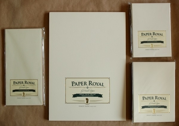
The other week I was tempted – again at ebay – by a listing for a substantial quantity of Rössler stationery: writing pads, notecards and envelopes in a variety of styles and sizes, something like fifteen pieces in total – all of it unused. While the sheer amount of it was excessive even by my standards, curiosity won out and I made an offer. Some of the contents are shown above, all from their ‘Paper Royal’ line. ‘Edelbütten’ items were also well-represented, along with a smaller number of other odds & ends.
More Stamps
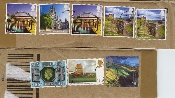
Frequently ordering items from ebay one might sometimes recieve a parcel decorated with an assortment of old postage stamps. One such delivery came disconcertingly adorned with at least a dozen stamps commemorating the wedding of Charles & Diana – a mere forty or so years after the event itself. Last week there arrived a consignment of stationery whose postage had been paid for by the eight stamps shown above – one of them dating as far back as 1977.
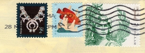
Other recent arrivals in the post have included letters from the U.S. bearing the trio of stamps above, and, below, one from Russia with half-a-dozen stamps on it.

James
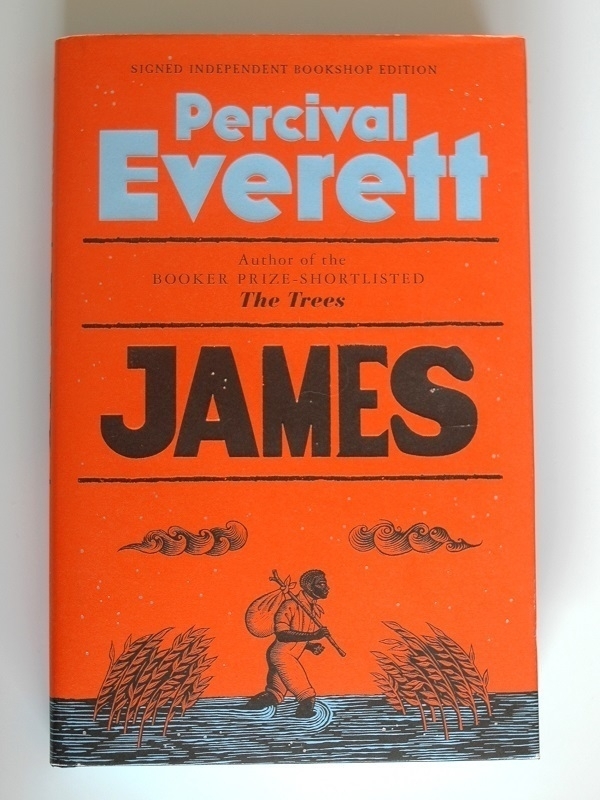
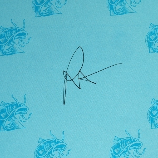
Chepstow Books & Gifts is the nearest proper bookshop to where I live. It’s a good little shop but I seldom buy there owing to my usual penny-pinching preference for used volumes. The amount of stock they can carry, moreover, is necessarily limited by their small premises. Looking around a few weks ago I spotted paperback copies of Percival Everett’s novels The Trees and Dr. No on their shelves and considered buying one or other of them, having been vaguely curious for a few years about this author’s work. Then, displayed on a table, I spied a ‘Signed Independent Bookstore Edition’ of his latest novel James and ended up buying that instead. I finished reading it the other day.
The novel is “a re-imagining of Mark Twain’s Adventures of Huckleberry Finn from the perspective of the runaway slave character Jim.” as wikipedia briefly summarizes it. I barely recalled the plot of Huckleberry Finn having read it over forty years ago, but that proved no impediment to enjoying this re-telling of the tale. Hazardous as grafting one’s story on to another writer’s work must be, Everett makes a great success of it here, lightening the desperate drama of the protagonist’s predicament with sharp and clever humour. While it’s not without some rough edges, I don’t think that further polishing would necessarily have improved on the entertaining and thought-provoking story we have.
Goats

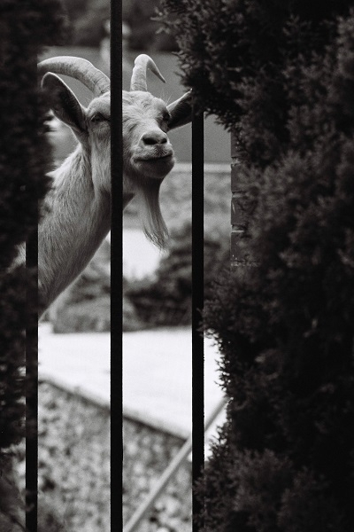
The year before last I attended a wedding at a French château, specifically Château de la Malmaison. Not, that is, the similarly-named and rather more famous Château de Malmaison, but this one in Champagne, between Épernay and Reims. An early 19th-Century house, it was built on the site of an older, fortified dwelling, of which there remained only the dried-out moat that had once surrounded it. In the moat, one might find a goat.
The house’s owners keep a small herd of goats which help maintain the grounds. Enticed by the appetising foliage in the fenced-off garden within the moat, the goats often approached the fence as if sizing it up in the hope of finding a weak spot to break through. I took the pictures with my Nikon FM3a on Kodax Tri-X 400 film. The five rolls of film I used over that long weekend were the last ones I sent off to be developed by the excellent Peak Imaging in Sheffield before their closure.
Basket
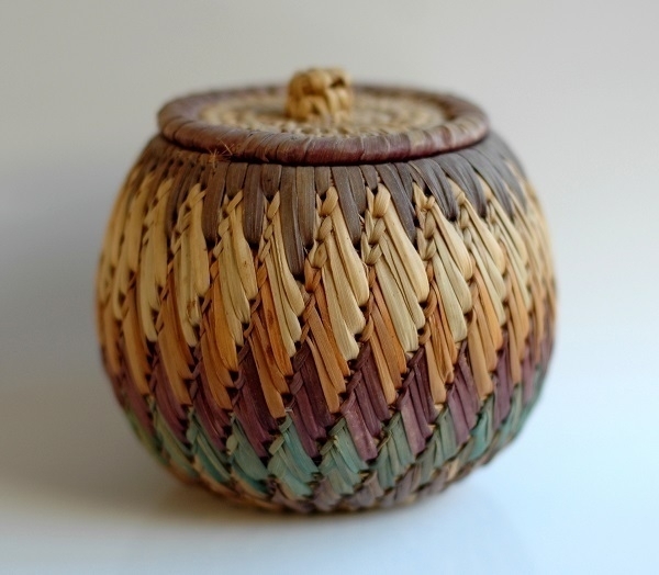
When I had my first blog I’d occasionally run giveaways on it to distribute books and CDs I no longer wanted or needed to whomever claimed them. In the wake of one of these giveaways, I received an email from a young man in Asmara, Eritrea, inquiring about one of the books. He was nominally a student in electrical engineering, he said, but the facilities and the course itself left a great deal to be desired. Having managed to learn English, he was eager to read English-language books, then in very short supply in Asmara. The volume he’d asked about was one I’d already sent elsewhere, but I posted off some others to him.
We maintained a sporadic email correspondence for six or seven years thereafter. Now and then I’d send him more books and other odds & ends, and he reciprocated by sending items in return. I was grateful for the bags of shiro powder he sent – my introduction to that foodstuff. Among the items he mailed to me was the decorative basket pictured above. It’s a beautifully-made thing, roughly 11cm/4⅓" tall, and with a similar diameter. The purplish colouration around the lid (which fits neatly and snugly) has faded slightly over the years. I used it to store garlic for a while until I stopped eating the stuff. Since then it’s been in need of a new purpose.
Brasil Universo
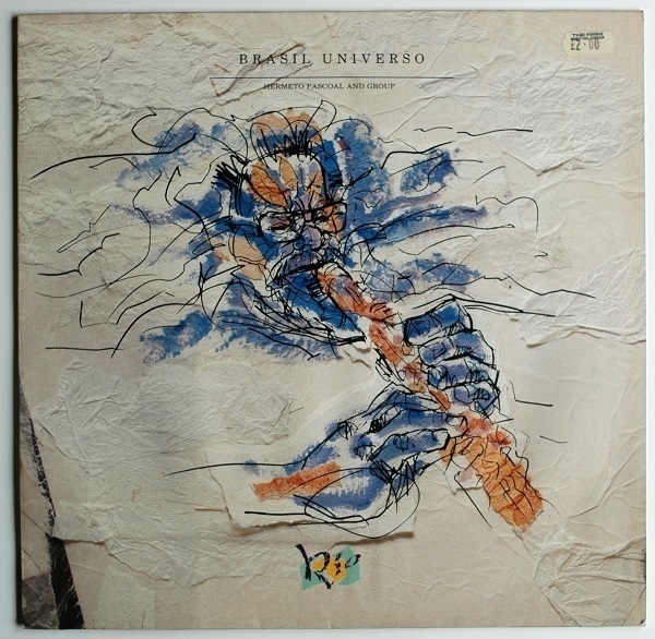
At ‘The Vinyl Spinner’ in Monmouth last month I took a chance on a late-’80s record by the Brazilian composer and multi-instrumentalist Hermeto Pascoal: Brasil Universo. It cost me £12, so I was relieved to find I greatly enjoyed it. The opening number ‘Mentalizando A Cruz’ begins with a few minutes of arresting solo piano before the rest of Pascoal’s band join in as he meanwhile hums and whistles, the whole thing eventually culminating in a wonky groove akin to off-kilter children’s music. On ‘Peixinho’ guest singer Jane Duboc contributes some vocalese as band-members ‘sing’ along with her on flute and saxophone.
Pascoal seems to be the sort of open-minded soul who can find music in almost any sound, and who, given the opportunity, will bring almost any sound into his music. The first track on side B, ‘O Tocador Quer Beber’, shimmies along irresistably for the most part like a popular accordion-powered tune from earlier in the 20th Century – aside from some brief freak-outs where voices and chicken noises come in to the mix. That’s followed by the somewhat discordant ‘Arapuá’, that would seem harder on the ears if it weren’t kept moving so briskly by its propulsive rhythms. The concluding tune, meanwhile, ‘Calma de Repente’ has some heartfelt vocals over acoustic guitars. It’s a varied album full of ideas & with many twists and turns.
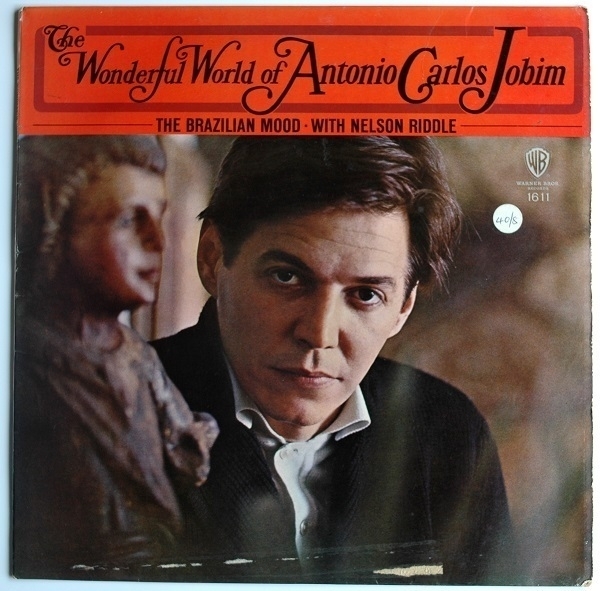
The same day, from the same place, I picked up something else with a Brazilian flavour in the shape of The Wonderful World Of Antonio Carlos Jobim (1964), where the great songwriter plays and sings his own tunes accompanied by master arranger Nelson Riddle and his orchestra. Reputedly Riddle’s favourite among the many records he worked on, it’s a thing of mellow beauty.
Chamomile
One day in the cafeteria at a former place of employment I saw a colleague sipping at a cup of some yellowish infusion, rather than her customary cappuccino. She told me it was chamomile tea. I’d heard of the stuff, but hadn’t hitherto seen anyone drink it. The stress of the place had been getting to her, she said, and she needed something without caffeine in it. Knocking back my usual espresso I felt slightly smug that I was weathering that workplace’s unreasonable demands a little better than her. Within a few weeks though, our roles were reversed. At the tail end of a nasty migraine I had a first taste of chamomile for myself.
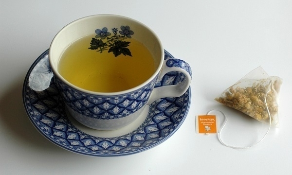
It was OK. Its softly bland flavour struck me as unexceptionable. Although a sub-optimal substitute for the proper tea and coffee I prefer, there are times – such as now – when it meets a need. In the picture is some Teapigs chamomile in a Spode cup decorated with a ‘Geranium’ pattern apparently first used ca. 1820. The cup and saucer were given to me about twelve years ago, and have seen very regular use ever since. Alas the cup has now developed a crack along one side so may not have much more mileage left in it.
Esparto
Esparto is a species of hardy, fibrous grass native to Iberia and the Maghreb. Its dried blades were traditionally used to make mats, baskets, rope and sandals (espadrilles were made from esparto). From the 1830s it begain to attract the attention of British paper-makers, who had been increasingly desperate for additional sources of raw material for paper pulp other than linen or cotton rags. The supply of rags was becoming ever less sufficient for the ramifying demands of imperial bureaucracy, steam-powered industry and burgeoning mass literacy. In 1850, one Thomas Routledge was the first to devise an economical means of manufacturing paper from esparto. By 1880, it was a mainstay of British paper-making, a position it retained for about a century, until wood-pulp came to predominate, as it had already done in most other paper-making nations.
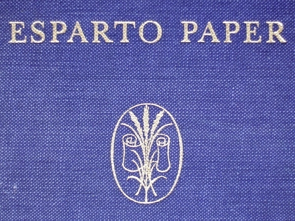
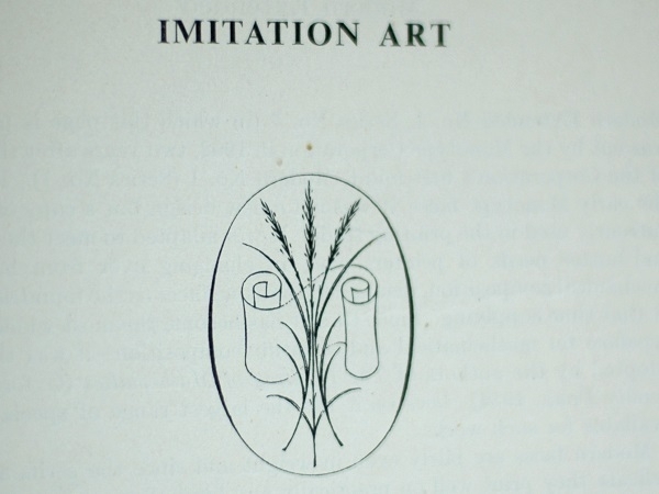
In 1956 came the publication, by ‘The Association of Makers of Esparto Papers’, of the book whose title is shown above. The volume opens with a pictorial guide following esparto from the harvesting of the grass to the reeling, cutting and stacking of the finished paper. At the end is a short treatise describing the same process. Between them are samples of several varieties of paper such as ‘Offset Cartridge’, ‘Deckle-Edge Antique Laid’, ‘Featherweight Laid’, ‘Duplicator Wove Tinted’, and, as below, ‘Imitation Art’. Art-paper was typically coated to achieve the kind of smooth, bright & glossy finish suitable for the reproduction of paintings, etc. By pressing and polishing uncoated paper it was possible to achieve an approximation of that effect, hence ‘Imitiation’ Art.
Blast

Above is a scan of a letterpress printing sample which incorporates phrases from Wyndham Lewis' Vorticist Manifesto, as expounded in the first of the two issues of BLAST magazine (1914). A friend with a long-standing interest in the various strands of modernism, and a specific fascination with Vorticism, had acquired his own late 19th century printing-press, which he set up in his garage. The sheet above is one of the several products of that press that have come my way. I’ve had a number of sets of letterheadings printed on it too, with, I hope, a new batch to come in the near future.
Specifically, the phrases above are from the 6th section of the first part of the Manifesto, which is on page 18 of the original magazine. Lewis was a man of many animosities, some of which seem to have softened over time – I’m not sure if his hostility toward the Victorian era & its artistic productions was among them.
Tartarus
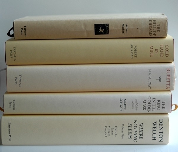
Five of the fifteen or so volumes in my library published by the excellent Tartarus Press are shown above. Going from top to bottom, the first was among my earliest Amazon purchases: a 1998 edition, bought when it was new, of Arthur Machen’s novel The Hill of Dreams. It’s a book that made a deep impression on me when I first read it in my twenties. This copy has been in a slightly distressed condition since a run in with my last-but-one dog. Tartarus have published many of Machen’s works, and have done likewise for Robert Aickman, whose collection Cold Hand in Mine comes next. This is a copy from their 2016 edition. Cold Hand in Mine was the first collection of Aickman’s stories I’d read, initially in a tatty paperback, and it remains my favourite of his books.
Third is a collection of Marcel Schwob’s fiction entitled The King in the Golden Mask (and Other Stories), as translated from the French by Iain White. It’s a 2012 edition based on one first published thirty years beforehand. Schwob, whose work was a notable influence on Jorge Luis Borges, has been a great favourite of mine since I first read a story of his in the Atlas Press anthology The Book of Masks twenty-five or so years ago. Next is one of Tartarus' original publications: N.A. Sulway’s intriguing novel Rupetta, with this, its first edition, dating from 2013. Last is one of two volumes (I do also have the other one) comprising the “complete short stories (and other related works)” by Denton Welch, issued in 2005 under the title Where Nothing Sleeps. As with the two volumes above it, this one’s spine has been sunned a shade or two lighter than when it was new.
Tents

Here’s a photo of some colourful tents in front of Caerphilly Castle. The tents were there for the duration of the ‘Big Cheese’ festival in 2010. It’s a Kodachrome slide which doesn’t really show that film to its best advantage. Had there been blue sky and brighter sunlight, I think it would have come out significantly better. In any light, moreover, green wasn’t Kodachrome’s best colour. Still, it’s as good a shot as I was going to get on the day.
Mediæval castles are two a penny in this part of the world, though admittedly the one at Caerphilly is on the larger side and fairly well-preserved. I’m not especially fond of the things myself: as with military architecture in general, I find castles to be rather dreary, unless thoroughly dilapidated – or designed to decorate rather than subjugate.
Filofax

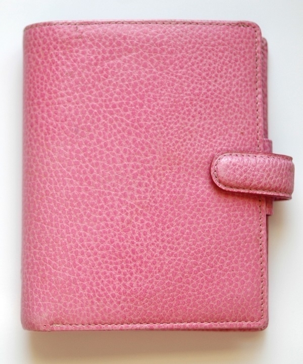
When I arrived in St. John’s eleven years ago, there must have seemed something suspicious about the two large bags of luggage I’d brought for a four or five-day stay. In any event I was asked to wait to be questioned by an immigration officer. Having asked about the reason for my visit (to attend a funeral), the lady began looking through my bags and then enquired, as she fished out a pink Filofax personal organiser, leafing through it, whether I’d visited the city before, and what connection I had with the place. I replied that I’d visited several times because it was my wife’s home town, and that she’d recently died and that it was her funeral I had come for. The Filofax had been hers, I added, whereupon the officer dropped it back into my bag like it was hot. After a few more questions about where I was staying and the date and location of the funeral, I was allowed to get on my way.
Among the bereaved are many who take comfort in being surrounded by their late loved ones' personal effects. I, on the other hand, found it less painful to give away or dispose of all but a very few of my wife’s things. The Filofax was one of the handful of mementoes I kept. I still use it to this day, if only as an address book. Filofaxes had their heyday in the ’80s, when they became fashionable accessories, but this one is only about twenty years old–from a time when there had already been several generations of electronic organisers, but before the advent of the smartphone. The Filofax brand is still current now: who is still buying their organisers today, I wonder?
Tyondai
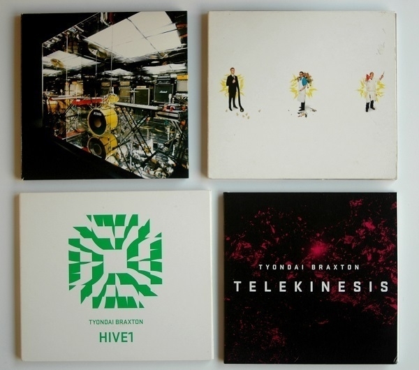
Above are four CDs of music by (or featuring) the American composer and musician Tyondai Braxton. My introduction to his work came via the 2007 album Mirrored by Battles (top left), whose front-man he was at the time. Its lead single ‘Atlas’ fascinated me, even if I only seldom returned to listen through the album as a whole. Two years later, Braxton’s solo album Central Market (top right) appeared, a highly original confection of electronic and ‘classical’ instrumentation. The unfamiliar blend of sounds and the peculiarly jaunty rhythms combine to disconcerting effect. I’m still not even sure I like this music, but now and again I’ll get drawn back to listen to it again.
HIVE1 (bottom left, 2015) is a predominantly electronic affair, with the sounds of synths and samplers augmented by percussion. I don’t know whether the percussion is likewise synthetic, or ‘organic’. ‘Gracka’ might be my favourite track on it. Unlike its predecessors, it’s a record I straightforwardly enjoy hearing all the way through. Bottom right is the most recent arrival of the four, ordered a couple of months ago, namely Telekinesis (2022). This is a single composition for large orchestra and chorus (with additional electric guitar and live electronics) that falls into four sections and has a total playing time of about 35 minutes. It’s music inspired by the anime Akira, without being any kind of retrospective soundtrack to it. I prefer the opening two ‘movements’ to the closing ones, but then I’m still getting to know the piece so my feelings could well change.
Kidderton Ash
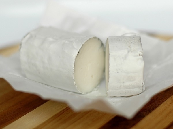
One day about six years ago, on my weekly trip to the supermarket, I found the shelves all but bare of milk and bread. There had been a light fall of snow, a relatively uncommon phenomenon hereabouts, but one which awakens an irrepressible urge in my compatriots to stock up on these two essential items at all costs, lest the inch of snow on the ground bring all food distribution to an immediate standstill. A few bottles of goats' milk were about all that remained: I felt the time was right to try some.
My first few sporadic encounters with goats' milk cheeses had not left a positive impression. I found their caprine tang decidedly off-putting. The milk too had an undeniable note of goat which did not appeal at first taste. On trying it a second and third time, however, my initial distaste gave way to tolerance. I wasn’t converted all at once, but this equivocal experience prompted me to start trying the occasional piece of goats' milk cheese with renewed curiosity. One of those that I grew to enjoy was ‘Kidderton Ash’, an opened pack of which is shown in the photo above.
It’s one of the many products sold by Butlers Farmhouse Cheeses, based in Lancashire’s Ribble Valley. The milk apparently comes from their farms, but I gather the cheese is made in Cheshire. The developing cheeses are sprinkled with ash, which reputedly encourages the formation of an edible rind. It’s a fairly mild cheese with just a slight hint of goatiness adding a little depth to its flavour.
Paper for Books, etc.
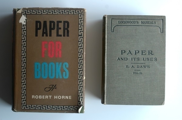
Here are a couple more of the books of paper samples I’ve collected. Robert Horne’s Paper for Books (‘A comprehensive survey of the various types of paper used in book production’) dates from 1961, and is a revised & enlarged edition that followed an original one in ‘53. There were multiple editions of Edward H. Dawe’s Paper and its Uses (‘A Treatise for Printers, Stationers and Others’) with my copy of vol. 2 belonging to the one issued in 1929. I’ve yet to acquire a matching copy of vol. 1. Dawe’s book covers more ground than Horne’s, with sections devoted to writing papers, cover & wrapping papers as well as printing papers.
The samples in Paper for Books are grouped into four sections, the first of which is concerned with “bulky book papers … from featherweights to smooth woves.” On the subject of so-called featherweight papers, Horne’s introductory text has some disparaging remarks which, I think, still have some relevance today (at least here in the UK). Such paper, he writes, “has as much guts, character and ‘feel’ as a wet blanket”. He continues:
Publishers rely on their customers, the booksellers, and booksellers have to please their customers, the public. They claim, in fact, that the man in the street … gauges the value of a book by its bulk: some would even, in their insistence on bulk, seem to claim that the public buys its books by the inch. A 320-page book at 12s. 6d., bulking half an inch, will stay on the shelf, while a 240-page book at 15s, bulking one inch, will sell out in no time! Or so some booksellers seem to believe.
Speaking for ourselves, we should much prefer a book to be slim, printed on good paper, so that it took up less room in the pocket, in a brief case, or on the shelf…. However, Featherweight appears to be what many publishers want, so we must continue to order it from the manufacturers. For there is no gainsaying that, substance for substance, Featherweight is the bulkiest paper made.
Bookmarks
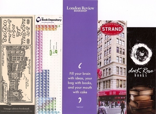
Above are five assorted bookmarks packed with books I’ve ordered on-line. From left to right:
- One of several Blackwell’s bookmarks I’ve accumulated.
- One with a Periodic Table of the Elements on it courtesy of The Book Depository, now defunct.
- A bookmark from the London Review Bookshop advising us to “Fill your brain with ideas, your bag with books, and your mouth with cake.”
- A bookmark from the famous Strand Books in New York (“18 Miles of Books”).
- One from Dark Rose Books whose tagline, on the reverse of the bookmark, is “Sourcing the best gothic books to satisfy your dark side.”