Red
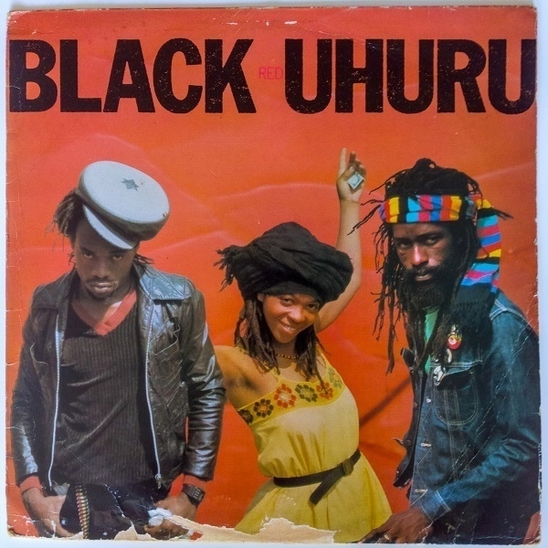
At the Oxfam shop in Thornbury recently, I spotted a copy of the LP Red by Black Uhuru. It was priced at £3.99, which didn’t seem too much to pay. I already owned a copy of the group’s 1980 album Sinsemilla, so getting the follow-up struck me as a fine idea. Noting the damage to the cover (shown above) I thought I’d better first check the state of the vinyl within. A pleasant surprise was in store - a plain red inner sleeve contained a bright red record, which, moreover, appeared to be in good order.
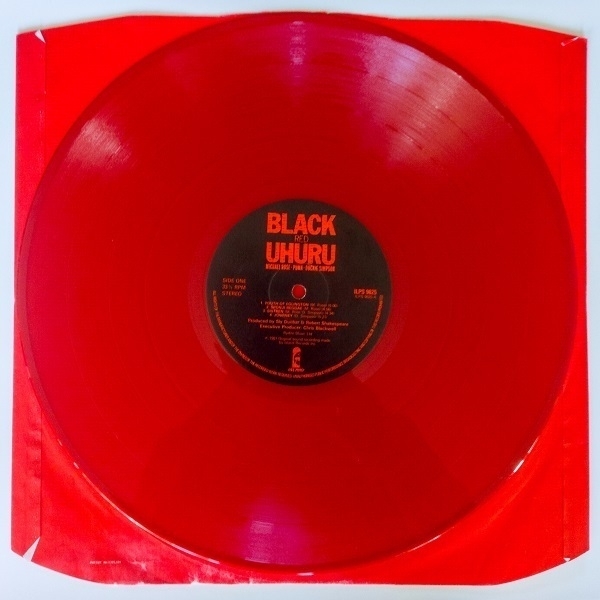
For just short of £10, I picked up Red, along with two classical piano LPs. On getting them home, the latter both proved to be disappointments: even Sviatoslav Richter couldn’t sell me on the merits of a couple of early Beethoven sonatas; and the sound quality of the early ’60s Chopin recital by Adam Harasiewicz left much to be desired. Black Uhuru, on the other hand, sounded great!
Costières de Nîmes
Lately I’ve been enjoying some Rhône wines, most of them courtesy of the local budget supermarkets. One I’ve returned to a few times is the 2021 Chassaux et Fils Costières de Nîmes stocked at Aldi. My last bottle cost me £6.49. I wasn’t sure why this one appealed to me more than, for example, a somewhat costlier Vacqueyras, until, reading a three-sentence review of the wine by Tina Gellie at Decanter, I learned that it’s a blend of 62% Syrah, 26% Grenache and 6% Marselan grapes. As a general rule I slightly prefer Syrah to Grenache, with the latter oftener predominating in southern Rhône wines.
Not that the Costières de Nîmes region is, strictly speaking, actually in the Rhône valley. Wikipedia explains that some ‘redistricting’ in 2004 saw it transferred from the Languedoc-Roussillon wine region to the Rhône one, as “its wines are more reflective of the typical characteristics of Rhône wines than of the Languedoc”. In any event, this wine suits my tastes very well. Gellie attributes it with “a lovely streak of tangy blackberry acidity that really lifts and refreshes the spicy palate, which runs the gamut of crunchy redcurrant to ripe bramble”, while David Williams at The Guardian reckons it “full of satisfying dark fruit and spice”. For myself I appreciate its welcoming warmth & hints of darker depths.
The bottle features an embossed emblem at its neck - a stylized crocodile and palm tree. Wondering about its significance, I gathered that “when the Ancient Romans developed the settlement ‘Colonia Nemausus’, which would become Nîmes, they chose as its emblem a Nile Crocodile chained to a palm tree. The symbol commemorates the Emperor Augustus, who fortified the city, and his victory over Mark Antony and Cleopatra in Egypt. Despite large reptiles not being native to Southern France, the crocodile has remained on the Nîmes coat of arms.”
Question
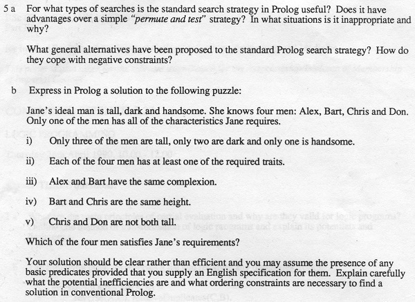
Shown above is Question 5 from the examination paper I was given in April 1990, for ‘Computing Science 3.27: Logic Programming’, part of the BSc(Eng) course I was taking at Imperial College of Science, Technology and Medicine, then affiliated with the University of London. That paper is one of four still in my possession all these years later: I think I might finally get around to throwing them away. It’s not like I did particularly well in these exams - I’d been on track for a 2:1 after my first two years, but had rather lost interest by the start of the third and final year, which, inconveniently, contributed 50% of the overall degree score. I ended up with a ‘Desmond’; a 2:2, which seemed to me a fair reflection of the work I’d put in to it.
I think the answer to the puzzle in part (b) of the question is Chris. My reasoning is as follows. We know from point (i) that three of the men are tall and one is short - so when we are told in point (iv) that Bart and Chris are the same height, they must surely both be tall. And as point (v) says Chris and Don are not both tall, that must mean Don is the short one. It also means that Don can’t be good-looking, as only one of the men has all three desired characteristics, and only one of the four is handsome. In point (iii) we see Alex and Bart have the same complexion, as must, we can deduce, Chris and Don, given that two of the men are dark and two pale. Returning to the proviso that each man must be at least tall or dark or handsome, it tells us that short & plain Don must be dark, therefore Chris can’t be pale; and hence he must also be the pretty boy.
How close I might have got to expressing the above in Prolog I do not recall. I had some familiarity with that language, which at no point appeared to catch on outside academia. At least mentioning it on my CV never did me any good. Indeed, there was regrettably little I could take from that degree as a whole which was of any use in my subsequent career as a software developer.
Croxley Writing And Ledger Papers
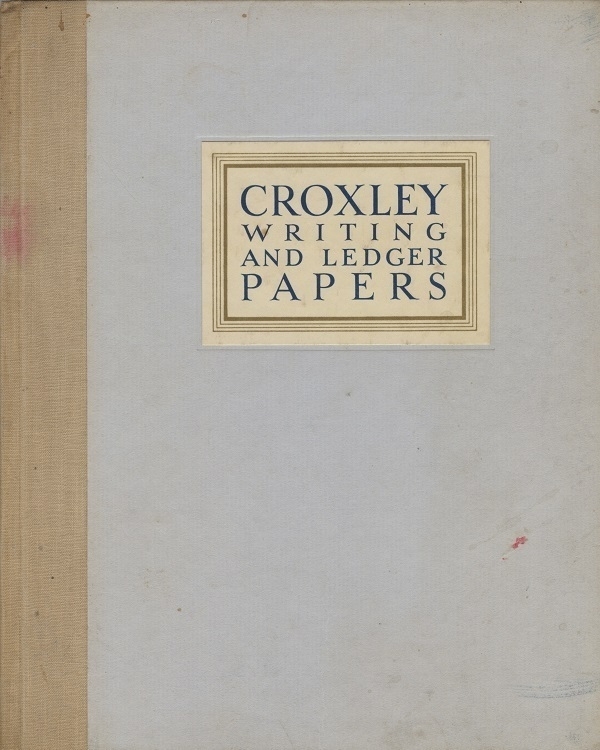
Another book of paper samples, this slim volume of Croxley Writing and Ledger Papers comprises, after some introductory matter, five leaves apiece of six different papers: Lion Loan, Three Candlesticks Parchment, Colne Valley Parchment, Croxley Lion Ledger, Croxley Extra Strong and Croxley Law Paper. These were all products of the Croxley mills operated by John Dickinson & Co. Ltd. There’s no publication date, but there are sample texts within the book bearing dates in 1937 & ‘38, so the latter year seems a likely candidate.
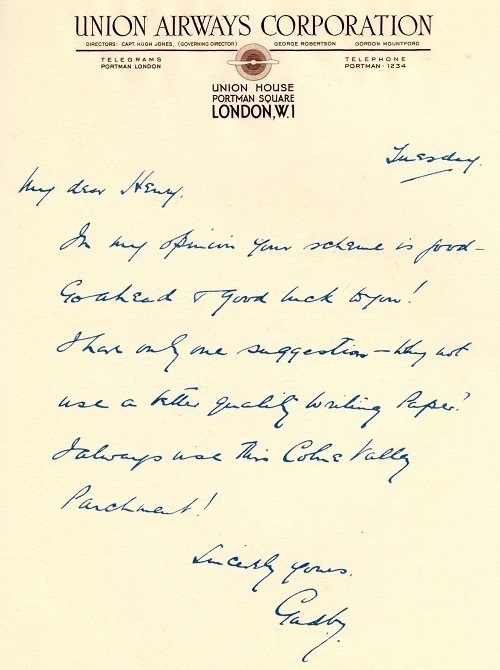
The sample texts are a well thought-out selection of pseudo-typewritten letters and ersatz handwritten ones; along with mocked-up legal and commercial documents. I particularly like the fake Art Deco letterheading in the sample above for the “Union Airways Corporation”, and the none-too-legible writing beneath it: “My dear Henry, In my opinion your scheme is good - Go ahead and good luck to you! I have only one suggestion–why not use a better quality writing paper? I always use this Colne Valley Parchment!”
Case de Lux
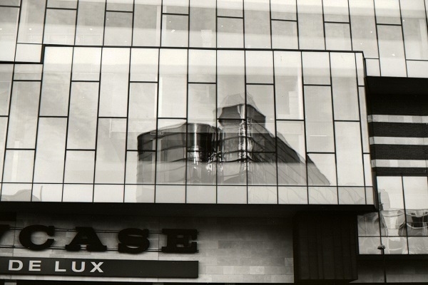
There are images that look good when framed in the camera’s viewfinder, only to disappoint us when we see what has actually been captured. And there are photographs that disappoint us at first sight, only to intrigue us on subsequent re-acquaintance. The picture above is an example of both of these phenomena.
In the glass frontage of the Showcase Cinema de Lux in central Bristol, a reflection of a building opposite which almost appears as though floating, untethered from terra firma. It’s a frame of Adox CMS 20 document film/microfilm, taken with my Nikon F80 camera in late 2011. It was on a roll that I developed myself at home, using dilute (1+200) Rodinal.
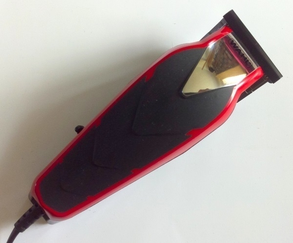
Baldfader
When I went to the barber’s on Valentine’s Day 2020, it didn’t occur to me that it may have been my last such visit. At the time I was in the habit of getting buzz-cuts every other month, which means I was ready for another one in April. By then, of course, the first round of Covid-related restrictions were in full effect. No barbers were open, nor would they be for some time therafter.
I decided I’d try cutting my own hair. I had some cordless clippers, acquired for facial-hair trimming. Alas, they proved to be quite unequal to the task at hand. In the end I resorted to shaving my head with a safety razor, which I found awkward and time-consuming to do. Nor were the results immediately encouraging: staring at an entirely bald pate in the mirror for the first time, I did not like what I saw.
But then, within a few days, with just a first hint of new growth in evidence, I felt it didn’t look bad at all. Being in possession of a big & bulby skull, I’d hitherto been apprehensive about exposing it more nakedly (progressive hair-loss, meanwhile, was giving me less choice in the matter). While weighing up the merits of a shorter hairstyle, it also occurred to me that I might, under the cover of lockdown isolation, try cultivating a moustache (a topic for another post).
Going on-line, I sought to buy some proper clippers. With a great many other people facing similar predicaments, supply was short, and, in some quarters, prices were inflated. At the Wahl website, from the limited stock they had available, I opted to buy a Baldfader Plus, a model apparently devised with close trimming of afro hair in mind, which mine (straight, fine & thinning) very much isn’t. I reckoned that if it could handle thicker hair with ease, mine oughtn’t pose it any problems.
Indeed it worked admirably well, and ever since I’ve been self-inflicting very short buzz-cuts every five weeks or so. Earlier this year I dropped & damaged the original clippers, after which they weren’t quite right. By way of replacement I ordered a second Baldfader.
Hadal Zone
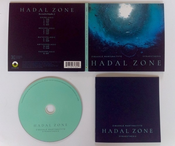
Newly-arrived this week, Hadal Zone, a recently-released album from Lithuanian-born composer Žibuoklė Martinaitytė. While it’s music largely free of melodic or rhythmic hooks, it is nevertheless a compelling sonic experience, one based on the simple concept of a descent to the uttermost depths of the ocean.
After a brief but unsettling introduction, the following eleven tracks lead the listener from the daylit open ocean ever downward, with ever-deeper pitches to the fore as the water, as it were, grows darker, colder & more compressed. The instrumental line up of bass clarinet, cello, piano, double bass and tuba is augmented by electronically-mediated vocal sounds. While at times the music expresses agitation & motion, an uneasy sense of calm is more prevalent. The final tracks–where things are at their deepest & darkest–I find the most fascinating. I’d love to hear them issuing from a large & powerful sound-system; there’s only so low my small bookshelf speakers can go.
The piece comes across as a near-counterpart to John Luther Adams' Sila: the Breath of the World which moves in the opposite direction, from low sounds to high ones over a similar ca. one-hour duration (although Sila, is arguably more abstract than this work). I first heard of Martinaitytė last year, having been intrigued by a review of her album Saudade, though I ultimately struggled to appreciate the works on that disc after buying a copy. Around the same time I’d encountered the then-unfamiliar term ‘Hadal Zone’ from its use as a title to the closing section of Julia Armfield’s unusual and interesting novel Our Wives Under the Sea, which also revolves around a voyage to the lowest oceanic depths.
La Perfetta Sinfonia
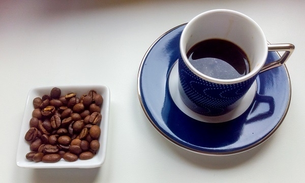
After nine months' leisurely sampling of the espresso coffee-bean blends readily-available at the local supermarkets, I have settled on Lavazza Qualità Oro as my preferred default. In my erstwhile coffee phase of the ’90s and ’00s, the same company’s Qualità Rossa was my usual choice - so my tastes haven’t travelled very far in the interim. I’m also partial to Illy’s Classico blend, but that’s somewhat more expensive.
Some Qualità Oro is shown above, in one of a set of four demi-tasse cups from a line called Grand Hotel by Andrew Martin (who don’t seem to be in the crockery business any more). I bought them, apparently unused, & still in their original gift-box from a charity shop in Monmouth for £8 total.
On the coffee’s packaging is the none-too-meaningful slogan “Perfect Symphony”: not the kind of phrase I can imagine any British food or drink supplier using. Then again, I’d been blithely unaware that it was an Ed Sheeran song title: for all I know, perhaps his words appear subliminally on all manner of grocery items. On Lavazza’s Italian website, there is a bit more context: “La perfetta sinfonia del gusto che puoi assaporare ogni giorno” (“the perfect symphony of flavour you can savour every day”).
Broadleaf Books
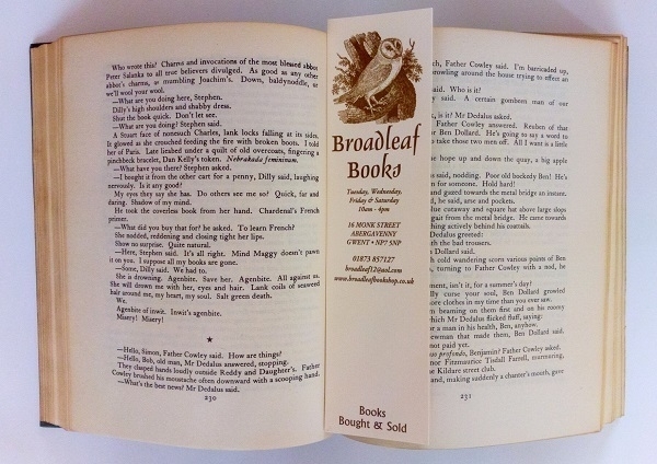
Really good second-hand bookshops are a rare & endangered species nowadays. My favourite such establishment in this part of the world is Broadleaf Books in Abergavenny. Their stock is arranged in thematic sections, with the volumes in each section not necessarily following any obvious order. This frustrates systematic search, as it meanwhile rewards serendipitous discovery. With systematic search very easily done on-line, this seems to me an ideal state of affairs. I’m not in Abergavenny too often, but when I go, I seldom leave Broadleaf without making a purchase.
One of their bookmarks is shown above, resting in an open copy of James Joyce’s Ulysses (specifically a mid-’50s reprint of the Bodley Head edition), that I picked up on my last visit there. I’ve read Ulysses about 1¾ times: once while in university, and then again a decade later, if only up to some point in the middle of the so-called ‘Circe’ chapter. I’d then put my paperback copy into the seat pocket in front of me, whence I forgot to retrieve it on leaving the plane. I very much doubt I’ll make a third attempt at reading it from cover to cover, but there are some chapters I’ll be delighted to revisit.
Two Blue Dukes
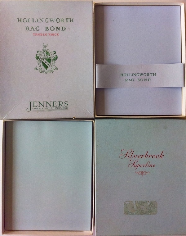
Shown above are two boxes of Duke-sized (5½"x7") writing paper in slightly different shades of pale blue. I acquired them together in a single ebay purchase. The Silverbrook Superfine paper is a shade often called ‘azure’ (in relation to stationery), with the Hollingworth Rag Bond a slightly deeper tint. The latter is watermarked, the former not.
‘Silverbrook’ was a brand-name once associated with F. Keay & Co. of Birmingham, about whom I know practically nothing. Nor do I know what ‘superfine’ might have meant to the erstwhile paper-buyer–if anything–beyond some vague expectation of higher quality. Many paper-makers listed ‘fine’ and ‘superfine’ papers among their product-lines (and even ‘extra superfine’ wasn’t unheard of). If those terms had any more meaningful definition, I’m unaware of it.
Hollingworth on the other hand had a long-held reputation for first-rate products. Rag-based papers were typically higher-end, expensive ones. Jenners Ltd. of Princes St., Edinburgh (whose name is printed on the box), was for well over a century that city’s principal department store. Hollingworth also made paper for Harrods. ‘Bank’, ‘Bond’ and ‘Loan’ were terms for paper weights: Banks were thin and light; Loans were thicker, heavier and more durable; Bonds were of normal medium weight, akin to modern office/copier paper.
Neither box of paper came with any matching envelopes. Fortunately, Duke-sized envelopes in blue haven’t been too hard to find on ebay.
Storybooks
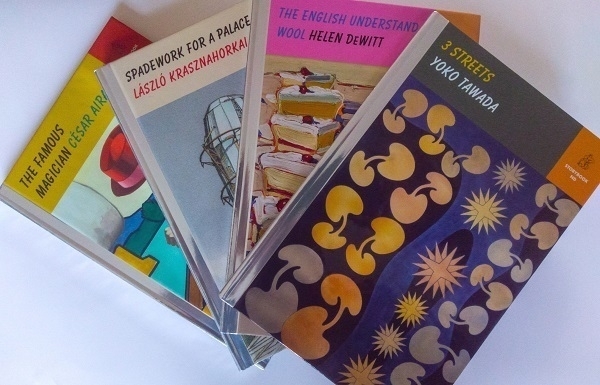
Here are four of the six books published in New Directions' Storybook ND series last year. These are short texts in un-jacketed glossy hardcover volumes whose design is vaguely reminiscent of certain children’s books. Each one, however, administers a small dose of more-or-less serious literature. “Storybook ND: the pleasure of reading a great book from cover to cover in an afternoon” as they put it. I’d learned about the series while it was still in preparation and was ready when the first batch were issued to place some orders. Having a slight preference for short & sharp books over big & baggy ones; and already being a fan of a few of the featured authors, it was an initiative unusually well-tailored to my tastes.
Given my proclivities for the somewhat obscure and unpopular, I have to wonder how well it will thrive, and how much more the series might grow. A further two volumes, at least, have appeared this year, which, I suppose, means at least some other readers must be ready to cough up the $17.95 (or equivalent) per volume, which is by no means the very cheapest means of obtaining an afternoon’s entertainment.
Yoko Tawada was the only one of the four authors above whose work I hadn’t previously encountered. 3 Streets comprises a trio of diverting and occasionally thought-provoking ghost stories set in her current home city of Berlin. I must have read a dozen or so of César Aira’s numerous books: while The Famous Magician isn’t among my very favourites, I nevertheless enjoyed it a good deal. László Krasznahorkai’s Spadework for a Palace is a characteristically intense and enthrallingly splenetic piece, whose obsessive narrator fixates on his famous namesake (Herman Melville) and the unbuilt works of an architect called Lebbeus Woods. My favourite of the set was Helen DeWitt’s The English Understand Wool, which, like her novel The Last Samurai has to do (in part at least) with the benefits of an unconventional education - for me it was an untrammelled joy to read.
Movement

When I still had my Nikon D80 camera, a favourite lens I often used with it was the 60mm f/2.8 Micro-Nikkor AF-D: a relatively inexpensive but excellent macro lens. Among the close-up shots I took with it is the one above of a Peseux calibre 320 Swiss watch movement that powered the timepiece I inherited from my father-in-law in 2007. It’s a cropped image including about 60% of the original frame.
He’d bought the watch in London in the late ’50s when he was still in the merchant marine. It was his prize possession: the one thing of value he retained through long spells of adversity, much of which was of the self-inflicted kind. When he died, his effects amounted to little more than a wallet, a Zippo lighter and the watch. I kept it for seven years or so, wearing it for about half that time, before passing it along to his grand-daughter.
TI-3500
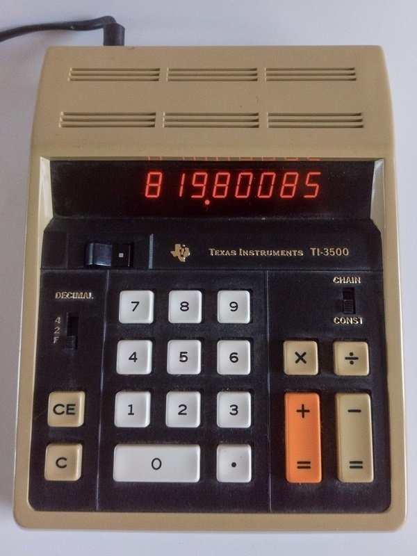
If £98,376,102 were to be divided equally between 120,000 people, I wondered: how much would each person get? I went to my Texas Instruments TI-3500 calculator in search of an answer, which turned out to be £819.80. A lucky minority of 10,200 people could be given an extra penny.
The TI-3500 was introduced in late 1972 as part of Texas Instruments' Datamath line of devices. I bought one because I do like an orange ‘Panaplex’ display. Something with Nixie tubes might have been even nicer, but they’re highly collectable and consequently tend to be expensive.
As mentioned previously, I have an upstairs calculator and a downstairs one, with the TI-3500 currently fulfilling the latter role.
Experimental Doom
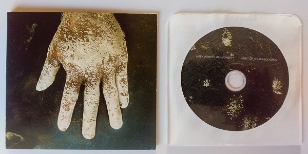
On asking for recommendations for music outside the styles I habitually favour, a correspondent suggested the track ‘Run Priest Run’ by Chicago-based outfit Wrekmeister Harmonies. I loved it, and went hastily to ebay to obtain a copy of the 2015 album that features it: Night of Your Ascension. I bought a lightly-used CD copy for £4 plus postage.
There are only two tracks on the album. First up is ‘Night of Your Ascension’ itself, which runs to over half an hour, and is apparently inspired by the composer and murderer Carlo Gesualdo. It’s a complex work with numerous moving parts, but still a gripping and absorbing one. At about seventeen minutes' duration, ‘Run Priest Run’ is no brief coda, providing a more unified exercise in bludgeoning menace.
Attempts to categorise Wrekmeister’s music tend to involve the words ‘experimental’, ‘drone’ and ‘doom’. Their name, I gather, is derived from that of Béla Tarr’s long & slow movie Werckmeister Harmonies (2000), which I have not seen, although I have read the novel on which it’s based: László Krasznahorkai’s The Melancholy of Resistance. Krasnahorkai has been quoted as saying “You will never go wrong anticipating doom in my books, any more than you’ll go wrong in anticipating doom in ordinary life”–so that’s a chain of inspiration that seems entirely apt.
Garlic Nostalgia
For years I was sporadically troubled by localised skin irritation near the tip of my left index finger, and, less often (and to a lesser extent), on my middle finger and thumb. It came and went; oftener worse in winter than summer. None of the potential causes I could think of explained the peculiar positional specificity of it, until, at length, I realised that the parts affected were those that held the garlic cloves as I chopped them with the knife held in my right hand.
There had meanwhile been an increasing incidence of digestive turmoil, which, on reflection, had oftentimes correlated with meals prominently featuring garlic or other alliums. While I’ve had no formal diagnosis as confirmation, I strongly believe I have developed an allergy or sensitivity of some kind to these very delicious vegetables, and hence, with great regret, I began to forsake them. Perhaps I was lightly bitten at some point by an ineffectual vampire.
Show me a soup or stew made without garlic or onion, and it will be one I don’t want to eat. Removing alliums from my diet has severely cramped my culinary style. I feel better physically, but it makes me sad if I stop to think about it; and walking past a restaurant from which a garlicky aroma emanates will provoke in me a pungent pang of nostalgia for the cloven past.
Tickets Please
It was December 1997 and I really needed to go to the bank. The problem was that I had latterly moved back to the UK and the bank was in Italy, where I had been working and living for the previous two years. Some weeks after departing, my former employers had made a final payment into that Italian account, which I had no ready way to access. I had funds coming from my new job, but not soon enough. All that remained was a diminishing sliver of available credit.
These adverse circumstances were exacerbated by procrastination, and by an anxious aversion to just making some phone-calls to to try to seek alternative arrangements. I decided on a Saturday morning I’d go to Heathrow airport and get myself a standby ticket to Rome, failing to realise (as I learned when I got there), that all flights were full and in any case fares were right up at a seasonal peak I could in no way afford. After some blank panic, my wishful thinking returned: I’d take the train to Rome - that would be cheaper.
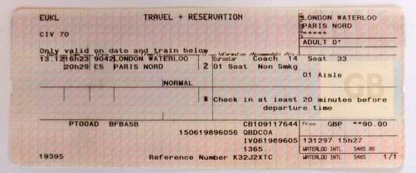
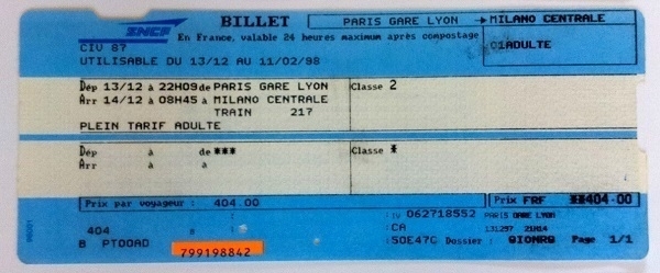
From Heathrow I took the tube into central London, making my way to Waterloo Station, in those days the terminus for the Eurostar service to Paris. A one-way ticket cost me £90. The train departed mid-afternoon, and deposited me at Paris Gare du Nord at half past eight in the evening. I learned somehow that there were trains to Milan from Gare de Lyon, so crossed the city via Metro or RER, half-resigned to spending the night at some station or other. Luck was on my side: there was an overnight service leaving at 22:09. The fare was a mere 404F.
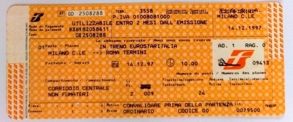
It was a slow and uncomfortable trip, but I did manage to sleep sitting up for a couple of hours before dawn. At a quarter to nine on Sunday morning I was in Milan, with time for a brioche and a cappuccino before catching the ten o’clock train to Rome. That cost me a very reasonable 79,500 Lire for the four-hour trip. Once at my destination I booked into a hotel near Stazione Termini despite having insufficient leeway left on my credit card to pay for it.
Monday morning I set out to exurban Settecamini where my branch was located, and succeeded in closing my account and withdrawing the ten million or so remaining lire without incident. With a pocketful of cash I took a taxi to the airport and boarded the next flight back to Heathrow, making fulsome apologies for my unplanned absence while on my way back to the office, where I arrived early that afternoon. My cashflow troubles dragged on fitfully for a few months thereafter, but at least no more impromptu international travel was needed.
I held on to the train tickets as a keepsake of an adventure than could very easily have become a misadventure.
Orphan Envelopes

When using up sets of writing paper and envelopes, I find there will almost always be at least one envelope left over once the sheets of paper are all gone. The picture above shows a sampling of some of the ‘orphan’ leftover envelopes I’ve held on to. A couple of them are relatively new, while some others are probably more than fifty years old.
Many of them are tissue-lined. The envelope to the top left and the green one overlapping it were both made by Elco. The latter has a deep brown lining, giving it a mint choc chip colour-scheme. The small blue envelope top-centre was made by G. Lalo in France, and has a delightful patterned lining. Also French is the ‘Amaris EVA’ envelope top-right with the asymmetric flap. It has a burgundy lining.
The red envelope was from a Tiffany-branded set made by Rössler in Germany. The impractically deep blue one came from an ‘Original Crown Mill’ set, made in Belgium. The envelope with the pink flap has a cartoon design of The Pink Panther on the front; the one to its right with the hammered finish has a lovely deep blue lining: I believe it to be French but don’t know who made it. The lilac envelope underneath those two came from a set of ‘Churston Deckle’ stationery, made in England.
Red as Blood
In my late teens I borrowed Tanith Lee’s short-story collection Red As Blood from the library. “Nine devilishly twisted fairy tales as the Brothers Grimm never dared to tell them” runs the blurb, hence the slightly laboured subtitle or, Tales from the Sisters Grimmer. While I didn’t enjoy all the stories equally, the book left a positive & lasting overall impression and lingered indistinctly in my memory for decades afterwards.
Last year I bought two other volumes of her short fiction: Tempting the Gods and Hunting the Shadows. It’s commonplace for short story collections to be mixed bags, but in these books I found an unusually (dramatically) wide variance between how much I loved the best stories and how actively I disliked the worst of them. Lee could write very fine prose - with something of a purplish hue - but seems to have been equally content to turn out pulpy pot-boilers. Literary finesse hadn’t been her only yardstick, whereas it was, in retrospect, the only one I had brought along.
Last month I obtained a copy of Red As Blood to re-read, some thirty-seven years on from my first encounter with it. Lee’s revisions, inversions & outright perversions of the traditional tales struck me as more successful (or at least, more enjoyable) than Angela Carter’s traversal of similar terrain in The Bloody Chamber. Again I preferred the slightly more literary pieces (especially the memorably eerie ‘Black as Ink’) to the pulpier ones (e.g. ‘Wolfland’), but on this occasion, helped by the distant echoes coming back from my first encounter with the book, I was more content to go with the flow and enjoy all of the stories on something more like their own terms.
I still have yet to read any of Lee’s novels. If I were to make a start on them I’d have to be selective, as neither free time nor shelf-space are in indefinite supply - and she wrote dozens of the things.
Eau de Parfum

Of all the stupid ideas for pastimes and hobbies I’ve come up with, the notion that I might dabble in perfumery must be up there with the most ridiculous of them. I had read a few fascinating books on the subject and didn’t see why I couldn’t try it for myself. Never mind letting a total lack of experience & ability stand in my way. Nor did I pause to reflect that, if anything, my olfactory acuity has tended to be below average.
I must have spent several hundred pounds stocking up on dozens of essential oils and essences, plus assorted bases & accessories; then going on to measure, mix, blend and sniff away for a month or two until an onslaught of migraines and the onset of new allergy symptoms pushed home the point that perhaps it wasn’t going to work out. Before giving up the ghost, I had managed to come up with a few concoctions I felt were worthwhile, the best of them an eau de perfum I made for my wife. Poured into a handmade bottle (ordered from a glassblower called Malcolm Sutcliffe, now seemingly retired), it formed part of a birthday present.
She was delighted with the gift, and, even if the fragrance might not have been something she’d otherwise have chosen for herself, she did enjoy wearing it from time to time. The bottle, with a small amount of the perfume left inside, ultimately became more of an ornament. Taking brightly backlit photographs of it brought out the beautiful detail within the glass that was less evident under normal illumination. The image above is a digital one taken with a Nikon D80, where the original frame was cropped and then subjected to a little more light photoshoppery.
Ellis in Wonderland
A few of my recent record buys have featured the virtuoso pianist Oscar Peterson as a more-or-less unobtrusive accompanist. On Soulville (1958, mentioned recently), Ben Webster was backed by Peterson’s trio, augmented by west coast drummer Stan Levey. On Anita Sings Jazz (1957, a re-titled UK pressing of Anita Sings the Most) Anita O’Day was accompanied by Peterson, again with his bassist Ray Brown and guitarist Herb Ellis, but this time joined by Milt Holland on the drums. It’s a record where the pianist played a more prominent role, with some wonderful interplay between him and O’Day.
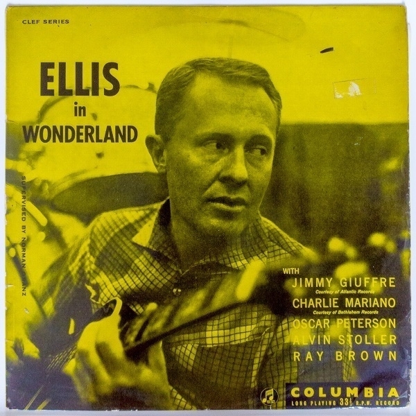
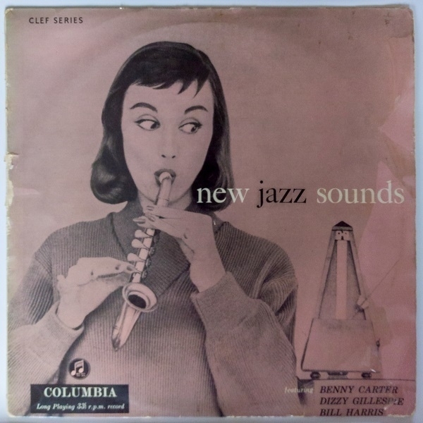
It was Herb Ellis’s turn in the spotlight on Ellis in Wonderland (1956, pictured above), which was the guitarist’s first LP as leader. With their roles reversed, Peterson stayed very much in the background. To be fair, there was plenty going on in the foreground with solos variously by Ellis, and by the three horn-players involved: Harry ‘Sweets’ Edison, Charlie Mariano and Jimmy Giuffre (the last a college-friend of the guitarist). Alvin Stoller played the drums. Peterson, Brown & Ellis were also part of the ensemble in five of the seven tracks on New Jazz Sounds (1955, below), where alto saxophonist Benny Carter was credited as leader. It’s a somewhat uneven record that’s at its best in an opening pair of tracks which benefit from an ebullient guest appearance by trumpet legend Dizzy Gillespie.
XO
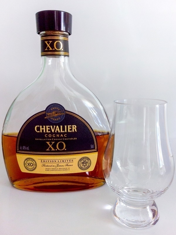
I was working as a waiter in a cocktail bar when I first sampled an XO cognac. It was late 1991 and I was one of the casual staff helping out during the pre-Christmas rush at the bar at Cardiff’s Holiday Inn (which later became the Marriott). I had to wear black trousers and a white shirt with a name-tag pinned to it, and one of those little fake bow-ties with a velcro fastener. At the end of one particularly gruelling shift, the bar manager told us we could each have one free drink of whatever we wanted from their stock (champagnes excepted). I opted to try one of the costliest spirits on offer - a measure of whichever XO it was they had.
I enjoyed it very much: a rare luxury in what had been a dismal year. Since then, though, I’ve very seldom repeated the experience. Other drinks almost always seemed to offer more appealing value for money. At the local Aldi around the turn of the year, however, their Chevalier XO offering was on sale. Even then it was still the best part of £30 for a 50cl bottle, but with some Yuletide funds left unspent I bought a bottle. It really is remarkably delicious. Alas, I don’t have a dedicated brandy glass so make do with the one in the photo. Naturally one wonders which cognac this is: a well-known brand that likewise begins with ‘C’ and ends with ‘r’?
Sputnik
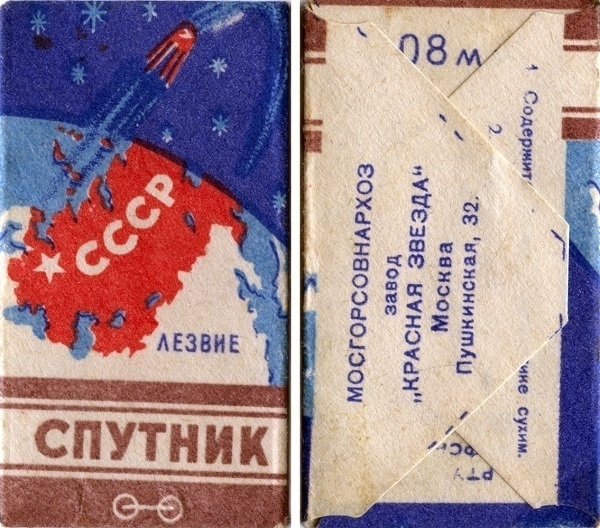
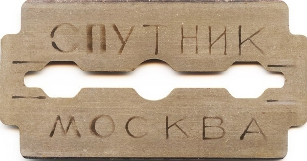
When I bought a vintage Hungarian-made safety razor from an ebay seller, included with it was a single Спутник (Sputnik) Soviet-era blade. The front and back of the blade’s wrapper are shown above. The razor wasn’t a great success, providing so mild an attack it was laborious getting any kind of close shave with the thing. Perhaps it would have worked better with the Sputnik installed, but I wasn’t so brave as to try it. The razor did at least come in useful that once I shaved my head during the first Covid lockdown.
Midas Touch
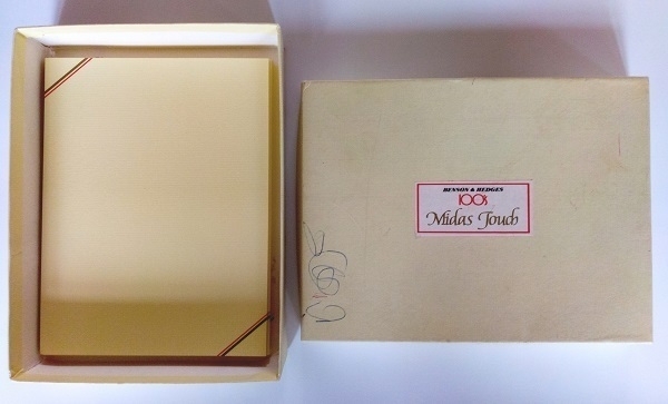
To be filed under “the past is a foreign country”, here we have some cigarette-themed writing paper. A promotional item, perhaps? Something one might obtain in exchange for the coupons one had been saving up? A gift for the discerning nicotine enthusiast in one’s life? Who knows, but here it is - obtained a couple of years ago from an ebay seller, each sheet decorated with brown and red diagonal stripes. I can’t be sure it dates from the ’70s, but it certainly looks the part.
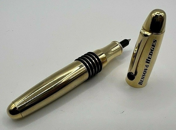
The paper is good-quality stuff in 6"x8" (‘Albert Quarto’) sheets bearing John Dickinson & Co’s Three Candlesticks 1649 watermark. The box has some ballpen scribbles courtesy of a previous owner: possibly done with a pen like this…
Big Dictionary Energy
Dictionaries. I was twenty-five when I acquired my first big one: a Shorter Oxford English Dictionary in two hefty volumes. I can still remember the discomfort of carrying the cumbrous tomes the twenty minutes' walk home from Blackwell’s bookshop in Cardiff. Relative to my disposable income at the time they had been expensive - but I considered them to be an investment in words, and expected they’d last me half a lifetime.
Twenty years later I gave them to my Dad. He was looking for something to help him tackle the newspaper’s daily crossword, and, while the SOED was more dictionary than he needed, it seemed surplus to my own requirements. After all, times had changed such that my library card gave me access to the entire on-line edition of the ever-growing, ever-changing Oxford English Dictionary, which, if a frozen snapshot of it were to be printed, might easily fill two dozen even heftier volumes.
Even so, when I happened upon a micrographically-printed ‘compact’ edition of the original OED in a Chepstow junkshop a few months later I did not resist the absurd compulsion to take it home. It was a ridiculous and gratuitous purchase, but it was also a very cheap one at only £5 for the two volumes, their tatty slipcase and the plastic hand-held magnifier to facilitiate reading the tiny, tiny print.
The absurdity was assuaged when, within a year of that purchase, local government budget cuts obliged local libraries here to withdraw access to the online OED. I no longer felt quite so foolish in holding on to my really big dictionary. In the meantime it had been joined on the shelf by a similarly ‘compact’ edition of the Dictionary of National Biography, also in two volumes, cased & with a magnifier, which an ebay seller had parted with for about £25.
It’s relatively seldom that I have recourse to either reference, yet it comforts me somehow to have all of that information available off-line, should it be needed. Having acquired the DNB I then sought out a further five (regular-sized) supplementary volumes that had post-dated it, but pre-dated the work’s once-controversial second edition. More recently still, a copy of the original Compact OED’s supplementary third volume turned up at my local charity shop, for which the asking price was all of £2.
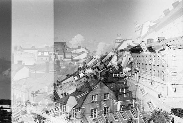
Double Exposures

Digitally-manipulated photography has meant that composite images have for some time been practically ubiquitous. One kind of composite image less in evidence than in years past, however, is the double-exposure (or multiple-exposure) native to film photography. Skilled professionals could exploit such re-exposures to striking effect, but these photos were much oftener the accidental results of error or malfunction. An example is the shot above, which I call Sleeping Dogs Lie, where I ended up with a pair of part-overlapping frames of my late Labrador.
Another more abstract-looking example is the one below, where, forgetting I had a 24-frame roll loaded rather than a 36-frame one, I repeatedly exposed and tried to advance the tail end of the film. I have dabbled a few times with superimposing images digitally - for example: this self-portrait) - but the results haven’t have quite the same flavour. And indeed, why even try to ape the look of film double-exposures when there are so many other was to play with images digitally?