Jun 6, 2024
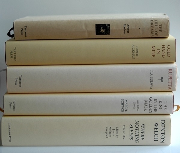
Five of the fifteen or so volumes in my library published by the excellent Tartarus Press are shown above. Going from top to bottom, the first was among my earliest Amazon purchases: a 1998 edition, bought when it was new, of Arthur Machen’s novel The Hill of Dreams. It’s a book that made a deep impression on me when I first read it in my twenties. This copy has been in a slightly distressed condition since a run in with my last-but-one dog. Tartarus have published many of Machen’s works, and have done likewise for Robert Aickman, whose collection Cold Hand in Mine comes next. This is a copy from their 2016 edition. Cold Hand in Mine was the first collection of Aickman’s stories I’d read, initially in a tatty paperback, and it remains my favourite of his books.
Third is a collection of Marcel Schwob’s fiction entitled The King in the Golden Mask (and Other Stories), as translated from the French by Iain White. It’s a 2012 edition based on one first published thirty years beforehand. Schwob, whose work was a notable influence on Jorge Luis Borges, has been a great favourite of mine since I first read a story of his in the Atlas Press anthology The Book of Masks twenty-five or so years ago. Next is one of Tartarus' original publications: N.A. Sulway’s intriguing novel Rupetta, with this, its first edition, dating from 2013. Last is one of two volumes (I do also have the other one) comprising the “complete short stories (and other related works)” by Denton Welch, issued in 2005 under the title Where Nothing Sleeps. As with the two volumes above it, this one’s spine has been sunned a shade or two lighter than when it was new.
Jun 4, 2024
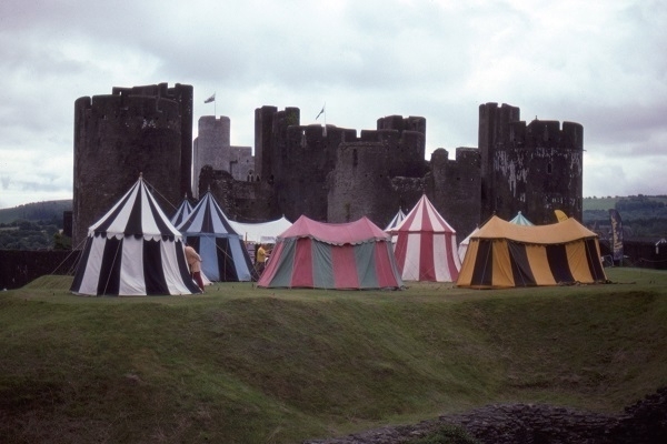
Here’s a photo of some colourful tents in front of Caerphilly Castle. The tents were there for the duration of the ‘Big Cheese’ festival in 2010. It’s a Kodachrome slide which doesn’t really show that film to its best advantage. Had there been blue sky and brighter sunlight, I think it would have come out significantly better. In any light, moreover, green wasn’t Kodachrome’s best colour. Still, it’s as good a shot as I was going to get on the day.
Mediæval castles are two a penny in this part of the world, though admittedly the one at Caerphilly is on the larger side and fairly well-preserved. I’m not especially fond of the things myself: as with military architecture in general, I find castles to be rather dreary, unless thoroughly dilapidated – or designed to decorate rather than subjugate.
Jun 2, 2024

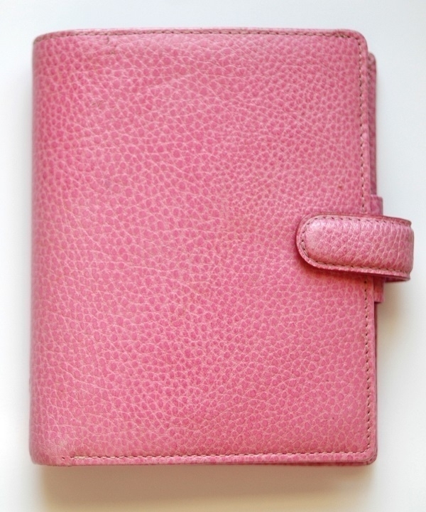
When I arrived in St. John’s eleven years ago, there must have seemed something suspicious about the two large bags of luggage I’d brought for a four or five-day stay. In any event I was asked to wait to be questioned by an immigration officer. Having asked about the reason for my visit (to attend a funeral), the lady began looking through my bags and then enquired, as she fished out a pink Filofax personal organiser, leafing through it, whether I’d visited the city before, and what connection I had with the place. I replied that I’d visited several times because it was my wife’s home town, and that she’d recently died and that it was her funeral I had come for. The Filofax had been hers, I added, whereupon the officer dropped it back into my bag like it was hot. After a few more questions about where I was staying and the date and location of the funeral, I was allowed to get on my way.
Among the bereaved are many who take comfort in being surrounded by their late loved ones' personal effects. I, on the other hand, found it less painful to give away or dispose of all but a very few of my wife’s things. The Filofax was one of the handful of mementoes I kept. I still use it to this day, if only as an address book. Filofaxes had their heyday in the ’80s, when they became fashionable accessories, but this one is only about twenty years old–from a time when there had already been several generations of electronic organisers, but before the advent of the smartphone. The Filofax brand is still current now: who is still buying their organisers today, I wonder?
May 31, 2024
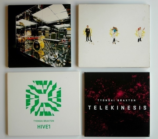
Above are four CDs of music by (or featuring) the American composer and musician Tyondai Braxton. My introduction to his work came via the 2007 album Mirrored by Battles (top left), whose front-man he was at the time. Its lead single ‘Atlas’ fascinated me, even if I only seldom returned to listen through the album as a whole. Two years later, Braxton’s solo album Central Market (top right) appeared, a highly original confection of electronic and ‘classical’ instrumentation. The unfamiliar blend of sounds and the peculiarly jaunty rhythms combine to disconcerting effect. I’m still not even sure I like this music, but now and again I’ll get drawn back to listen to it again.
HIVE1 (bottom left, 2015) is a predominantly electronic affair, with the sounds of synths and samplers augmented by percussion. I don’t know whether the percussion is likewise synthetic, or ‘organic’. ‘Gracka’ might be my favourite track on it. Unlike its predecessors, it’s a record I straightforwardly enjoy hearing all the way through. Bottom right is the most recent arrival of the four, ordered a couple of months ago, namely Telekinesis (2022). This is a single composition for large orchestra and chorus (with additional electric guitar and live electronics) that falls into four sections and has a total playing time of about 35 minutes. It’s music inspired by the anime Akira, without being any kind of retrospective soundtrack to it. I prefer the opening two ‘movements’ to the closing ones, but then I’m still getting to know the piece so my feelings could well change.
May 29, 2024
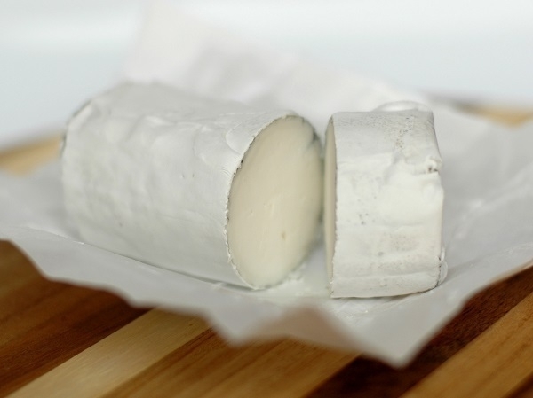
One day about six years ago, on my weekly trip to the supermarket, I found the shelves all but bare of milk and bread. There had been a light fall of snow, a relatively uncommon phenomenon hereabouts, but one which awakens an irrepressible urge in my compatriots to stock up on these two essential items at all costs, lest the inch of snow on the ground bring all food distribution to an immediate standstill. A few bottles of goats' milk were about all that remained: I felt the time was right to try some.
My first few sporadic encounters with goats' milk cheeses had not left a positive impression. I found their caprine tang decidedly off-putting. The milk too had an undeniable note of goat which did not appeal at first taste. On trying it a second and third time, however, my initial distaste gave way to tolerance. I wasn’t converted all at once, but this equivocal experience prompted me to start trying the occasional piece of goats' milk cheese with renewed curiosity. One of those that I grew to enjoy was ‘Kidderton Ash’, an opened pack of which is shown in the photo above.
It’s one of the many products sold by Butlers Farmhouse Cheeses, based in Lancashire’s Ribble Valley. The milk apparently comes from their farms, but I gather the cheese is made in Cheshire. The developing cheeses are sprinkled with ash, which reputedly encourages the formation of an edible rind. It’s a fairly mild cheese with just a slight hint of goatiness adding a little depth to its flavour.
May 27, 2024
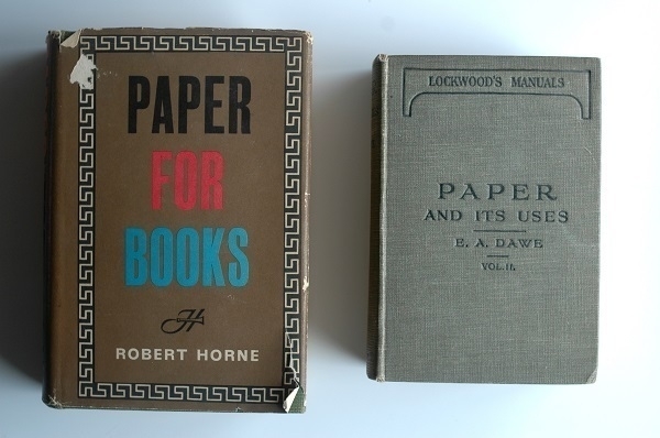
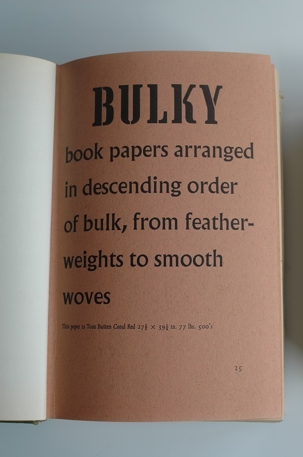
Here are a couple more of the books of paper samples I’ve collected. Robert Horne’s Paper for Books (‘A comprehensive survey of the various types of paper used in book production’) dates from 1961, and is a revised & enlarged edition that followed an original one in ‘53. There were multiple editions of Edward H. Dawe’s Paper and its Uses (‘A Treatise for Printers, Stationers and Others’) with my copy of vol. 2 belonging to the one issued in 1929. I’ve yet to acquire a matching copy of vol. 1. Dawe’s book covers more ground than Horne’s, with sections devoted to writing papers, cover & wrapping papers as well as printing papers.
The samples in Paper for Books are grouped into four sections, the first of which is concerned with “bulky book papers … from featherweights to smooth woves.” On the subject of so-called featherweight papers, Horne’s introductory text has some disparaging remarks which, I think, still have some relevance today (at least here in the UK). Such paper, he writes, “has as much guts, character and ‘feel’ as a wet blanket”. He continues:
Publishers rely on their customers, the booksellers, and booksellers have to please their customers, the public. They claim, in fact, that the man in the street … gauges the value of a book by its bulk: some would even, in their insistence on bulk, seem to claim that the public buys its books by the inch. A 320-page book at 12s. 6d., bulking half an inch, will stay on the shelf, while a 240-page book at 15s, bulking one inch, will sell out in no time! Or so some booksellers seem to believe.
Speaking for ourselves, we should much prefer a book to be slim, printed on good paper, so that it took up less room in the pocket, in a brief case, or on the shelf…. However, Featherweight appears to be what many publishers want, so we muct continue to order it from the manufacturers. For there is no gainsaying that, substance for substance, Featherweight is the bulkiest paper made.
May 25, 2024
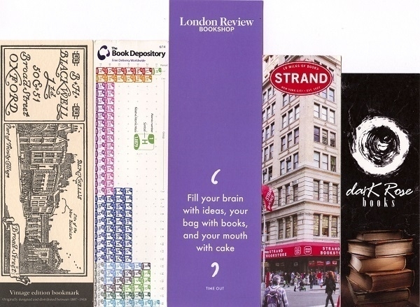
Above are five assorted bookmarks packed with books I’ve ordered on-line. From left to right:
- One of several Blackwell’s bookmarks I’ve accumulated.
- One with a Periodic Table of the Elements on it courtesy of The Book Depository, now defunct.
- A bookmark from the London Review Bookshop advising us to “Fill your brain with ideas, your bag with books, and your mouth with cake.”
- A bookmark from the famous Strand Books in New York (“18 Miles of Books”).
- One from Dark Rose Books whose tagline, on the reverse of the bookmark, is “Sourcing the best gothic books to satisfy your dark side.”
May 23, 2024
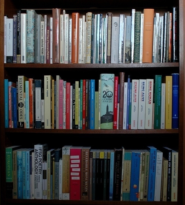
Three or four years ago I had the idea of devoting more space on my bookshelves to poetry. I very seldom re-read works of fiction: once I’ve read a story I hardly ever feel the need to revisit it. As the passing of time continues to take its toll, it could be that a weakening memory might lend more appeal to re-reading novels and short stories, but for now most the volumes in the fiction section of my library are little more than mementoes of past pleasures. To my mind, poems are more akin to songs in that I can ‘listen’ to them repeatedly with little or no diminution of enjoyment. Such was the basis for a determined effort to make room for verse at the expense of prose.
I allocated one of my IKEA-like bookcases for poetry. At first it was half empty, but gradually it filled up as new acquisitions arrived, until, a couple of months ago, the last bit of free space was taken, as is shown – none too clearly, alas – in the image above. The bookcase is in rather a small room directly opposite my desk. To get the picture I had to clamber underneath the desk with a 24mm lens attached to my Nikon D70S (I suppose I could have just used my phone). About half of the volumes are by individual authors, and the rest are anthologies. The former are organised alphabetically by author name, the latter are grouped more arbitrarily according to ‘keywords’ which may relate to the title, or the editor, or the publisher, or the nationality of the poets featured the book.
May 21, 2024
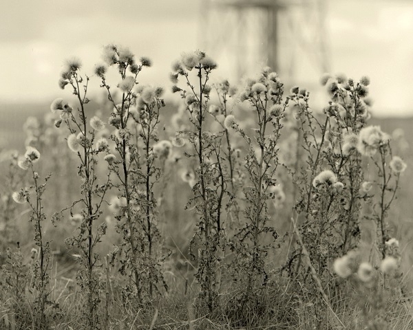
Along the eastern side of the Taff valley north of Quaker’s Yard and Treharris is a ridge, part of which is known as Mynydd-y-Capel (‘Chapel Mountain’). On this hilltop, Ordnance Survey maps indicate the presence of “Forest Chapel (Remains Of)”. Intrigued by this point on the map, and living nearby at the time, I decided to walk up there and take a look, ascending the hill through Treharris on a road that became a track that became a path that then petered out to nothing as I continued north.
It proved more of a real hike than the leisurely walk I’d anticipated. Atop Mynydd-y-Capel there were wonderful views, but the remains of the chapel – if indeed I was even looking in the right place – were desultory: some scattered bits of grey stone. There was one spot, a natural hollow near what seemed to be the summit, which afforded a surprising degree of shelter from the buffetting breeze, and where there was an eerie silence. I could imagine that being an appropriate locale for spritual reflection.
I stopped to take a few photos along the way. While there was still a track to follow, my eye was caught by some skeletal thistles which foregrounded a radio or TV transmission tower. I used a Mamiya C330 loaded with Adox CHS 25 film to take the picture, and developed the film at home using Tanol, with very pleasing results. I slightly cropped the square frame for the image above. My over-ambitious walk left me dehydrated, footsore, and with the beginnings of a migraine, but at least I had something to show for it.
May 19, 2024
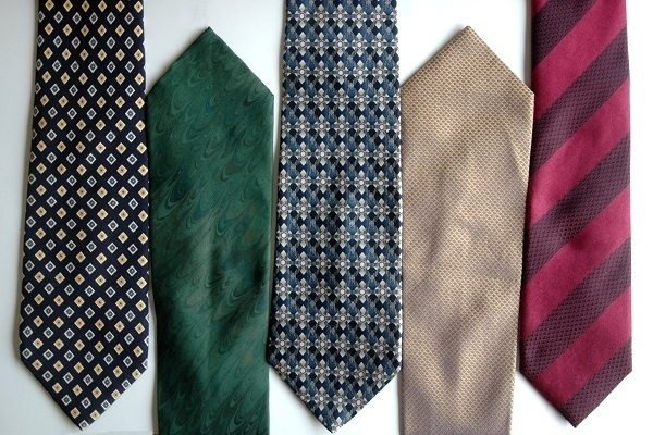
The necktie has become a thing of the past. It was the done thing at the outset of my career as a software developer in the early ’90s to wear a suit & tie to work, which is what I routinely did for a decade or so. As befits someone my age, I still have at least a dozen of the things, currently all draped around the neck of a mannequin. Five of them are shown in the photo above.
Four of the five date back to the last century. The leftmost one is an Eredi Pisanò tie I bought in Rome in ‘97. The distressed-looking green one has a lovely marbled pattern which is difficult to see in the picture. I picked it up at Alberto Valese Ebrù in Venice, who sold all manner of marbled papers and fabrics. In the middle is a stolen item, a Bill Blass tie that came into my hands after an airport baggage reclaim mix-up in Canada. My then-fiancée spotted the tie in the bag that was not mine, and insisted it would suit me and that I should keep it: I was too besotted (with her, not the tie) to argue the point. Second from right – another one not in the best of shape – is the tie I wore on my wedding-day. It’s a ‘Principles for men’ tie purchased at the Debenhams in Crawley ca. September ‘99.
Lately I’ve only worn ties to weddings and funerals. I wore the one on the right of the photo to my niece’s wedding last year. I’d ordered it on-line from Charles Tyrwhitt. Not pictured is the plain black tie I wore to a funeral a few months later. Such occasions are now just about the only ones where knotting a length of silk around one’s neck is still standard practice.
May 17, 2024
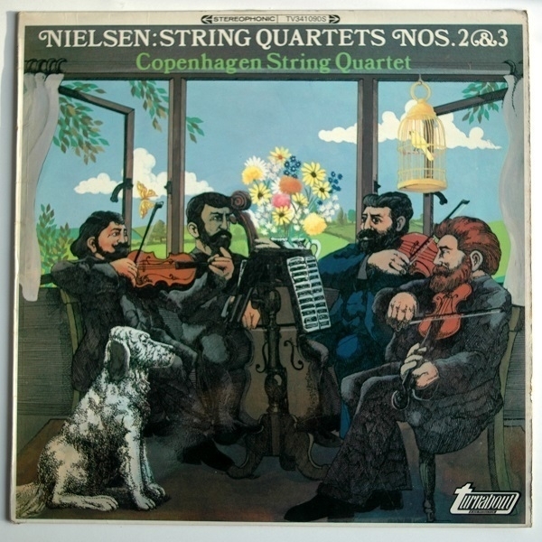
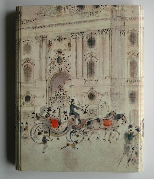
Above is the sleeve of a 1968 LP, acquired last month, on which the second and third of Danish composer Carl Nielsen’s four string quartets are performed by the Copenhagen Quartet. I’m still getting to know these pieces, but my provisional preference out of the two is for the more straightforwardly ebullient second over the third. I very much like the record’s cover image too (very much of its time). The style of the drawing or painting seems maddeningly familiar, though the sleeve only credits the ‘Decca Publicity Art Department’ with the sleeve design: I don’t know if they commissioned the image or made it themselves. I have my doubts that it’s an actual depiction of the Copenhagen Quartet.
The record brings the current count of string quartets I have on vinyl up to thirty-one. As well as the Nielsen ones there’s Berg’s Quartet Op. 3; three late Beethoven quartets (nos. 14-16); Borodin’s renowned 2nd (two renditions of that one); three of Dvořák’s (nos. 8, 10 & 12); no fewer than a dozen by Haydn (plus another one misattributed to him); Elgar’s op. 83 Quartet; both of Janáček’s; Ravel’s sole Quartet; Prokofiev’s 2nd; both of Smetana’s; & Tchaikovsky’s 1st. There’s some overlap between that list and the rather longer one of CD string quartet recordings on my shelves. At one time or another I’ve also owned (on vinyl) some Mozart quartets; a couple by Schubert; at least three more of Beethoven’s; four of Bartók’s and yet more of Haydn’s. I’d love to find some of Shostakovich’s quartets too on black plastic one of these days, despite already having most of them in digital form.
May 15, 2024
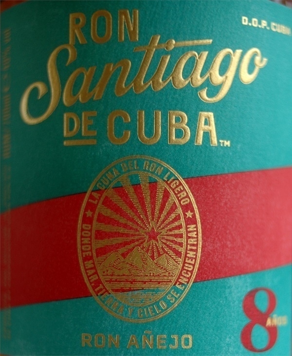
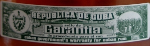
Aside from my old favourite Havana Club, the only other Cuban rum I’ve tried has been the Santiago de Cuba brand. For my 53rd birthday I was given a bottle of the 11-year-old ‘Extra Añejo’ variety. I loved the stuff – I’d say it’s my favourite out of all the rums I’ve sampled in recent years. Last year, the 8-year-old version began to appear on local supermarket shelves, and, in time, I picked up a bottle. I find it very nearly as good as its elder sibling.
This is a brand purportedly “developed to be paired with the finest Cuban cigars”. I can imagine such a combination working very well indeed, but it’s been too long since I smoked my last cigar for me to be tempted to try it. In any case, I greatly enjoy the rum on its own, accompanied only by some good music.
May 13, 2024
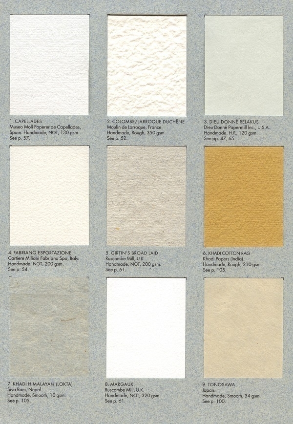
In Silvie Turner’s The Book of Fine Paper (1998), as well as the many descriptions and photographs of hand-made and other fancy art papers, there is a folder within containing eighteen small samples (each about 2¼"x1¾") arrayed “so that their character, weight and texture can be felt”. These range from some filmy 10gsm “Khadi Himalayan” stuff from Nepal to a thick & heavily-textured French 350gsm “Colombe/Larroque Duchêne” paper.
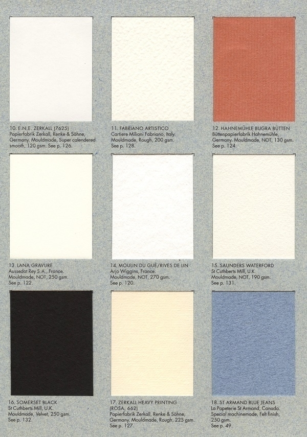
Other manufacturers featured include Fabriano, Hahnemühle and Dieu Donné. The book as a whole has more emphasis on papers for artists and craftspeople than the writing papers that more specifically interest me, but it’s nevertheless a highly informative volume and one I’m glad to have on my shelves. Mine is an ex-library copy that once belonged to the University of Salford, where it seems not to have been much used.
May 11, 2024

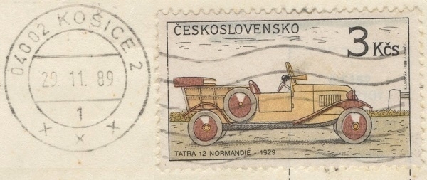
The city of Košice in eastern Slovakia is one of the locales mentioned in Laurent Binet’s novel HHhH (mentioned in my previous post). Although it didn’t play any sigificant part in the story of “Operation Anthropoid”, Binet recounted how time he spent teaching there in the ’90s was a foundational influence on his becoming obsessed with the subject.
The postcard above was sent to me from Košice in 1989 by my then-flatmate who had gone for a week or two as part of a long-standing inter-university exchange programme. He had the good fortune to arrive at a heady moment when the ‘Velvet Revolution’ was gathering pace, joining with his hosts in some of the on-going mass demonstrations, and learning the phrase slobodné voľby teraz! (‘free elections now!'). His message on the card didn’t mention any of that, praising instead the virtues of Prazdroj, which I already knew and loved in its exported form as ‘Pilsner Urquell’.
May 9, 2024
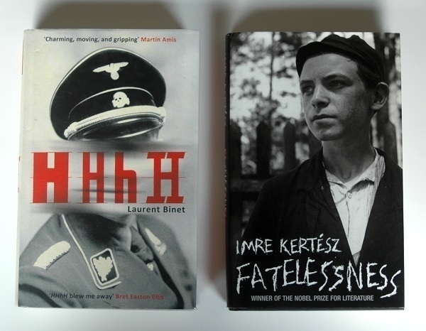
Above are two novels in translation I’ve read recently set in World War II: HHhH by Laurent Binet and Fatelessness (aka Fateless) by Imre Kertész. These editions were published in 2012 and ‘05 respectively. Both were acquired second-hand at the excellent Broadleaf Books in Abergavenny.
HHhH relates the rise to prominence of the notorious high-ranking Nazi official Reinhard Heydrich, and follows the ultimately successful plot to assassinate him. The story is thinly fictionalised in a post-modern sort of a way with numerous asides about the author’s misgivings in mixing invention with historical fact, and about the practicalities of writing of the book and of the research behind it – sort of like seeing a movie intercut with scenes from its own ‘making-of’ featurette. How much one enjoys the result will depend, I think, on how well one gets along with Binet’s authorial presence. A few irritating instances aside, I got along with him very well. The story of the assassination is an inherently gripping one, and Binet conveys its high-stakes intensity in fine style.
The plans laid by Heydrich resulted in a flood-tide of death and suffering when they were set into motion. His death was untimely inasmuch as it came too late to help the millions of people affected, though who knows how much more damage he could have done had he lived longer. Fatelessness concerns one person’s experience of Heydrich’s murderous legacy. A 14-year-old Jewish boy from Budapest, initially more bemused than alarmed by the proliferating rules and restrictions imposed on him and his family, finds himself part of a large group of Jews rounded up and put on a train to Auschwitz. Kertész had himself endured a similar ordeal. His narrator has a detached outlook and a relatively dispassionate ‘voice’, which (so it seemed to me) provided some insulation for the reader from the appalling subject-matter. Even so, I found it a difficult story to read.
May 7, 2024

A few times each year a travelling ‘family funfair’ sets up in playing fields a few minutes' walk from my home. They were there over the Bank Holiday weekend, packing back up and driving away today. I wonder how the funfair business is holding up in the age of the smartphone. Something that catches my eye in funfairs is the frequently garish decorative art painted on the rides.

The three pictures here were all taken at Axel’s funfair on one of its stops in Southern Sweden back in ‘08, but I’ve seen similar here in the UK. They were taken with a Nikon F80 camera using Kodachrome film, which gave a further boost to the already bright colours.
May 5, 2024

At one time I would have owned well over a hundred DVDs. Now, the ones in the picture above are almost all that remain. In my early forties I somehow lost my ability to enjoy movies. Bad films bored me; loud films irritated me (I’d be delighted if I never saw another superhero movie again); and even well-crafted, well-acted films would make me anxious and fidgety – more so if there was any amount of dramatic catharsis in them. Television likewise became more of an irritant than a comfort, and I eventually threw out my TV a decade ago.
The DVDs my wife and I had accumulated were given away to friends & family, or donated to charity shops. Except, that is, for those few Region 1 discs we’d ordered from the US or Canada. I was wary of releasing those back into the wild with no ready way of reminding prospective buyers that their Region 2 hardware wouldn’t play them (unless region-checking could be disabled). I’ve yet to act on the vague notion of selling them as a job lot on ebay. Some of the cases aren’t in the best of shape, with noticeably sunned spines.
From top to bottom we have Amélie (2001); City of God (‘02); Donnie Darko (‘01); Kung Fu Hustle (‘04); Mulholland Drive (‘01); A Scanner Darkly (‘06); season 3 of Canadian TV comedy Trailer Park Boys (‘03); seasons 1 & 2 of the same (‘01-‘02); and season 2 of The Wire (‘03). Media from the earlier part of the ’00s predominates as it became too temptingly easy to obtain films & TV by other means later in that decade. Of the movies, I remember Kung Fu Hustle the least clearly (aside from the plain fact that I enjoyed it); whereas Mulholland Drive is still wedged firmly in my memory (aided by having revisited scenes from it on-line over the years).
May 3, 2024
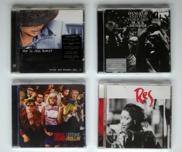
In recent years I’ve been beginning to catch up with some of the ‘neo-soul’ music whose popularity crested in the years either side of the millennium, but which I failed to appreciate at the time. As times have changed, my tastes have too: nowadays I find plenty of it is very much to my liking. Above are a few of the albums I’ve acquired lately on inexpensive second-hand CDs.
Top left: Who Is Jill Scott? Words and Sounds Vol. 1 the titular singer-songwriter’s debut record. It’s a plush confection of smooth textures underpinned by strong melodies and topped with Scott’s warm & elegant vocals, and is a rare album that doesn’t outstay it’s welcome over a 70+ minute running time. Example track: Gettin' In The Way. Top right: a relatively late entry in the annals of the genre (from 2014), namely Black Messiah by D’Angelo and the Vanguard. I hesitated to buy this one as I’d not readily warmed to the same artist’s previous (and much acclaimed) Voodoo album. The newer one, however, directly hit the spot at first hearing: I love it (e.g. Sugah Daddy).
Bottom right: looking for other titles to explore I found a list of 10 Essential Neo-Soul Albums that included a record I’d never even heard of: How I Do by Res (2001). Having now listened to it a few times, I’d say that if it is neo-soul, it’s not only neo-soul, with rock & pop influences very much to the fore alongside the soul ones (not to mention other ingredients). Fortunately, it’s as easy to enjoy as it is difficult to classify – see They-Say Vision, for instance. Lastly, bottom left: Stone Rollin' by Raphael Saadiq (2011). This one is undeniably soul, if perhaps more obviously retro than neo. Although redolent of the ’60s and ’70s, there’s more to it than its vintage sonic garb. If inclined, try the title track for size.
May 1, 2024

When I first unwittingly ate an olive I felt I’d made a grave mistake. I was maybe eighteen years old. It was a black olive that had been placed in the middle of a pizza. In my naivety I hadn’t known what it was. “This is not a foodstuff” I thought, dismayed, “why wasn’t I warned?” I was in company, however, and did not want to betray my unwordliness by spitting it back out. The second time I tasted an olive was also in error. It was a slice of green olive garnishing something or other I’d been served on a flight. Had I known, I’d have never put it in my mouth, but I found the mystery item delicious, only later realising what I’d consumed.
I learned to love olives of various kinds. I still often eat green ones, while my other regular choices tend to be Kalamata olives, originating from the vicinity of the city by that name on the southern coast of the Peloponnese peninsula in Greece. They’re not the most photogenic of subjects – I put some in a Tokyo Design Studio bowl for the shot above – but they are very tasty. The copy on the jar I took them from uses the adjectives fruity and meaty when describing them, the former in relation to their flavour and the latter, their texture. They are fruit, of course – drupes to be specific – though presumably they’re referring to what I discern as a vaguely grapelike note amidst all the salty savouriness. Meanwhile there is something undeniably fleshy about their mouthfeel.
Apr 29, 2024
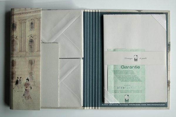
Since last writing about vintage Elco stationery I’ve obtained another set of it. Unlike the Paris Linen and Royal Linen boxes I previously acquired, this set doesn’t have any kind of descriptive name, packaged instead in a folder with a pictorial cover featuring a design of horses-and-carriages outside a palatial building. Within there are twenty envelopes, fifteen double (i.e. pre-folded) sheets of paper and five notecards. All are pale grey with the tissue lining the envelopes a darker blue-grey shade like that on the inside of folder’s spine. The paper and envelopes have the usual Elco watermark. The sheets are A4-sized when unfolded.
On the green Garantie slip there’s mention of over seventy years of corporate experience. Wikipedia gives a foundation date for Elco of 1884, while the company’s own website suggests 1891. Depending on when the 70 years were counted from, that could mean post-1954 or ‘61. A ’60s origin seems plausible. The equivalent slip in the Paris Linen set (as seen in my previous post) boasts of only sixty-plus years’ experience, so evidently that is the older product of the two.
Apr 27, 2024
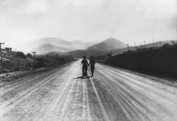
From the same set of film-still slides as mentioned here previously (1, 2, 3), comes the one above, featuring the unmistakable silhouette of Charlie Chaplin. It’s from the closing moments of Modern Times (1936), where Chaplin, in his final appearance as ‘The Tramp’, walks away with Ellen (played by Paulette Goddard) “down the road towards an uncertain but hopeful future”.
I did not know, until reading the wikipedia article about the movie earlier today, that Chaplin himself composed the music for it (drawing inspiration from Puccini’s Tosca), with the instrumental theme heard over last scene later the basis for the song ‘Smile’, as popularised by Nat ‘King’ Cole in 1954.
Apr 25, 2024
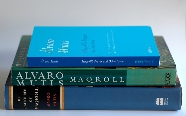
In the picture are two volumes of prose and one of poetry by the Colombian writer Álvaro Mutis (1923-2013). The two hardbacks collect between them seven novellas written in the ’80s and ’90s, all revolving around the character of Maqroll, also known as el Gaviero (the lookout). Maqroll is a rootless mariner of indeterminate nationality; an aimless wanderer into dubious and not necessarily legal schemes; and, for all his intelligence and experience, a hapless victim of frequent misfortune. Despite many setbacks, however, he remains stoical, thoughtful, and steadfastly loyal to his friends.
I happened upon an on-line recommendation of Mutis' work twenty years ago, whereupon I bought the NYRB paperback edition of The Adventures and Misadventures of Maqroll, combining all seven novellas in a single volume. This provided me with one of the most pleasurable reading experiences of my life. With that copy’s spine three-quarters bleached by years of sunlight, and looking in a sorry state, I replaced it a couple of years ago with the mismatched hardbacks, one of them the UK edition, the other from the US. Too much time has elapsed since I read the novellas for me to give any worthwile account of the books: this article by Matt Seidel at The Millions does a good job of that.
Last month the venerable Complete Review alerted me to the existence of a volume of Mutis' poetry in English translation: Maqroll’s Prayer and Other Poems. This I read with no less delight than his prose had brought me. Mutis had first made his name as a poet, and Maqroll had made his debut in verse. ‘The Snow of the Admiral’, for example – the first of the novellas – was fleshed out from an earlier prose poem of the same title. Only a few of the poems explicitly relate to el Gaviero, but they are all cut from a similar sort of sailcloth as his prose Adventures & Misadventures.
Apr 23, 2024
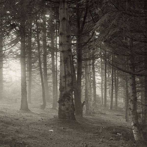
One murky September morning I drove up from the Taff Valley where I then lived into the nearby hills in the hope of capturing some atmospheric shots of the shifting mist before it cleared. Wandering a way from my parked car into a conifer plantation, I took the photo above. I used my Mamita C330s camera loaded with a roll of Ilford Pan-F 50 film, which I later developed myself using Tanol. The haze infiltrating the lines of trees, with an absence of undergrowth between them, conjured up what I felt was a satisfactorily eerie effect.
Apr 21, 2024

When he retired, ca. 1981, my maternal grandfather was presented with a pen as a gift from his former employers. It was a Sheaffer Targa slimline ballpoint pen with a brushed chrome finish. Although at the entry level of the Targa line, I thought at the time it was the coolest thing. Certainly the coolest pen I had seen up close.
With that in mind, while teetering around the edge of the fountain pen rabbit hole toward the end of the last decade, it occurred to me to buy myself a Targa fountain pen. I settled on a very lightly-used 1001 model in stainless steel. How much I paid for it escapes me.
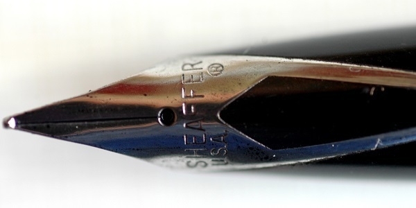
It has since seen a great deal of use, being my note-taking pen of choice when I work from home. Now and then I’ll also write a letter with it. The inlaid stainless steel nib always feels good when it hits the page. I keep it filled with Aurora Black ink.
Apr 19, 2024
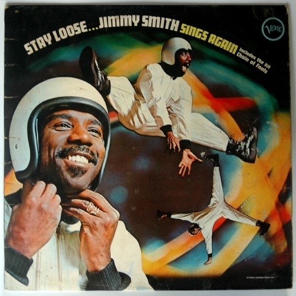
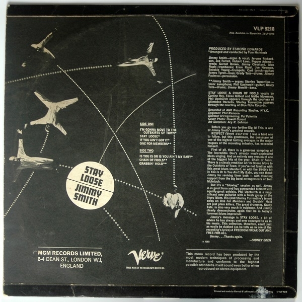
While in the vicinity last month I stopped in Blackwood, and, for the first time, took a look around the town’s second-hand vinyl emporium: Heart of the Valleys Records. It’s a small place but one with a very good selection well worth browsing through. One of the LPs I bought there was Stay Loose by jazz organist extraordinaire Jimmy Smith. It’s subtitled Jimmy Smith Sings Again. Smith had few peers – if any – in his command of the Hammond Organ, I don’t think it’s unfair to say that his singing wasn’t at quite the same level. If anything, I wouldn’t have minded a little less of his raspy vocals.
There are seven tracks on the record, four where Smith was part of a fifteen-piece band, and another three featuring him in a quintet setting. The mood is exuberant and upbeat throughout. There are bluesy numbers but they are by no means melancholy. My favourite track is the one closing side A, on which where there’s no singing as such, just some expressions of enthusiasm & exhortations from Smith to his bandmates: ‘One For Members’.
The cover design comes under the heading of ‘it seemed like a good idea at the time’. It’s not clear why the organist is wearing overalls and a crash helmet. Admittedly, he looks pretty happy about it: perhaps he was fed up of being photographed while sitting at the keyboard. There are some more pictures of him on the back of the sleeve, along with some unduly hyperbolic sleeve-notes by one Sidney Eden. It’s an entertaining and enjoyable album, but by no means “one of Jimmy Smith’s greatest records”.