Wristwatch

Pictured above is my current wristwatch, a Seiko 5 Sports model, specifically an SRPD51K2. It cost me £186 two years ago. It’s my second automatic/self-winding clockwork watch. My previous one had been a Vostok Amphibia which was still more or less keeping time (as well as it ever had) after five years' use, but in light of events in Ukraine I didn’t want to go on wearing a Russian-made watch. One thing I appreciated about the Amphibia was its rotating bezel, a feature I found very useful, so when it came time to buy something new that’s something I looked for in its replacement.
I think my first ever childhood watch was some kind of basic Timex model. I was much more impressed with my second one: an LED digital watch of the kind where you had to press a button to see the time in glowing red digits. As a nine or ten year old in the late ’70s, this seemed to me the height of cool. I was never as enthused about LCD watches, and didn’t much care for the look of the Casio with the plastic strap that I wore while in secondary school, but there’s no disputing it was a reliable and hard-wearing unit. When I was eighteen I was given a gold-plated analogue watch with a metal bracelet (possibly a Seiko – I forget) which I wore for all of a couple of years before it was stolen.
In my twenties and thirties I had a succession of inexpensive watches, most of which I barely remember. I know I had a number of Swatch models, and particularly liked one from their ‘Irony’ line with a green face and a green leather strap to match. I’d formed a preference for leather straps, even though they only ever tended to last me for a year or so before they would wear out. After my father-in-law died in 2008 I inherited his ca. 1950s Swiss-made watch and wore that for a few years. When I bought the new Seiko it came with a nylon ‘NATO’ strap, which I was favourably impressed with. It lasted me a little longer than a leather one would have done. The one in the picture was its first replacement.
Synchro System
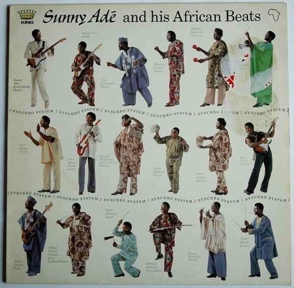
On the cover of Synchro System (1983) by King Sunny Adé and his African Beats we see portraits of what, presumably, is the whole band, all eighteen of them. Adé himself is top-left in the white suit. He played lead guitar and sang. Five of the men pictured provided additional vocals. There were two further supporting guitarists, one rhythm guitarist, one steel guitarist and one bassist. The remaining seven band-members were all percussionists, among them two exponents of the talking drum, apparently “the lead and predominant instrument” of jùjú music, of which this is an example.
This was the second of three albums that Adé et al. recorded for Island Records, their signing reportedly a result of the label’s attempts to fill the gap in its roster left by the untimely death of Bob Marley. It’s too bad that the cover on my copy, obtained recently, is slightly marred by the remnants of two large stickers. The record itself sounds excellent: the recording, mastering and pressing collectively serve the music very well. I’ve only played the LP a couple of times and haven’t yet got to know it especially well, but my first encounters with its infectious, insistent grooves have been very enjoyable ones. I’ll have to put it on again over the weekend. The whole thing (Side A/Side B) is on YouTube, for anyone curious to hear it.
Lincolnshire Poacher

At the cheese counter the lady unwrapped a half-wheel of Lincolnshire Poacher cheese and, with the wire poised over it, asked “this much?” Although at first glance it had seemed like a good amount, by the time she’d finished cutting I realised it was a significantly heftier slab than I’d had in mind. Even so, I said I’d take it, striving not to twitch as much as an eyelid when I learned how much it would cost. At least it did very nearly all get used and I felt like I got something like my money’s worth in the end. A small remnant of it is pictured above.
It’s a mature hard cheese with a firm texture. Devised to combine characteristics of Cheddar and Alpine cheeses like Comté, it is to my palate more obviously reminiscent of the latter. It has variously been described as having “rich herbacious notes” of being “nutty” or “savoury and brothy”. Some can discern a pineapple-like hint in it. I found it worked equally well on a cheeseboard as it did grated and used in cooking. This is one of only a small number of cheeses produced on the east coast of England, in an area much better known for arable farming. Its name derives from the title of a traditional folk song.
Associates
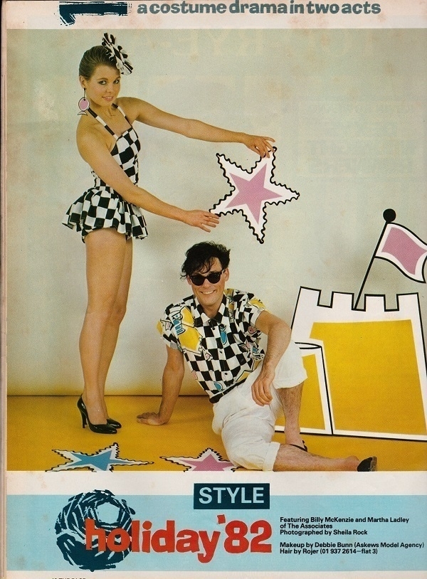
An exception to my usual rule of only posting my own pictures, here’s something that just happened to catch my eye somewhere on-line a few years ago. It’s a scan of a page from some 1982 teen magazine, part of a fashion spread with a photo of the late Billy MacKenzie with one of his Associates, Martha Ladly. I’m not sure which magazine exactly. Sheila Rock is credited as the photographer.
Once in a while I’ll spend some time listening to MacKenzie’s singing and feel sad all over again he died so young. Prior to teaming up with him, Ladly had been a member of Martha and the Muffins – not the Martha who sang, but the Muffins' keyboardist who also happened to go by that name. MacKenzie is widely believed to be the subject of The Smiths' song ‘William, it was Really Nothing’. Ladly had a tenuous connection to another classic Manchester 7": on the label of the A-side of Joy Division’s ‘Love Will Tear Us Apart’ is a dedication “For ML” from designer Peter Saville, her boyfriend at the time.
Iraqi Poetry Today
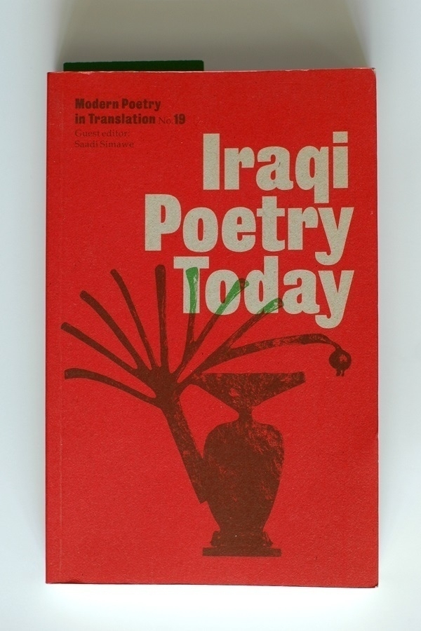
Iraqi Poetry Today is an issue of the periodical Modern Poetry in Translation published in 2003. ‘Today’ in this context was a time when the country had left the frying pan of Saddam Hussein’s regime for the fire of the Iraq War. In his introduction, editor Saadi Simawe laments “the difficulty of finding major sources of Iraqi poetry since 1980, when the series of wars began” and regrets his inability to include many of “the new generation of poets who began writing under sanctions and do not have access to publication”. For these reasons and others, the majority of the poems featured are by exiled authors.
As well as translations from the Arabic, there are a number from the Kurdish and a few from the Hebrew. The Kurdish poems represented are for the most part fairly straightforward expressions of nationalism – understandable given Kurdistan’s status as a nation that isn’t a country. There is a great deal more variety and complexity in the poems from the Arabic. Some of the most appealing works for me were ones incorporating Western influences, bringing them on to something more akin to familiar ground. Fadhil al-Azzawi’s poems, for example, were among my favourites in the book. Elsewhere I hadn’t expected to read a poem referencing T.S. Eliot’s Murder in the Cathedral and less still another in praise of the Welsh author R.S. Thomas.
In a different vein is the poet given the most space in the book: Muzaffar al-Nawab. A single long poem ‘Bridge of Old Wonders’ takes up thirty-one pages, followed by another four pages of explanatory notes. It’s a work transcribed from a live performance recorded on cassette tape. Its first part bristles (so I gather from the notes) with historical references and allusions to the Koran & to classical Arabic poets. The second half gives powerful rherotical voice to a sense of wounded grievance on behalf of the Palestinians (a recurring note in the very small cross-section of modern Arabic poetry I’ve encountered). The effect for a Western reader who might be considered by al-Nawab as – if not the enemy – at least a part of the problem his complaints and invective address, is as disconcerting as it is impressive.
Stairs

By 2014 my enthusiasm for film photography had begun to wane. Among the last rolls of 120 film that I developed myself at home were a few that I took on an outing to Raglan Castle in the spring of that year. The shot above is one of the better ones from those rolls. We see steps leading up from a gloomy cellar room, lit by sunlight coming through an open doorway. I’d taken a couple of exposures of the same composition with different shutter speeds – this is the darker of the two. I used my Mamiya C330S loaded with Ilford HP5+ film, and developed it using Kodak D76.
Aftershave

While the use of aftershave lotions has fallen rather out of favour, I’m still a fan of the invigorating sting of an alcohol-based splash hitting one’s freshly-scraped face. Above is my current bottle of the Sandalwood lotion made by D.R. Harris & Co. Ltd. I find it’s warmly lingering aroma reliably pleasant. In contrast, my other regular aftershave option, Proraso’s ‘Rinfrescante’ lotion, has a fleeting, neutrally cool sort of scent.
In the past I’ve used and enjoyed the likes of Eternity for Men and Terre d’Hermès. Certain classic lotions have proven less to my liking, at least not in their current formulations. Brut and Old Spice, for example, don’t do much for me, while Tabac has more appeal, but I find it too overpowering for all but the most occasional use.
Megadisc
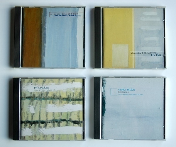
According to discogs.com, the most valuable CD in my collection is the one to the lower right of the picture above – an album called Revelation which brings together four pieces by the contemporary Latvian composer Georgs Pelēcis. I’d be interested to know how this somewhat obscure recording has come to achieve a median value currently calculated as £37.61. It’s a very good record, and presumably an uncommon one, but I have rarer CDs that aren’t valued as highly.
It, like the other three albums shown above, was put out by the Belgian-based Megadisc Classics label. I have another three of their releases on my shelves, and at one time would have had four or five more again. The consistent look of their covers derives from their all featuring details from abstract paintings by the artist Ilse d’Hollander (1968-97). Many of the label’s releases showcased music by composers from the former Soviet Union. Besides Pelēcis, here we have work from Valentin Silvestrov (Ukrainian); Alexandre Rabinovitch (Russian-born) and Rytis Mažulis (Lithuanian).
Top left is Silvestrov’s Orchestral Works (vol. 1) – I also have vol. 2. The highlight on it for me is his Symphony No. 4, a sombre piece with a little more heft to it than one hears in the same composer’s more disembodied later style. Top right is Die Zeit by Rabinovitch, where a briskly idiosyncratic kind of minimalism is the order of the day. The title piece, featuring a quartet of amplified instruments, is my favourite on the disc. Choral music is the focus of Mažulis' Cum Essem Parvulus, with the track Sibylla the one to really catch my ear.
Coming back to Pelēcis, his music is determinedly consonant and upbeat, drawing much of its inspiration from the composer’s study of ‘early music’. Some listeners might consider it kitsch, but it works for me. Buena Riga is a piece I find particularly enjoyable.
Decaf

Some unhappy experiences with decaffeinated coffee – not all of them intentional – had left me averse to trying it again. Those experiences, however, when I stopped to think about them, all dated back to the last century: what if there had been significant improvements in the interim? Decaffeinated espresso in particular is a paradoxical phenomenon: a method specifically designed to deliver a concentrated dose of caffeine perversely deprived of its very raison d’être. Even so, that’s what I decided to try.
I must say I am persuaded of its merits. I’ve been drinking Lavazza Decaffeinato, which I feel provides a better approximation to a ‘proper’ espresso than it has any right to. Of course it’s not a perfect simulacrum: there remains a melancholy note of disappointment in its aftertaste – something is still obviously missing, but it’s an absence that, for me, doesn’t spoil the show. A number of health benefits have, more or less implausibly, been ascribed to decaf. While I don’t lend those claims much credence, I have found that this stuff feels like it’s doing me good.
The plain white cup and saucer in the picture above were made by Wm Bartleet & Sons: I bought a pair of each at a charity shop last year.
Waldorf, Revisited
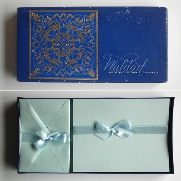
There hasn’t been any opportunity to post about old stationery for a while – until now, with this newly-arrived set of Waldorf-brand writing paper and envelopes in a shade they called ‘Marina Blue’. The sixty sheets of un-watermarked ‘Duke’ size paper are of decent quality. The forty envelopes are un-lined. The box arrived from the seller still encased in the original cellophane. More cellophane wrapped the contents, which, over time, had compressed them somewhat out of shape, as can just be discerned in the picture above.
Download Codes

Will download code cards ever be prized by the ephemera collectors of tomorrow, I wonder? If so, I wouldn’t be surprised if the cards or slips from the earlier phase of the vinyl revival might be more highly-prized than later ones, as – in my limited experience at least - a little more care and attention seems to have been devoted to them then than now. Nowadays, if there’s a download code at all in a new record, it might be printed generically on a tiny slip of paper.
Above are scans – front and back – of an appealing example with a colourful design on one side, and all the necessary information on the other, to which has been added some mild flattery. “Why, yes, thank you, my taste is pretty good, isn’t it?” A plainer example from another self-titled album is shown below. In both cases I’ve edited out the actual codes.

Shelf Portrait (Number Eight)
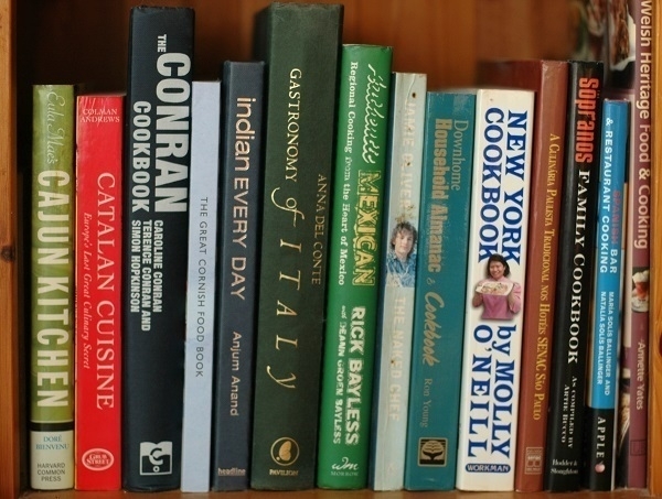
Once upon a time I had about twice as many cookbooks as I do now. The survivors are shown in the picture above. They occupy the bottom shelf in the downstairs bookcase. In recent years I’ve been on something closer to an ‘eat to live’ regime than a ‘live to eat’ one, owing to a variety of food sensitivities and a need to keep my weight under some semblance of control. These books get opened quite seldom now – they’re the remnants of a tastier past.
I came by these volumes by a variety of means. Anjum Anand’s Indian Every Day caught my eye in a Malmö bookshop. I learned of the existence of Eula Mae’s Cajun Kitchen (“Cooking Through the Seasons on Avery Island”) while searching Amazon for On Avery Island, i.e. the debut album by Neutral Milk Hotel. Catalan Cuisine and A Culínaria Paulista Tradicional (the latter featuring recipes from the São Paulo area of Brazil) were sent to me by on-line acquaintances. Welsh Heritage Food & Cooking was a gift from my mother. The Downhome Household Almanac & Cookbook (with its hundreds of recipes from my late wife’s native Newfoundland) was sent to us by our Canadian niece. We already had a copy, albeit a worn & tattered one, that this one replaced.
Some others have seen a great deal of use: The Conran Cookbook, Indian Every Day and The Gastronomy of Italy have all lost their damaged dust-jackets, while the spine of Jaimie Oliver’s first publication The Naked Chef is faded, cracked and stained. On the other hand, Rick Bayless' Authentic Mexican and the Sopranos Family Cookbook have seen much less in the way of active service. In the case of the former title, the difficulty of obtaining many of the necessary ingredients in Northern Europe proved too much of an impediment in re-creating its recipes. Even then, it allowed for some tantalizing ‘window-shopping’ onto another cuisine.
Balloons

Every year about this time is the Bristol Balloon Fiesta. If you’re in the city and the breeze is blowing the right way you might be lucky enough to see a sky filled with colourful hot-air balloons. With the usual prevailing winds being more or less south-westerly, those north-east of the Fiesta’s base at Ashton Court would be most likely to see such a sight. One day in August 2011 it happened that the light breeze was just the right amount more southerly than westerly to bring many balloons over the suburb in the north of the city where I then lived.
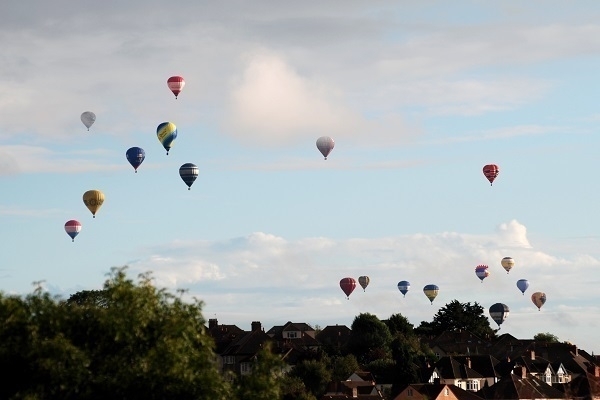
Both of these photos were taken from a second-floor window with my Nikon D80 using a zoom lens (probably the one that came with the camera). For the first one the focal length was at its maximum of 300mm; while for the second it was at 145mm. Both images are cropped, the second a little more so. A couple of the balloons ended up floating low and nearby enough that I could quite clearly see the aeronauts in their baskets.
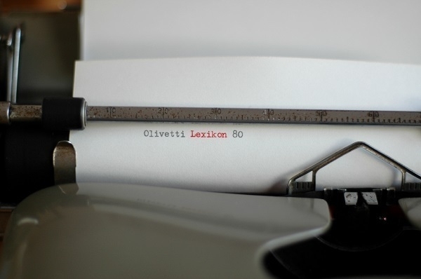
Lexikon 80
One Saturday morning in the Spring of 2016 I pulled over into a lay-by off the A46 just south of the Tormarton Interchange with the M4. A couple of minutes later, a white van pulled in just ahead of me. Both I and the van’s driver left our vehicles. This, alas, was nothing as interesting as a sordid tryst, or an exchange of contraband. The man opened his passenger-side door and I looked inside, nodding with approval when I saw what was there: an Olivetti Lexikon 80 typewriter that I’d bought via ebay for about £20.
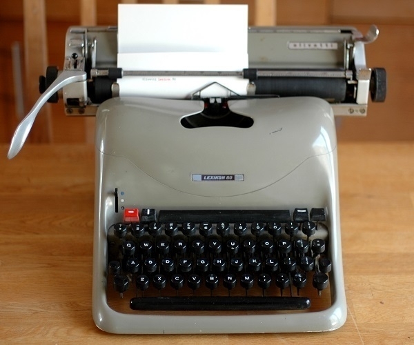
It’s a later-model Lexikon 80 with the thicker keys. This particular one was made in 1958 at Olivetti’s factory in Glasgow. Unsurprisingly it has a UK keyboard layout including the usual plethora of fractions: ⅛, ¼, ⅜, ½, ⅝, ¾ & ⅞. Also standard-issue is the taupe finish. The type is 12cpi Elite. The obvious scratch on the ribbon cover was there when I bought it, as were some spots of rust. At first, the keys were stiff and reluctant to move. With some light cleaning and regular use, however, everything freed up very nicely.
The Lexikon 80 is more often mentioned in connection with Marcello Nizzoli’s elegant design (which has made this typewriter a museum piece) than with its typing action. For me, though, it has become a firm favourite, hitting a sweet spot between smoothness and snappiness. It looks good and feels good. Its hefty bulk lends it a satisfying stability, yet it’s more compact and manoeuvrable than an Olympia SG-1 or an Hermes Ambassador. Latterly it’s been seeing the most action out of all of my typewriters.
Mea Culpa
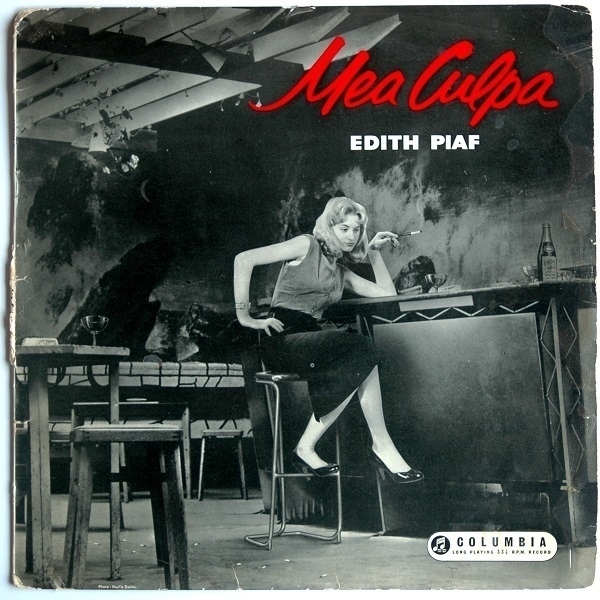
I love the record cover shown above. A disconsolate young woman smokes a cigarette while nursing a drink at an otherwise deserted bar. It caught my eye during a quick trip to Chepstow just this morning, and I bought it despite having only a few weeks ago picked up another Edith Piaf compilation (Portrait of Piaf: 25 of her Greatest Hits) which already amply covered my modest Piaf needs. Portrait of Piaf is a 1973 double album “electronically reprocessed to give a stereo effect” while Mea Culpa (1958) is in the original mono, with added pops and crackles due to a fair amount of wear & tear it has sustained over the years.
Eight of the earlier album’s fourteen tracks also appear on the later one, with my favourite – ‘La Vie en Rose’ – among them. Mea Culpa is necessarily missing such famous numbers as ‘Milord’ and ‘Non, Je Ne Regrette Rien’ that post-dated it. I was slightly surprised, when first listening to Portrait of Piaf, to recognise a familiar melody in ‘Le Trois Cloches’, which I’d long known from one of its English versions.
On handing over the £3 asking price for Portrait of Piaf at a Monmouth charity shop, the cashier told me she had seen Piaf perform in concert in Paris. I was suitably impressed – only later pausing to wonder at the practicalities of it when I realized Piaf had died as long ago as 1963. Even if it had been one of the singer’s last shows, the cashier (who I don’t think can have been older than in her mid seventies) must have been a teenager at the time. She said she’d had no prior knowledge of Piaf and had been taken along by a friend. On seeing a little old lady come out on to the stage she’d been disconcerted, but her reservations were soon dispelled when Piaf began to sing. “A little old lady” seems an unkind description, given the singer never made it past her forties, but I suppose it’s consistent with how a teenager might have perceived her.
Morbier

From a cheese coated in ash, to another with a layer of ash inside it: Morbier. I bought the slice of it shown above at the local Tesco. In most modern Morbier, the ash is no more than a vestigial remnant of the way the cheese was originally made, when an ash-layer served the purpose of protecting a part-filled mould of curds until it could be topped up.
Florence Arnaud, writing in The Oxford Companion to Cheese tells us that Morbier dates at least as far back as the late 18th century, but that only as recently as 2002 was it made subject to AOC rules in an effort to re-associate the cheese with its original terroir in the Haut-Jura region of eastern France. She adds that “It should be left at room temperature for at least thirty minutes before being eaten so that it can reveal all its aromas, with fruity, yoghurt, vanilla, milky, and even fudge being the most notable”. I confess I tend to be too eager to consume the stuff after removing it from the fridge and seldom give those aromas their proper due. I should be more patient.
It’s a mild cheese: pleasantly subtle rather than bold. Earlier this year I tried some Ashcombe – an English cheese modelled on Morbier. It was excellent, with a good deal of depth and complexity, albeit at a considerably higher asking price than the Tesco Morbier. Doubtless in France there’ll be more sophisticated artisanal examples of the style which are at least as good as the Ashcombe.
Please Enjoy
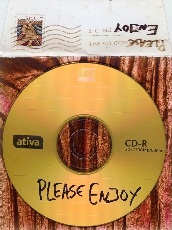
Between about 2006 and 2014 I occasionally took part in organised CD-R music swaps. A total of anywhere between, say, fifty and a hundred participants would be more or less randomly assigned into groups of five or six. Everyone in each group would make a mix CD and post it out to their fellow group-members. In one of the first such swaps I was a part of, in spring ‘07, someone did a little light hacking to access the full list of swappers and anonymously sent them all the same mix.
My copy of this CD is shown above. “PLEASE ENJOY” was written on the disc, which came in a square envelope with a close-up of a tree-trunk – a redwood? – on one side, and my address on the other. On the flap of the envelope was the stamp, a San Francisco postmark, and another handwritten “PLEASE ENJOY”. Some recipients were upset that their addresses had been so easily obtained without their permission. As for myself, I was happy enough to receive another CD: I did quite enjoy it and played it a good many times.
No track-list was included with it, but one was circulated shortly afterwards. All the music was new to me so I wouldn’t have recognised anything on it otherwise. The fifteen selections included trip-hop, electronica, downtempo & adjacent genres. Among the artists featured were Bonobo, Matthew Herbert, Plaid and The Cinematic Orchestra. I’m not sure if the disc still plays (it’s been a while since I tried it), but I remain grateful to the anonymous benefactor who sent it.
The Hole
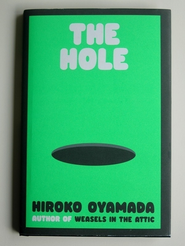
At first, when looking at the new fiction in hardback at the Abergavenny branch of Waterstones last month, nothing had caught my eye. Then I thought to look closer and see if any of the shorter & thinner books nestling between the stouter, more eye-catching ones might be of interest. No fewer than four of those seemed appealing and I ended up buying two of them: Shy by Max Porter (122pp); and, shown above, The Hole by Hiroko Oyamada (92pp). I liked the bold & simple cover design of the latter, and the fact that its author had also written another book called Weasels in the Attic. Those two things, and a mildly intriguing blurb, were all it took to persuade me to part with the £12.99 asking price. In another mood on another day I may well have just put the book back on the shelf.
The story concerns Asa, a young woman, who moves with her husband from an expensive city apartment (and from a stressful, unrewarding job) to live rent-free in the countryside next door to her in-laws. Despite the superficial changes for the better in her circumstances, she feels ill-at-ease in her new surroundings, and in the oppressively hot summer that ensues she has a variety of strange encounters and experiences. It’s not spelled out as to whether these are delusions, or supernatural phenomena; nor if they are to be taken at face value or construed as metaphors. It’s very likely that some of the weirdness is a commentary on the social norms and conventional expectations weighing down on our protagonist, but any neat & tidy explanation for it all eluded me.
It’s a book where I felt that a few pages of end-notes from the translator may have been helpful. Several Japanese terms in the text were unfamiliar to me. One I had heard of (‘hikikomori’) did get a brief gloss. More than once I wondered if I were missing some or other allusion as a result of my ignorance. Aside from that quibble, I thought David Boyd’s translation into American-accented English came across well. On balance, I enjoyed this odd and confusing little book.
Valley

Another of the types of photographic film I’ve dabbled with is Ilford SFX 200, a black-&-white film with ‘extended red sensitivity’ edging into the near infra-red. Used in conjunction with the right kind of deep red or near-black filter one can get, in theory, a proper infra-red photograph. The image above is from one of the few rolls of SFX 200 I ever bought in 120 format. It’s a shot of the Cynon Valley in South Wales taken from a hillside above Abercynon.
I was shooting that day with a Mamiya C330S medium-format camera. The only suitable filter I had (a B+W 092) was intended for use with 35mm Nikon lenses, so I’d had to obtain a speficic adaptor for mounting the ⌀ 52mm filter on the smaller Mamiya lens. I developed the film at home using Tanol, which may well have been the only time I attempted that particular combination. I was pleased with the way this high-contrast shot came out, even if it fell a little way short of the dramatic effect I’d hoped for.
Vipp

I am often something of a cheapskate, yet occasionally will spend absurd sums on items that have caught my eye. Take, for instance the Vipp 13 pedal bin pictured above. The current suggested UK retail price for one of these is £235. I bought one for something like half that amount about twenty years ago. I’d seen it in a fancy designer homewares store near my apartment in Sweden. There were several such appealing shops in the town where I lived. To generalise and stereotype, one might say that Swedes are more prone to allocate rather more of their disposable income for upmarket home decor than for designer clothes & accessories; whereas for Italians, the converse might be true. In any event, I was pleased with my ridiculous purchase: it ‘sparked joy’, as the expression goes.
Tragedy struck when I moved back to the UK: in a mix-up with the movers, the Vipp bin was left behind. Some years later, when the cheap bin I’d bought from Argos by way of replacement was rusting where there was metal and cracking where there was plastic, I pondered getting another Vipp. Bathroom bins aren’t the sort of item that most people would contemplate buying second-hand, yet that’s exactly what I ended up doing. An ebay seller had a stock of the things ostensibly from the rooms in a defunct boutique hotel. I ordered the one above for something in the region of £60-£80 – much less than a new one would have set me back, but still very far from cheap for such a humble item. Nevertheless I was delighted to have such a good quality bin in my bathroom again.
Only on taking the picture above did I notice the wonkiness of the pedal, which I’ll admit is bothering me slightly. Having said that, when looking at the bin from the usual higher vantage point, the angle of the pedal is barely noticeable, so I don’t think I’ll be losing any sleep over it.
Alice Coltrane
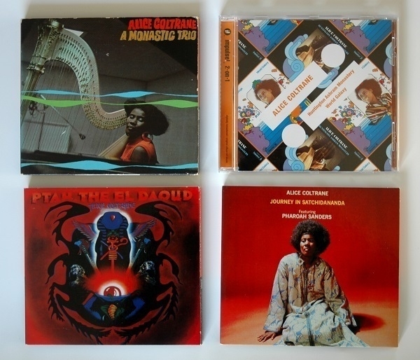
As shown above, I now have five of Alice Coltrane’s first six solo albums on CD, a pair of them – Huntington Ashram Monastery (1969) and World Galaxy (1972) – bundled together as a ‘twofer’. This disc was the first of the four I bought, acquired on a rare visit to the HMV in Cribbs Causeway. Not much later, in early 2020, I picked up Ptah, the El Daoud (1970) and Journey in Satchidananda (1971) at Spillers Records in Cardiff. While those were all inexpensive reissues, her debut album A Monastic Trio wasn’t so easy to find at a bargain price. At length I gave up trying and handed over £15 for a used copy from a seller on Discogs: it arrived last week.
I could have spent just over twice as much to get a new vinyl copy – but then I’d have missed out on the extra three tracks included on the CD; with a further eighteen and a half minutes of fascinating and beautiful music beween them. The booklet notes include excerpts from an interview with Coltrane, in which she explains, among other things, her dissatisfaction with ‘jazz’ as a descriptor for what she was doing; and how she considered the album to be a first continuation of her late husband’s work. For all that, I find I enjoy her records more than those by her esteemed spouse. This is serious music without, I think, being self-important; and spritual without being dogmatic. An example track: ‘Gospel Trane’.
270
Seldom in my adult life have I consumed less alcohol than over the last few months. Perhaps while recovering from the flu that laid me low in early ‘07; maybe while providing moral support for my late wife when she quit smoking in ‘11. My consumption had been moderate enough for long enough that reducing it to next to nothing has had next to no effect, beyond possibly helping me lose a couple of pounds (lbs.), while undoubtedly saving me a few pounds (£££).
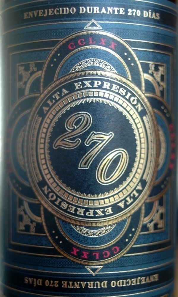
I’ve every intention of tentatively breaking the drought this evening by having a glass of red wine, specifically some 2021 ‘Alta Expresíon 270 Ribera del Duero’. This Spanish wine, made from the Tempranillo grape, is reckoned by James Button at Decanter to offer “intense black fruits with plenty of oak spice and touches of tobacco, chocolate, earth and herbs”. If I’m in any fit state, I’ll come back to add my own thoughts about it later.
Added six hours later. It was delicious: well-rounded wine with black fruits & spice notes as promised, supported by unobtrusive tannic underpinnings. I couldn’t pick out tobacco, chocolate, earth or herbs as such in the chord of flavours it presented, but, whatever its constituent parts, the overall effect was a harmonious one.
Waste Paper
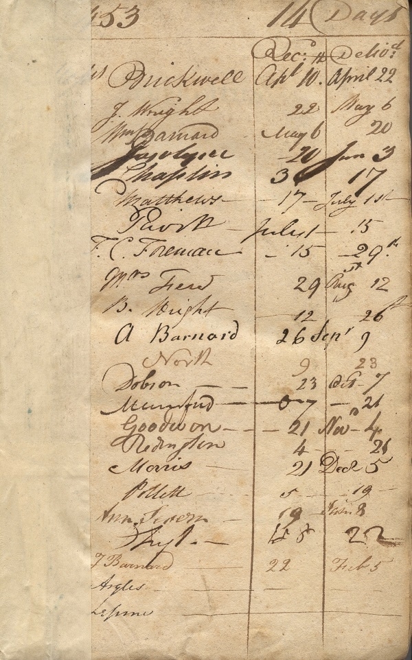
Once upon a time it wasn’t uncommon for old waste paper to be re-used when binding or re-binding books. The one example of that practice in my possession is shown above, a sheet bearing a register of handwritten names and dates – partly obscured by a strip of adhesive tape – repurposed for the front endpaper in a copy of Vol. 3 of Isaac D’Israeli’s Curiosities of Literature as published by John Murray in 1817. The binding is rather flimsy and seems to have been improvised by a former owner, with only one board at the back and some thinnish blue card glued to it that wraps around the spine and serves as the front cover. There’s a label on the spine with title, author, publisher and publication date neatly written on it.
It seems plausible that the re-binding job might have been done in the later 19th Century, but I don’t know if that’s any help in dating the inscribed sheet. Above the list of names is the number 453, above the dates is written 14 Days. I can’t construe all of the names but recognise surnames like Wright, Barnard, North, Dobson, Goodwin, and Morris. There’s one name I can’t unsee as Mrs. Fiend, which I don’t suppose can be right! On a barely-related note, the book’s title page carries an epigraph – a maxim attributed to the Marquess of Halifax – “The struggling for knowledge hath a pleasure in it, like that of wrestling with a fine woman.”

Angels at the Ritz
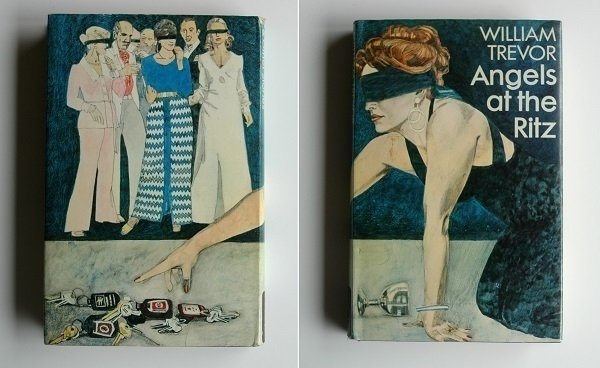
Having more-or-less exhausted the bodies of work of some of my favourite short-story writers, I thought I’d try someone new, and ordered a collection by the renowned Irish author William Trevor: Angels at the Ritz (and Other Stories). The book’s striking front cover depicts a bindfolded woman on her hands and knees. The design wraps around to the back cover which provides the context: a ‘key party’ is at its crucial stage with the woman about to select a key and with it a partner for the rest of the night.
The image relates to the volume’s title story. In it, thirtysomething Londoners Gavin and Polly attend a party thrown by old friends where partner-swapping is on the agenda, although they intend to leave before things get to that late stage. During the party both are (separately) propositioned, with Polly recoiling from the suggestion but Gavin demurring only with a reluctance observed by his wife, who realises it marks a turning-point in their marriage. The somewhat sordid goings-on are portrayed as a fall from grace when contrasted with the friends' recollections of an impromptu gathering years beforehand (well beyond their usual means) at the Ritz Hotel. Rather more shocking to the modern reader than the swinging shenanigans is the fact of Gavin, described as having put away at least four G&Ts, drunk-driving them back from the party, and then giving their babysitter a lift home afterwards: something which doesn’t cause Trevor to so much as lift an authorial eyebrow in disapproval.
I admired the book more than I enjoyed it. I felt there was something of Chekhov in Trevor’s outlook – which would be higher praise coming from someone who better appreciated the Russian’s writing. It’s a book of solid endings: Trevor makes sure to clearly put across a point or a moral or an insight at the end of each tale. I prefer a little more subtlety myself, while conceding that an excess of inconclusive ambiguity can be more annoying than heavy-handed closure. What I did love about the writing were the powerfully vivid evocations of time & place throughout. My favourites of the stories were placed one after another near the middle of the book: ‘The Tennis Court’, ‘A Complicated Nature’ and ‘Teresa’s Wedding’.
Riot! Dont Diet

Where I lived in Sweden, it was interesting to see rather more graffiti in English than in Swedish. My apartment for most of my time there was in a building that also housed a small hotel, a bookshop and a takeaway pizza place: all the amenties one could hope for. In the basement was a parking garage with an entrance at the rear of the building. One day in late 2004 some pink spray-painted graffiti appeared next to that entrance exhorting “RIOT! DONT DIET”. Nearby was another heartwarming message in English. I took the pictures with the little point-and-shoot digital camera I had at the time, a Pentax Optio S4.
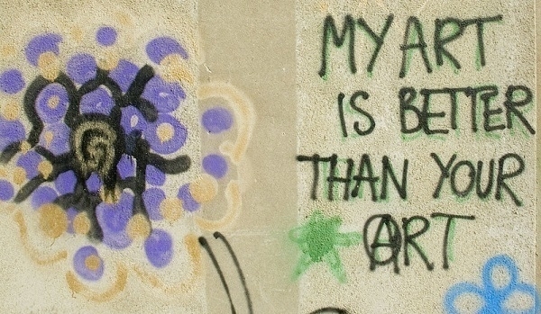
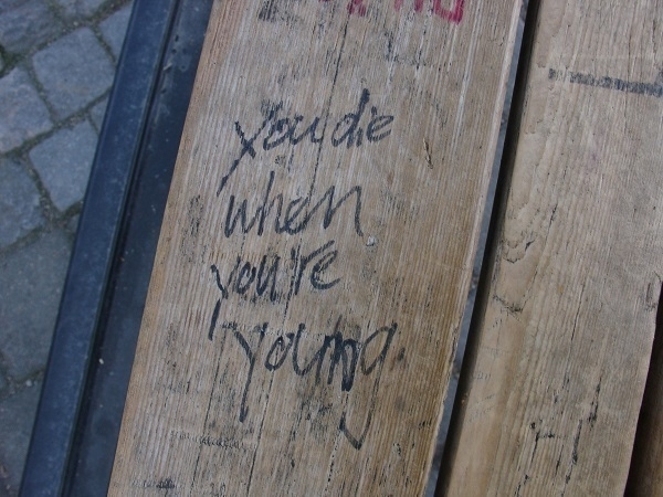
As I’ve mentioned before, it was another piece of graffiti that, a few years later, helped intensify my enthusiasm for photography. Some other miscellaneous messages I photographed in and around Karlskrona ca. 2005-09: MY ART IS BETTER THAN YOUR ART; you die when you’re young; Love+Love+; FLOAT LIKE A BUTTERFLY STING LIKE A BEE; and, as shown below, FIRE WALK WITH ME!