A Glass of Amontillado
It’s quite likely that my maternal grandmother was responsible for my first taste of sherry, it being her booze of choice. I found the ‘cream’ sherry she favoured overly sweet, if pleasant enough in small servings. A glass of manzanilla at a Spanish seafood restaurant some twenty years ago brought another style of the wine to my attention – one that was more to my taste. After that I’d occasionally seek out a bottle of the stuff – an exception to my general preference for red wines over whites.
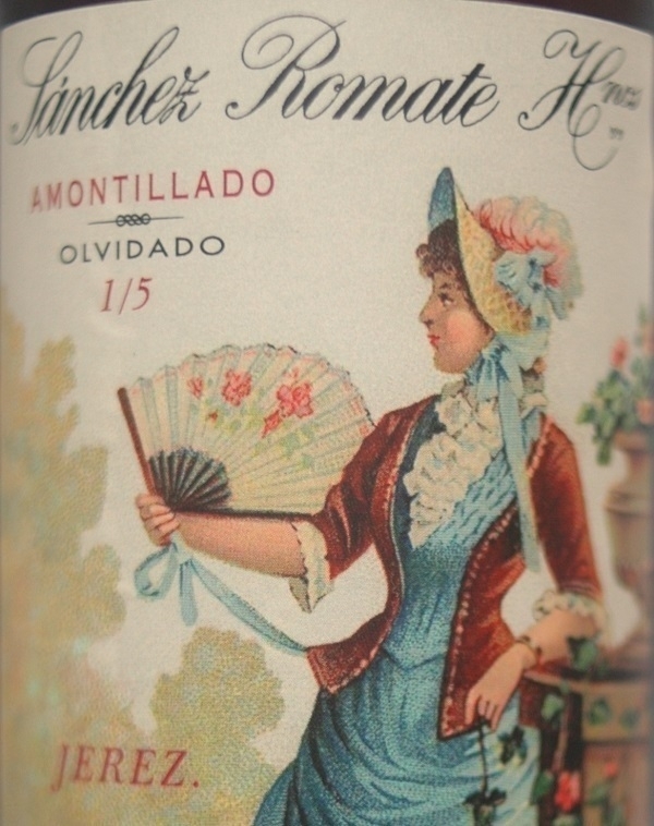
I had never tried amontillado sherry until the other week, despite long familiarity with the word thanks to Mr. Poe. The label above caught my eye during a visit to a nearby branch of Waitrose. It adorned a half-bottle of Sánchez Romate Hermanos' Amontillado Olvidado, where ‘olvidado’ relates to the wine having reputedly been left forgotten and undisturbed in the company’s cellars in 1000-litre toneles for 25 years.
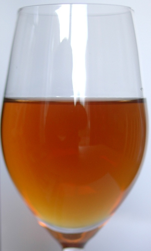
The blurb on the back of the bottle describes it as “elegant, with delicate hazelnut reminders and antique furniture notes”. The latter comparison seemed fanciful to me until I took a good sniff, with the bouquet of the amber nectar within redolent indeed of old wood and furniture polish. My palate was more oblivious to those hazelnut reminders – “tastes like sherry” was my own unhelpful conclusion; albeit a broader, deeper, more intense kind than I’d sampled before. Its lengthy spell in the barrel hadn’t altogether mellowed the wine: it was smooth but not without brashness, something like (attempting a fanciful comparison of my own) the flavour equivalent of a brass fanfare and its lingering reverberations.
Clippings
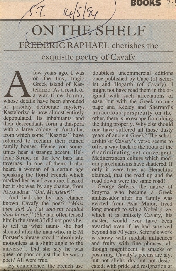
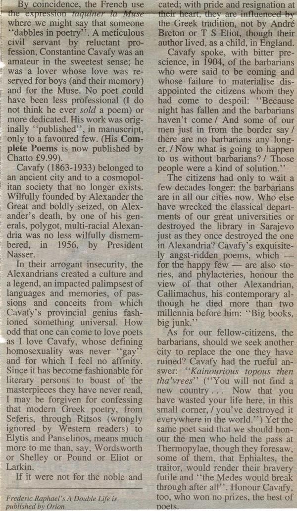
From one of the charity shops in Monmouth last week I bought a copy of C.P. Cavafy’s Collected Poems, specifically a 1984 paperback volume published under The Hogarth Press imprint. It cost me £2. I didn’t open the book until I’d brought it home, so only then did I see the newspaper clippings that had been enclosed within by a prior owner of the book. One of them (part of which is shown above) is a piece by Frederic Raphael about Cavafy & his poetry which has “S.T. 14/5/94” written on it. I imagined S.T. might stand for the Sunday Times, but 14/5/94 was a Saturday. The remainder of the clipping (which, unfolded, is a little taller than my scanner’s flatbed) is here, should anyone be interested.
The other clipping is a more substantial one: three full pages from a November 2008 issue of the NYRB, stapled together in one corner and folded three times. It preserves an article about Cavafy entitled “‘As Good as Great Poetry Gets’” by Daniel Mendelsohn, together with a translation by Mendelsohn of Cavafy’s poem ‘Myres: Alexandria in 340 AD’. This was in advance of Mendelsohn’s edition (Knopf, 2009) of the poet’s collected work.
There was further evidence of prior ownership with an inscription inside the cover bearing the original purchaser’s (unusual) name, dated October 1984. Also, a wooden toothpick that had served as a bookmark. Searching on-line for the inscribed name, I found it matched that of a newspaper journalist who had worked internationally in the ’90s and ’00s. Could he be the author of the inscription? And, balancing one conjecture unsteadily on top of another, might he have been the one to fold up and enclose the clippings?
I had previously – in the early ’90s – owned a similar second-hand volume of Cavafy’s poetry. In those days I felt somewhat ambivalent about the superficially un-lyrical plainness of his verse, and a little uncomfortable (having, regrettably, absorbed some of the ambient homophobia of the times) with his writing about same-sex attraction. On becoming re-acquainted with Cavafy’s poetry, I felt no such misgivings and found rather more to enjoy and appreciate in it than before.
Hollingworth Papers
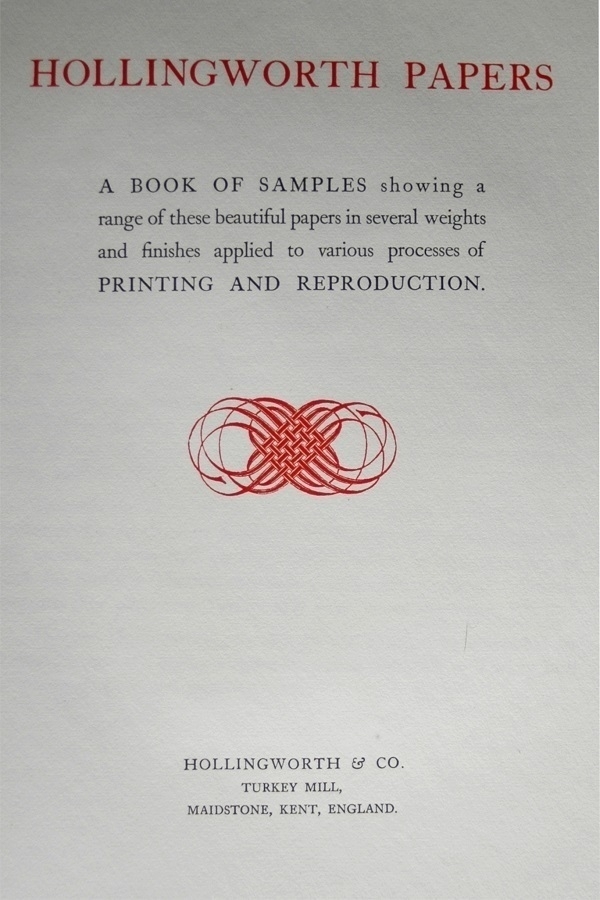
Among the books of paper samples I’ve acquired, the volume of Hollingworth Papers has to be the most elegant. It’s a tall, slim hardback bound in pale blue cloth with some vellum-effect stuff at the spine. It has gilt titling, and the upper page-edges are gilded too. The paper within is appropriately excellent. Its title-page is shown above.
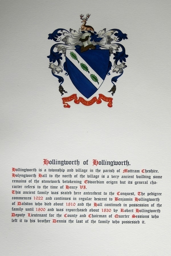
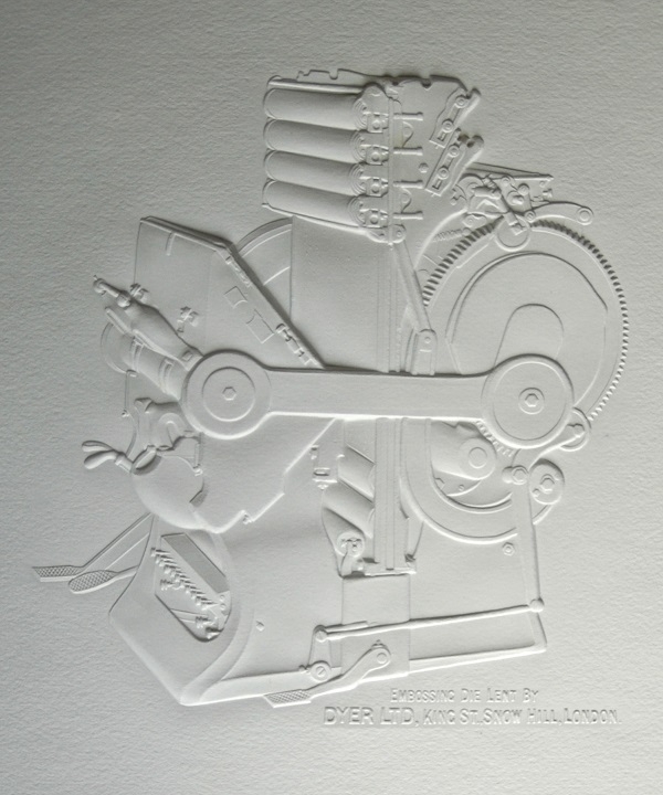
Before the title comes a page with a hand-illuminated Hollingworth coat of arms. There follows some letterpress printing, and a selection of illustrations highlighting how the company’s papers show off lithographs, collotypes and photogravures to fine effect. Each illustration is protected by a sheet of tissue-paper. In a folder within the back cover are a few examples of embossed images.
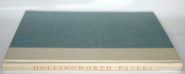
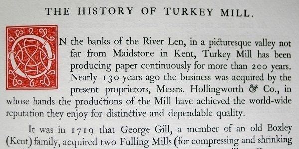
No date of publication is given. The ebay seller I bought it from claimed it dated from the 1920s. It can’t at any rate be earlier than that as there’s mention of over two centuries of paper-making at the company’s Turkey Mill premises, which were first used for that purpose in 1719. The same mill was the venue, a few decades later, for James Whatman’s invention of wove paper. with the Hollingworth family only becoming its proprietors near the end of the 18th century.
Pegs
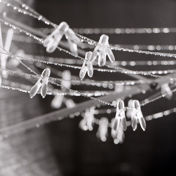
Of the various kinds of photographic film I tried out, one I didn’t have much luck with was Rollei Ortho 25. My attempts to develop it at home were bedevilled by blemishes in the finished negatives. Most likely this was due to something amiss in my process, although I suppose it could just have been a bad batch of the film. In any case, most of the frames I shot on the stuff were uninspired efforts, so little of value was spoiled.
The sole exception was the photo above. Early one autumn morning I caught sight of a low slant of sunlight illuminating the bedewed clothesline in the garden and the plastic pegs hanging from it. What at other times would have been a poor choice of subject had momentarily become a fascinating one. There are still small blotchy marks in this frame too (much more apparent when viewing a larger version of the image), but they are less prominent than on most of the others from the same roll. I took the photo with my Mamiya C330S, and developed the Ortho 25 in Rodinal.
Gotta, LouPer
One gets the impression that German-made straight razors tended to be more ostentatious than those made in Sheffield. Brand-names are more prominent; scales are more often decorative; etching and gold-washing on the blade more eye-catching. There would have been a time, in the early years of the last century, when many German-made goods were regarded in the UK, fairly or not, as cheap and inferior imports, so perhaps there was a tendency on the manufacturers' parts to try to compensate by projecting a more de-luxe appearance.
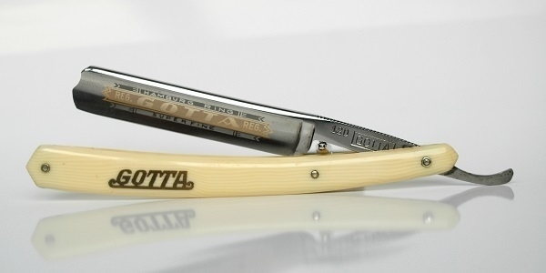
For example here’s a Gotta 120 razor with a 4/8, full hollow ground blade which has a ‘barber’s notch’ at the point. The GOTTA brand-name, one of a few used by the firm of Grah & Plümacher, appears on the scales (which I believe to be celluloid), in gold wash on the blade and again on the tang. On the other side of the tang is the text “Finest Silver Steel / Forged and Ground / in Solingen Germany” (Solingen, like Sheffield, being a traditional centre for bladesmithing and cutlery manufacture).
I’ve been using this one for three years. When it first arrived, the edge on it was formidably sharp, and in my inexperienced hands my first shave with it wasn’t far short of a bloody mess. Not quite a case of “Gotta call an ambulance” but certainly “Gotta be more careful next time!” Since then it has been reliably excellent: I had a great shave with it the other day.
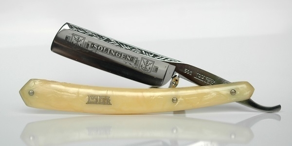
And here’s a LouPer Flamme razor. This one has a 6/8 blade with a ‘French’ point which is decorated along the spine and has SOLINGEN – and the city’s coat of arms – etched into the sides of the blade. On the reverse of the tang is the text “🔥 Flamme / Louper / Solingen”. The scales, again, are probably celluloid, albeit this time with a marbled effect. ‘LouPer’ and ‘Flamme’ were trademarks of the Louis Perlmann company, which originated in Leipzig in the 1860s, but later set up an operation in Solingen, as well as a presence in Berlin. In addition to making blades themselves, they also supplied machinery and material to other cutlery companies.
I obtained the LouPer a few months after the Gotta. Whereas the Gotta was in near-pristine condition, and still had its original box, the LouPer had more signs of prior use, and arrived boxless. Despite that, it too has served me very well. Both razors are likely to have been made between the wars, which raises the unsettling (and potentially unanswerable) question: are these artefacts of the Weimar Republic, or of the Third Reich?
Le Mystère Des Voix Bulgares
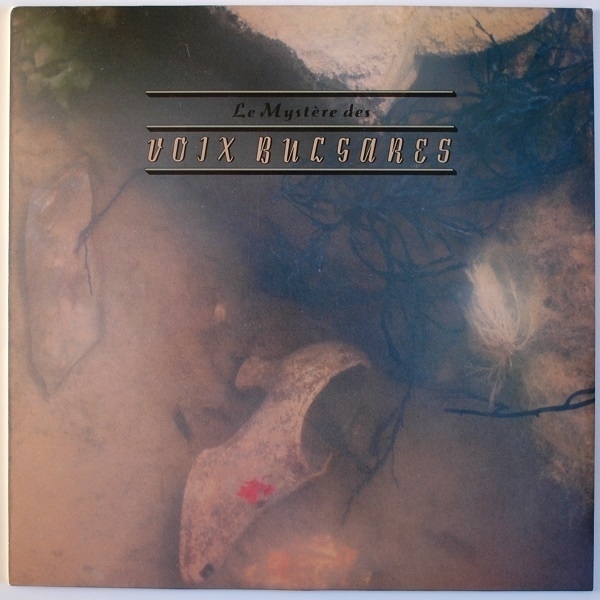
A few weekends ago out of the boxes of LPs at one of my usual haunts, I picked up a copy of Le Mystère Des Voix Bulgares, specifically the 1986 re-release on 4AD. As 4AD is a label which has maintained a certain vogue (and one which hit its stride at a time when cassettes and CDs were increasingly prevalent), one seldom finds affordable copies of their vinyl releases out & about. I was lucky enough to get this one as part of a 3-for-£10 offer. The cover is a typically enigmatic example of the work of 23 Envelope, whose connection to the music – if there is any – is far from obvious,
It’s an album that had first been released a decade earlier, as the fruit of many years' labour by the Swiss ethnomusicologist Marcel Cellier, who had made and collected recordings of traditional Bulgarian song performed by female choirs (notably the Bulgarian State Television Female Vocal Choir). These performances were in contemporary (’60s and ’70s) arrangements, but the singing style, like the material, had much older Slavic (and even Byzantine) roots, utilizing close harmonies in a way that, to Western ears, can have a piquant dissonance about it.
At a time when the average listener’s musical horizons were more constrained than they are now, the release of such unfamilar-sounding, yet inarguably beautiful and powerful music felt like a bolt from the blue, and the 4AD re-issue (and a subsequent one on Nonesuch in the US) made some waves. George Harrison, for example, praised and recommended it; Kate Bush invited the Trio Bulgarka (whose members also sang for the Bulgarian State Television Female Vocal Choir) to join her on a couple of the tracks on The Sensual World; and it inspired the soundtrack for the anime Ghost in the Shell.
Gorwydd Caerphilly
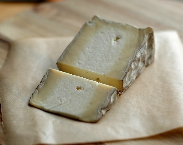
Mass-produced Caerphilly cheese of the kind generally available in supermarkets tends to have a simple flavour profile: salty, mildly creamy; somewhat tangy; and a dryish, crumbly texture. A farmhouse-style Caerphilly like the Gorwydd one shown above is altogether more complex. As the photo illustrates, it has a pale-coloured heart around which is a deeper yellow layer within its edible rind. The pale part of the cheese has something like the quasi-citric tang of its factory-made namesake, whereas the outer part contributes rounder and deeper notes, and the rind an earthy mushroomlike quality. The overall effect is that of an harmonious chord of flavours, as opposed to a single note.
The Trethowan brothers who make Gorwydd pioneered the revival of farmhouse Caerphilly after the style had become all-but extinct. It was named for the farm in west Wales where they first made it, a name retained after their relocation to Somerset in south-west England. I bought the wedge in the picture from the Newhall Farm Shop near Chepstow. It’s a delicious cheese that is meanwhile mild enough not to alarm the unadventurous.
Kursuus-sectâ
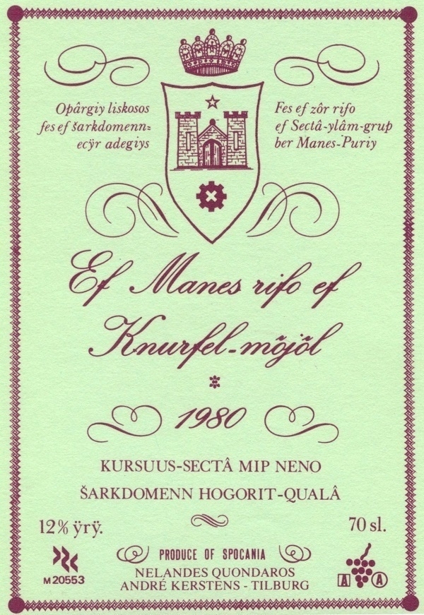
Twenty years ago, I learned of an exhibition that had been staged in Rotterdam in 1983 called Imaginaire Landen, which collected various artworks that mapped or described imaginary locales. Intrigued by some of the names of the artists and writers represented in the show, I ordered a copy of the exhibition catalogue. This, when it arrived, turned out to be a box containing numerous unbound leaflets printed in Dutch, along with sundry additional pieces of ephemera, among them a box of matches bearing the name of a non-existent airline (but with real matches inside); a weird card-game; a button-badge; numerous maps, blueprints, charts and tables; schematics of dreamt-up metro networks; a musical score; and even a little bag containing coarse black sand, some pebbles, and a broken cockle-shell, purportedly from the imaginary island of Atipé. Also there was the wine-label shown above.
The fictional location that produced the wine was one called Spokanië (or Spocania) an island-group ostensibly in the Atlantic to the south-west of Ireland: originally the brainchild of Rolandt Tweehuysen, a Dutch linguist. Given his line of work, it’s no surprise that the language of Spokaans (or Spocanian) is a significant part of his creation. According to wikipedia, it has a “a dictionary of over 25,000 entries” and is “one of the most elaborated artistic languages ever created”. Many other aspects of the islands and their inhabitants have also been described by Tweehuysen and others, with two books and an extensive old-school website devoted to the subject.
Back to the wine-label. From this page on the web-site (with the help of Google Translate), I’ve learned that it’s from the southern side of the Tjokky Mountains in the Neno district of the island of Tigof. It’s specifically a product of the Hogorit-Qualâ estate, and is a Kursuus-sectâ (or ‘blood wine’), a term used in that part of Spocania for light red wines akin to French Beaujolais or Burgundy. What kind of vintage might 1980 have been, I wonder?
Churston Deckle
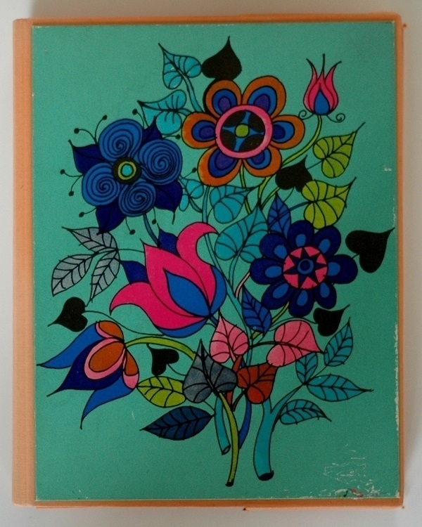
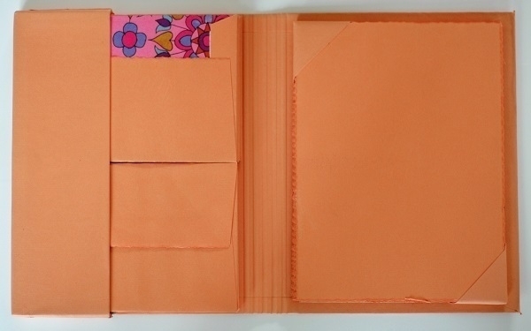
Shown above, the striking design on the cover of a folder containing an old set of writing paper and envelopes. I would say the image and its colour-scheme suggest a ’70s origin. The paper within is an orangey shade given the name ‘peach bloom’. Below are the contents of the folder when opened out, with one of the envelopes' flaps folded back to display part of the bold design in its lining, one which echoes the cover image.
The sheets of paper are watermarked Churston Deckle, this being one of the many product-lines sold by John Dickinson & Co. Ltd (previously: 1, 2). Those words don’t appear on the outer packaging, however, which merely describes the contents as “distinctive deckle-edged writing paper”. I wonder if the brand may have had old-fashioned associations by that time, and perhaps this set was an attempt to appeal to a groovier, younger public?
Ligotti
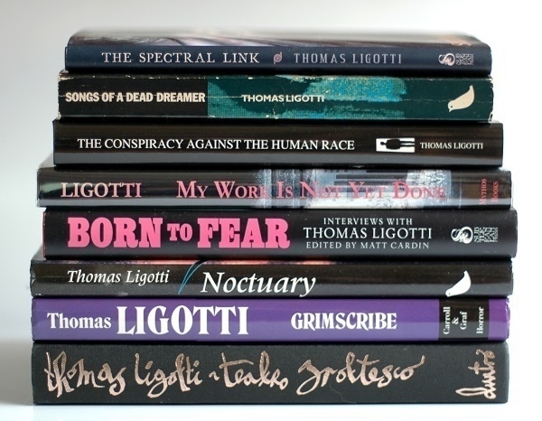
Here we see the books currently in my library from the pen of the idiosyncratic American horror writer Thomas Ligotti.
Second from top is my copy of the first UK edition of his debut short story collection Songs of a Dead Dreamer (1989). This is a book I’d first read in ‘92, having borrowed it from Cardiff Central Library. At the time I was very unhappily acclimatising to the misery of my first proper full-time job, and I found a perverse comfort in Ligotti’s bleak worldview. I meanwhile greatly enjoyed his way with words. To paraphrase a line from the story ‘Vastarien’, I felt as though “the book had found its reader” and became an immediate fan. After much searching I found a copy of my own in early ‘94, at the Cardiff branch of ‘Forbidden Planet’.
Toward the end of that same year I spotted Ligotti’s second book, Grimscribe (1991), listed in a mail-order bookseller’s catalogue. How that copy (of the UK edition – published by Robinson, ended up in a US Carroll & Graf dust-jacket is a long story I won’t get into). Story collection #3, Noctuary (1994) came into my hands in ‘98. I suspect it would have been among my first on-line book orders, but I can’t specifically recall. The remaining five volumes were definitely all on-line orders, all placed as soon as I’d heard of the titles’ having been published.
My Work is Not Yet Done (2002) is a collectable volume, coming as it did with a bookplate signed by both Ligotti and illustrator Harry O. Morris. More sought-after still is the Durtro edition of Teatro Grottesco (2006). Hardback copies of Ligotti’s essay The Conspiracy Against the Human Race (2010) likewise seem to be decidedly uncommon. Rounding out the set are the small volume of two stories that is The Spectral Link and the collection of interviews gathered in Born to Fear, both published by Subterranean Press in 2014. My copy of the former might have been worth more if my dog hadn’t got his teeth into it.
At one time or another I’ve also owned copies of The Nightmare Factory; In a Foreign Town, in a Foreign Land; Crampton; Sideshow, and Other Stories and Death Poems. Of these I sold a couple and gave away the remainder. There are only a few of his works (most notably The Agonizing Resurrection of Victor Frankenstein) that I haven’t read at all.
Big Hand
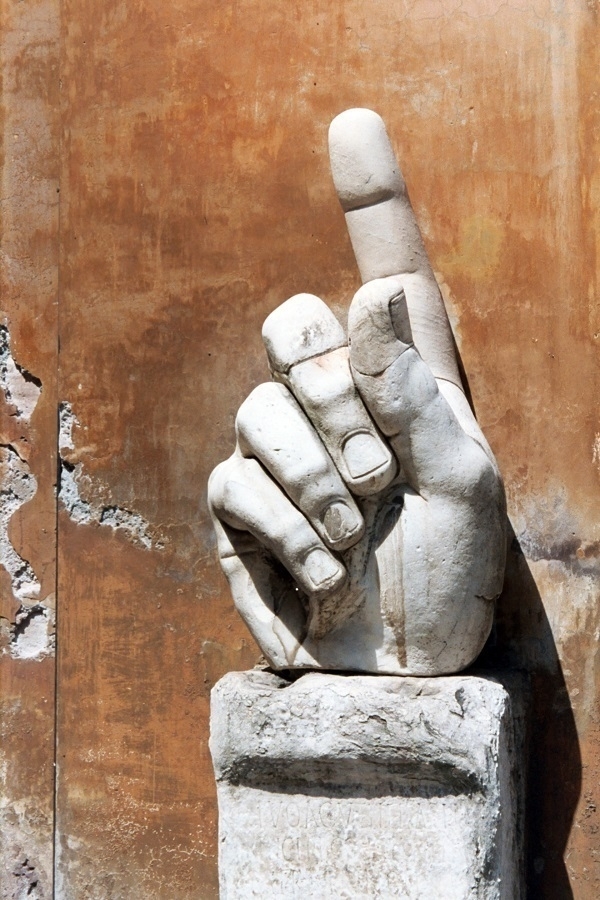
Here’s a photo of a disembodied hand, a surviving fragment of an ancient statue, to be found (at least as of August ‘97) in the courtyard of the Musei Capitolini at Piazza di Campdoglio in Rome. There must be many, many thousands of similar images out there similarly snapped by a significant proportion of the Museums’ very numerous visitors.
Ninety-seven was the year I finally got my hands on some of the desirable gadgets of the day. A JVC ‘Micro Component’ CD player (and speakers) and a Canon IXUS compact ‘APS’ camera. The IXUS was a great-looking little thing – all brushed metal and black plastic – with a nifty retracting zoom lens. It wasn’t the sturdiest device, however, and after four years' light use it conked out.
The ‘Advanced Photographic System’ must have been one of the last hurrahs of film photography, before the digital imaging juggernaut rolled in. I held on to about a dozen of the exposed APS films I’d shot, which, a decade or so later, I sent off to be digitally scanned. The ‘big hand’ was one of the frames in the first roll I ran through the IXUS. APS frames had a rather elongated 7:4 aspect ratio, which I’ve slightly cropped here.
Torpedo 18a
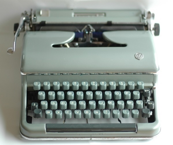
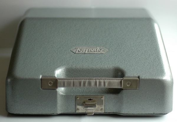
Pictured above is my 1954 Torpedo 18a typewriter. The difference between the 18a and the 18b being that the latter came equipped with a tabulator, while the former did not. I bought this one in December ‘17 from an ebay seller somewhere in Devon or Somerset. It was a pre-Christmas impulse-buy that cost me something like £35, postage included. As I recall it arrived packaged in an old Fortnum & Mason box.
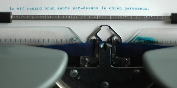
For obvious reasons, a German company using ‘Torpedo’ as their brand would have raised more eyebrows than profits in mid-20th Century Britain, hence for the UK market these machines went by the name ‘Blue Bird’. This one is a ‘Torpedo’ having been destined for France: it has a French AZERTY keyboard-layout, which is likely the main reason I was able to buy it relatively cheaply. Despite years of use, I still frequently mqke the sqme old mistqkes when typing on it. Also, its platen is rather hard, with the type-bars consequently liable to try to stamp holes in one’s paper.
On the plus side, out of all the portable typewriters I’ve used, this one has my favourite typing action: very responsive & sweetly snappy. The type itself is an appealing ‘Congress’-style one. I have a blue ribbon installed in the 18a, obtained from FJA Products in the U.S., which has served me well. I’d order more from them if the postage rates weren’t so prohibitive. When not in use, the machine resides in its smart metal carrying case. When I bought it, all that remained of the case’s handle was a steel strip. I later re-upholstered this with a section of a dog collar I’d found in a vaguely similar shade of grey.
Turbulence and Pulse, etc.
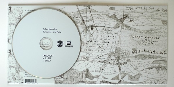
Latterly added to my shelves, and shown above, is the album Turbulence and Pulse by the South African drummer, composer and bandleader Asher Gamedze. It was released last year, another fine offering from the people at International Anthem. For a taste of the music see Gamedze’s quartet play a live version of ‘Melancholia’, one of the tracks on the album.
It’s acoustic jazz with an old-school sound agreeably reminscent at times of Charles Mingus, with its unison horn passages and powerhouse rhythm section, in which Gamedze is very ably aided & abetted by bassist Thembinkosi Mavimbela. Shaped by American traditions it may be, but it also has an accent and an attitude very much its own. I’m less convinced by the vocal contributions of Julian ‘Deacon’ Otis on a couple of its numbers, but they may yet grow on me. If this and my one other slice of South African jazz (Shabaka And The Ancestors' We Are Sent Here By History) are anything to go by, then further exploration of that country’s music will be well worth my time.
Here are a couple more jazz or jazz-related albums that have made an impression on me lately. Also from last year, Bark Out Thunder Roar Out Lightning by Chief Xian aTunde Adjuah, hitherto known as a trumpeter (and formerly named Christian Scott), who has turned to using his voice, in conjunction with harp-like instruments inspired by the West African ngoni and kora, and has produced a striking record heavy on the percussion and replete with call-&-response vocals. Hear for example ‘Shallow Water’.
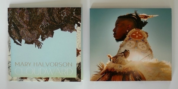
And the first 2024 release to reach me: Mary Halvorson’s Cloudward, a sequel of sorts to her wonderful ‘22 album Amaryllis, one that features the same sextet line-up as that earlier record. Apart from Halvorson’s highly-distinctive guitar work, Patricia Brennan’s contributions on the vibraphone are, for me, particular highlights. An example track is ‘The Gate’.
Pistachios
In my provincial ’70s British working-class childhood, nuts usually meant peanuts: plain salted peanuts, or, less often, in ‘monkey nut’ form. Around Christmastime there would be bowls of mixed nuts in their shells: hazelnuts, walnuts, brazil nuts. And a nutcracker nearby. Occasionally one might have almonds. I daresay pecans and cashews have been available for much longer, but as far as I was concerned they may as well have not been invented until the mid-’80s.
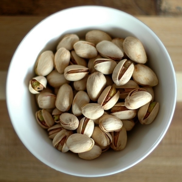
Pistachios likewise weren’t a part of my formative snacking experiences. I don’t recall when I might have first tried them – possibly in my teens. Now they are my favorite of all the commonly-encountered nuts. The ones pictured above are some Tesco own-brand roasted & salted pistachios that I ate while working from home this morning.
Spare Stamps
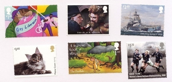
When I send letters I like to adorn them with special-issue stamps, especially now the standard Royal Mail stamp designs are so remarkably ugly. Special issues come in sets, often with an assortment of denominations, some of which tend to be more readily-usable then others. With the passing of time and the consequent increases to postal rates, I’ve accumulated a variety of the less readily-usable ones which are still awaiting an opportunity for affixing to an envelope.
The examples pictured above are from the Pride set (2022); from Royal Navy Ships (‘19); Blackadder (‘23); Cats (‘22) The Gruffalo (‘19) and Rugby Union (‘21) respectively. Perhaps in time I’ll be in a position to make a decorative arrangement out of them all. Oddly, a couple of the letters I’ve sent recently have had their (Spice Girls, ‘24) stamps seemingly removed while in the mail. Has a ’90s pop fan taken an acquisitive shine to them? Did their adhesive somehow fail? The latest letter I received was likewise missing its stamp.
Imperial Parchment
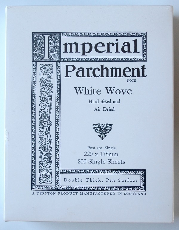
This box of Imperial Parchment paper, obtained recently via ebay, is something of an oddity. It’s announced as “a Terston product”, that being a brand-name used by George Waterston and Sons of Edinburgh and London, who went out of business over twenty years ago. The watermarked sheets within have an old-school look and feel, and the other text printed on the box, about the paper being “Hard Sized and Air-Dried” etc., is likewise redolent of a bygone era. Yet the box itself seems flimsily new.
Could this stuff be old stock re-packaged in the company’s declining years, or re-sold ‘posthumously’ by someone who acquired it when the manufacturer ceased trading? Might it even be counterfeit, unlikely as that seems? I may never know, but it’s good, relatively thick & heavyweight paper & there’s plenty of it.
Poems of Today
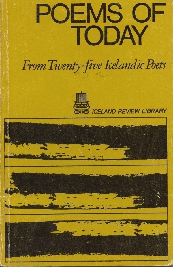
The latest addition to my collection of obscure anthologies of translated poetry is Poems for Today: from Twenty-five Icelandic Poets, a 1971 publication from the Iceland Review Library selected and translated by Alan Boucher. Specifically my copy is a ‘74 reprint that was purchased in Iceland in ‘76, for 720 ISK (judging from the inscription on the half-title page and the price-tag on the back cover). The inscription suggests the original owner lived out on the Western Isles of Scotland.
I enjoyed the poems. As one might perhaps expect there’s a good deal of boreal gloom in them. “Hard it is to bear on a mountain road / a full load of autumn forebodings” writes Jóhannes úr Kötlum, the oldest of the poets featured, in his ‘Traveller’s verse’. In the same author’s ‘Climacteric’ one finds a note of atomic-age anxiety, while elsewhere, in Stéfan Hördur Grímsson’s ‘Term of reckoning’, there is ecological unease. I don’t know if it was a sign of the times, or a characteristic of the selection, but only one of the poets whose work was included was a woman – Nína Björk Árnadóttir.
Iceland’s spectacular landscape features heavily - its mountains, fells, pristine pools and all-but-empty roads; and there are striking lines about the harsh splendour of winter at those latitudes – “Our passage through storm-whirled thundering polar darkness soon at an end / on the wind-polished ice-blue pane a whitening cloud” writes Hannes Sigfússon in an excerpt from ‘Winter pictures from the life of poets’. There are summer idylls too, though, and poems about non-Icelandic landscapes set in deserts and sprawling cities.
The country’s legendary and mythical pasts also cast long shadows: there are some echoes of the sagas; the occasional glimpse of an elf. We also read something of the poverty and hardship of times past, as in Jón úr Vör’s ‘Lean months’: “And do you remember the endless / milkless midwinter days, / the lean months’ left-overs, / salted scraps soaked in the pail…” Less weighty contemporary concerns crop up too: one of the poems is about the novelty of Mediterranean package holidays. There follows one of the poems in full.
Wait while it sings
When a bird first sings on your bough
do not go straight away — but wait while it sings
though its song be strange to you and new
wait while it sings although you thirst
with parched throat about the fire and hear
springs trickle at the foot of the hill; still wait
in the bright night while it trills.
Its lyrical tongue will cease in the night’s
quiet and peace among you in the flames’ light —
a strange tongue — wait nevertheless;
you will not enjoy that voice for long
for it will fly off when it has released
the heart-child from chains and freed
those clear eyes, quick small fingers
and little feet; brought to your ears
in the leafy thicket; wait while it sings.
—Thorsteinn frá Hamri.
Daffodils
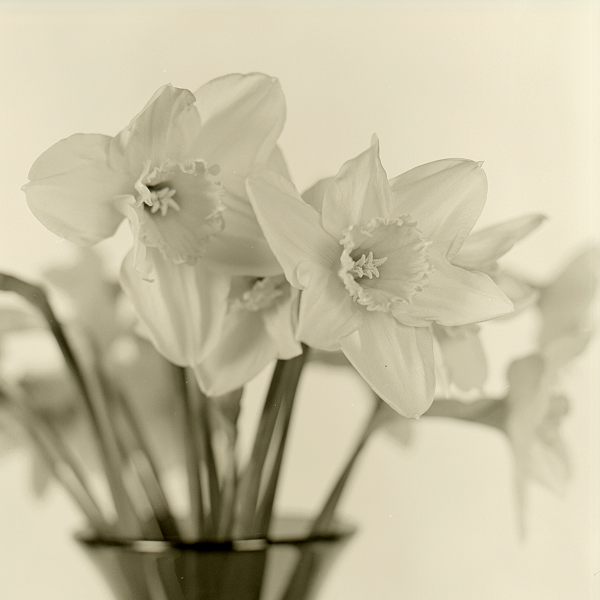
As it’s the time of year when the daffodils are proliferating hereabouts in gardens and along roadsides, here is a photograph of some daffs in a vase. I took it back in 2010 with my Mamiya C330 Pro S camera, most likely with the standard 80mm lens-pair attached. The film was Adox CHS 50 (now discontinued) which I developed at home using Tanol. I was very pleased with the way this shot turned out.
Car-key
Whereas most people are eager to learn to drive as soon as they’re of the age to do so, I was keen to avoid having to get behind the wheel, and for the first decade of my adult life, arranged things around being able to walk where I needed to go, or else to take public transport. When my first proper employers subsidised a course of driving lessons for me, I dutifully took them, but wasn’t sorry when I failed the test that followed.
Things changed when I met my wife. She tolerated train-travel, but disdained buses. Meanwhile she liked to drive, and was happy enough for the most part to do the driving for us both. For another decade or so this worked out tolerably well, until a change of location and a change of circumstances obliged me to knuckle down and start taking lessons again. It did not come naturally to me, and I failed test after test. Only after months of struggle, and at the sixth or seventh attempt, did I belatedly pass.
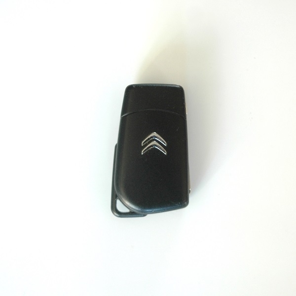
This serves to explain why, although I’ve owned seven cars in my time, I’ve only driven five of them. Car no. 7 is a 2016 Citroën C1 in plain white, the latest in a line of small, low-powered and (relatively) cheap vehicles. Its key is shown above, with the prong folded away. I’ve had this one for less than a year. I like it quite well, though wish it had a CD-player rather than the bluetooth music-playing contraption it came with. At least it does have a radio.
It's Better to Travel
The music I heard as a very young child came in the form of the pop hits of the day issuing tinnily from transistor radios. On my first exposure to heavier & harder rock I didn’t care for it - I called it ‘rough music’, so must have valued a certain softness & smoothness in the tunes I heard. In time though, I lost that aural equivalent of a sweet tooth and grew to appreciate the merits of roughness; eventually coming to disdain music I considered to have too smooth or glossy a surface. These latter sentiments prevailed – albeit with gradually proliferating exceptions – well into my forties. Even now I’m deeper into middle age, I often still find myself oddly resistant to certain lower-friction sounds.
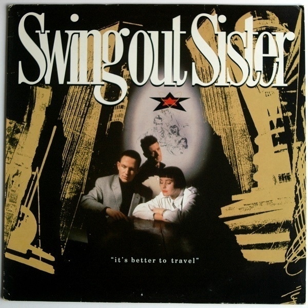
A few of last year’s vinyl acquisitions brought me back to music I’d formerly overlooked for those reasons, among them Secret Combination by Randy Crawford; Roberta Flack & Donny Hathaway; Sade’s Diamond Life; and (pictured above), It’s Better to Travel, by Swing Out Sister. From the last-named, I was unavoidably familiar with some of the singles, espcially ‘Breakout’, their most successful song. I liked the tunes well enough, and Corinne Drewery’s smoky vocals, but had been less fond of the sheen of their polished production. Now, thirty-odd years on, I can at last better appreciate it for the fine album that it’s always been.
Earl Grey
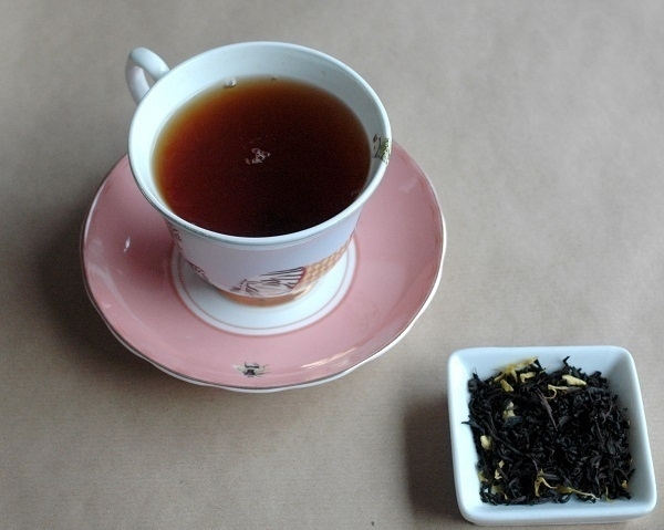
I’m partial to a cup of Earl Grey tea. To my taste, cheap Earl Greys (Earls Grey?) are often unpleasant. On the other hand, it doesn’t seem worth paying too high a premium for a tea where the added flavouring is as important as the accompanying leaves. My preferred point of compromise in recent years has been the loose leaf Earl Grey made by the Brew Tea Co. I’d say their claim that “our Earl Grey Loose Leaf tastes less like hot perfume, and more like proper tea” is well-founded.
It’s my usual choice of drink on those days when I travel in to the office. The cup and saucer shown above are by Yvonne Ellen, and were a gift from my sister.
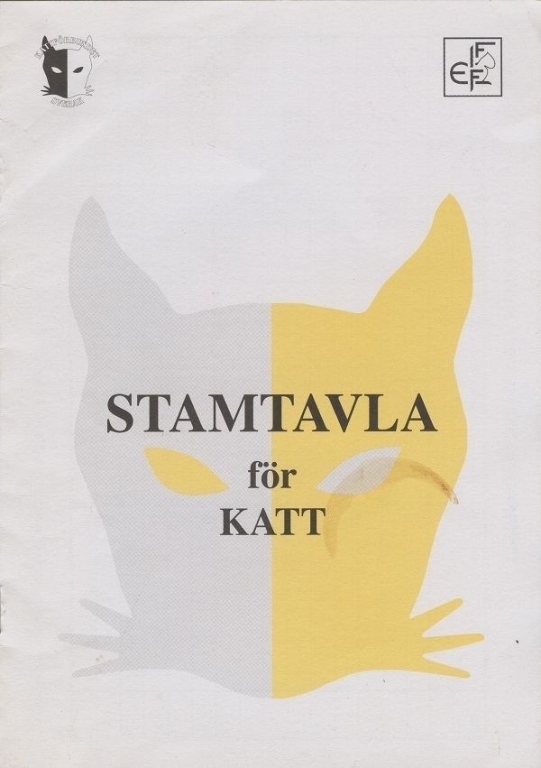
Stamtavla
A document that happened to come to hand the other day was my cat’s Stamtavla, that is to say his Pedigree (he was born in Sweden, and spent his first year and a half there). Before being renamed Murphy, he had originally been given the name “Adolfsbergs Big Me”. Adolfsberg is a place near Örebro; while ‘Big Me’ apparently derives from his tendency (still in evidence today), to want to be at the centre of attention.
The pedigree documents four generations of his ancestry in full, which is a good deal more detail than I have in my own genealogy. That probably goes some way toward explaining why one of us has often drawn spontaneous praise for his good looks, and one of us hasn’t. Had it been left up to me, I would have sooner adopted an unwanted stray, but my wife was dead-set on getting a Birman. hence all this paperwork.
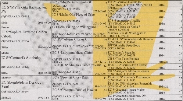
His family tree contains a bewildering variety of inventive names, many of them utilising somewhat unidiomatic English, or otherwise mixing languages. His father, for instance, went by “Sun Mountain Gimme Love To Give”, while his maternal grandfather was “Centauri’s Autobahn”. A particular favourite name is that of his paternal grandfather’s paternal grandmother, “Ullstrumpans Qumquat”, Ullstrumpan being Swedish for ‘the woollen stocking’.
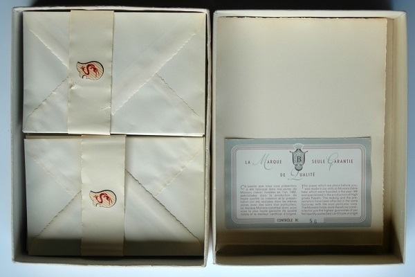
Vélin de Moirans
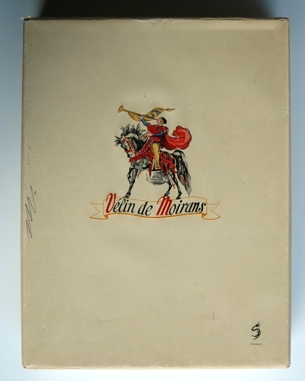
Here’s a box of Vélin de Moirans writing paper and envelopes. Moirans is a town in the Isère department in southeastern France. There was paper-making in that area for nearly five centuries, with the earliest mill purportedly dating back to 1480. I suspect this box was made in the late ’40s or ’50s. There’s reference on the back of it to some kind of trademark registration in 1946, which must have been around the time production resumed after its wartime hiatus. Sadly, Les Papeteries Barjon closed down for good in 1977.
The paper is of a very good quality. The sheets measure approx. 16cm x 21.5cm, and are watermarked along one longer edge with the pseudo-handwritten text “F. Barjon Moirans”. The envelopes are lined with dark brown tissue. A slip inside the box assures the buyer about the excellence its contents in French and English, the latter concluding “The Moirans trade-mark therefore constitutes for you the highest guarantee of perfect quality and the best certificate of origin.”
Journey to the South
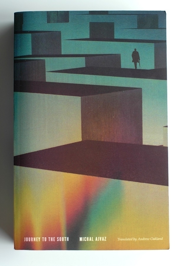
There are no few novels where an author who has successfully established an intriguing atmosphere, or has brought to life some well-rounded characters, or has described a tantalising series of events, then finds themselves unable to tie together the various threads they’ve been spinning to bring about a satisfactory conclusion. Conversely, there are books where the author has a devised a proper ending, but one they’ve only been able to attain by way of a wearisomely laborious set-up. I’ve met with significantly fewer books in the latter category than the former – to my mind, Michal Ajvaz’s novel Journey to the South, which I finished a few days ago, is one of them.
It could well be that aficionados of detective or mystery stories are more familiar than I with stories that build weakly only to end strongly. Journey to the South is, among other things, a murder mystery. Martin, a postgraduate student, witnesses a fatal shooting in a theatre, at a performance of a ballet composed by one Tomáš Kantor. In the crime’s aftermath, Martin becomes involved with Kristýna, a fellow-eyewitness, who had formerly been Kantor’s girlfriend. The victim of the shooting and Kantor were step-brothers. Before his ballet’s première, Kantor had also been found murdered.
The second part of the book is an account of Martin & Kristýna’s attempts to unravel the twin mysteries of the these deaths, a quest which leads them from their home city of Prague to the Greek Islands – the titular Journey to the South. Theirs is a highly-implausible but colourfully-imaginative quest for the truth. Before we even learn about that journey, however, the bulk of the novel’s first (and longer) part is devoted to a narration of an unconventional manuscript of Tomáš Kantor’s, one which comprises stories within stories within stories. The various ways in which its nested narratives inter-relate with the murder-mystery and its solution are striking and thought-provoking.
The trouble I had with it all was that the constituent narratives themselves were, as often as not, rather pedestrian and flatly-written. Working ones way into the nested tangle of unlikely stories felt at times like an arduous ascent, through the ways these were resolved felt correspondlingly akin to an enjoyably freewheeling descent. Amidst it all Ajvaz has a good deal to say about the nature of narrative, and how it alters and is altered by the world around it; about art imitating life imitating art, etc.; and about signs and symbols and how they are interpreted and misinterpreted. Ultimately though, I found Journey to the South almost as frustrating as it was rewarding, and wouldn’t recommend it as a point of entry into Ajvaz’s work.
Fridge Poem
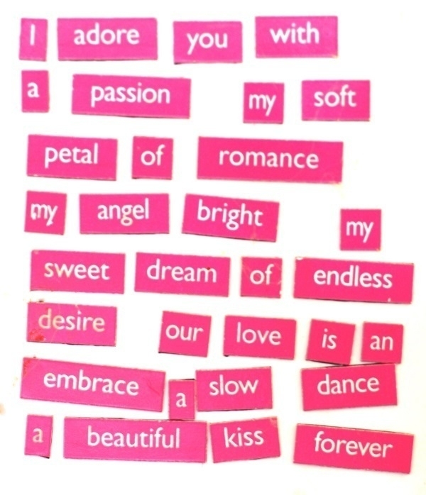
With Valentine’s Day just over, here’s a photo of a ‘fridge-poem’ I made for my wife. The fridge poetry “romance kit” may well have been a Valentine’s gift – I can’t recall. I do remember it lay unused for a year or two before I tried conjuring something appropriately romantic from its limited vocabulary; an undertaking that proved more difficult and time-consuming than I’d anticipated. Those thirty-two words were the result.
The ‘poem’ had been on the fridge for a few more years when I took the picture, hence its sub-optimal cleanliness. The photo was an aide-memoire so I’d more readily know how to replace the words on a new fridge in a different house after a move.
‘Endless’ and ‘forever’ are utterances – however sincerely expressed or deeply felt – that the passage of time will make a brusque mockery of. Within ten years of choosing those words, within five years of taking the picture, I was a widower.